BITROCKET — name development, logo development, corporate identity, advertising communications
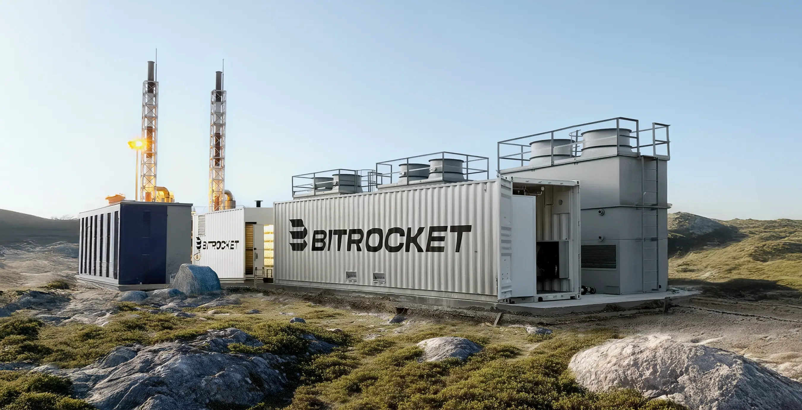
BITROCKET is a premium provider of comprehensive modular and fixed solutions for mining and data processing. Branding agency BRANDEXPERT “Freedom Island” was tasked with shaping a contemporary strategic and visual brand platform that highlights BITROCKET’s innovative spirit and technological leadership.
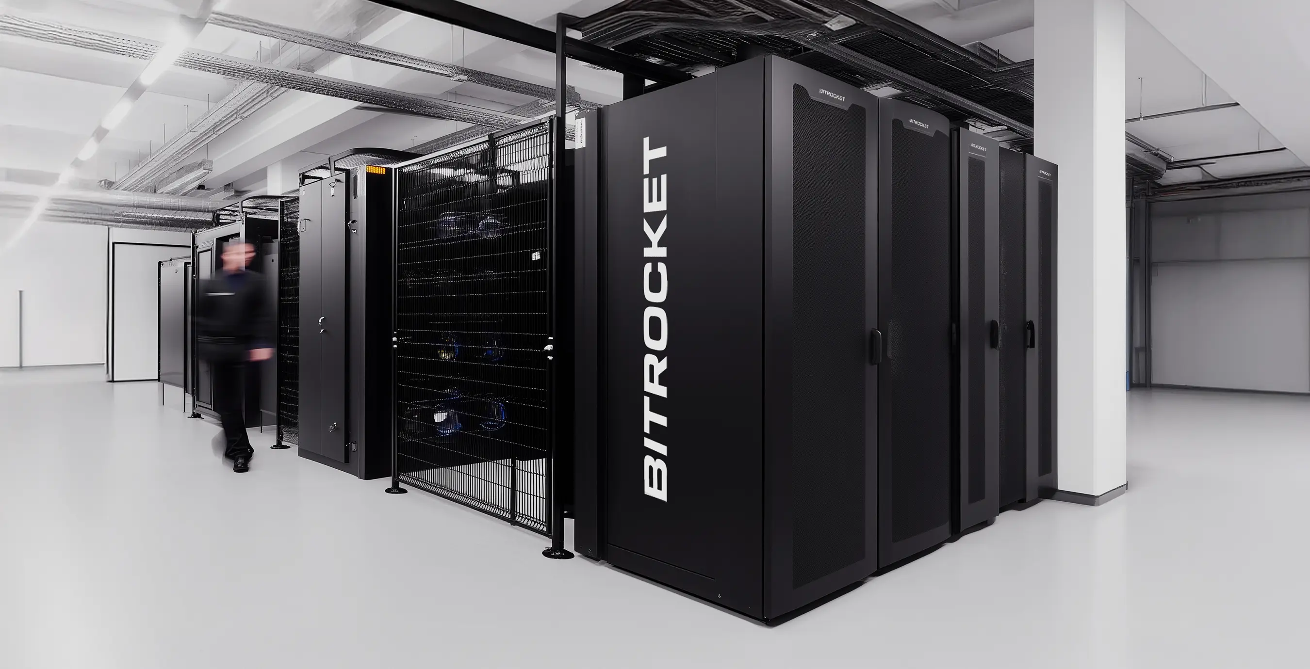
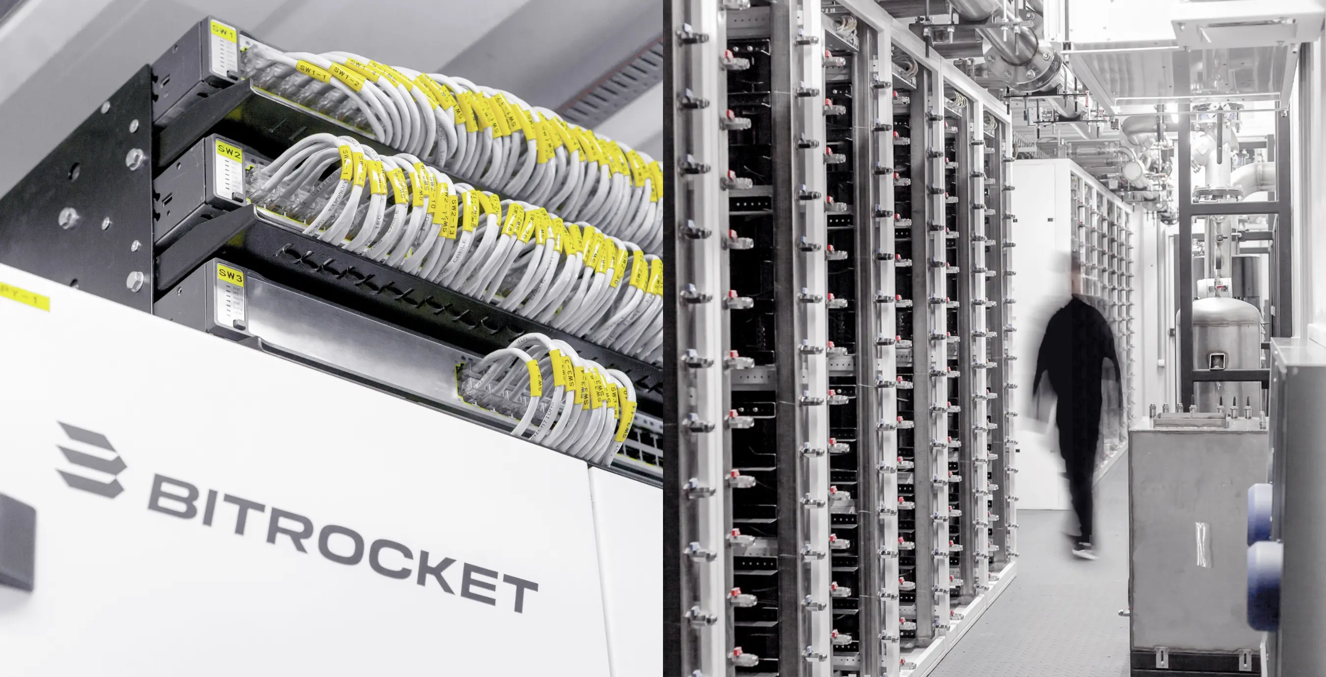
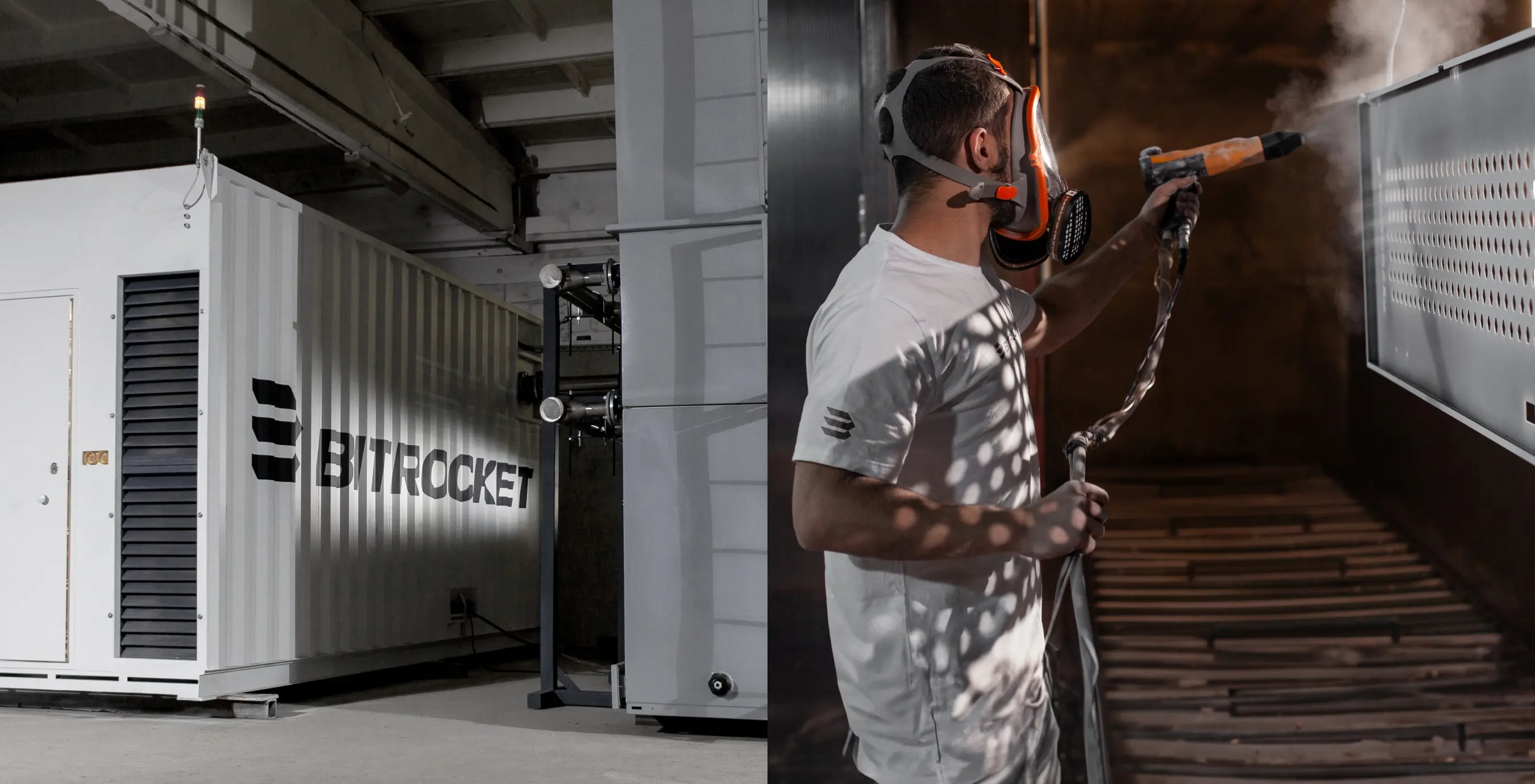
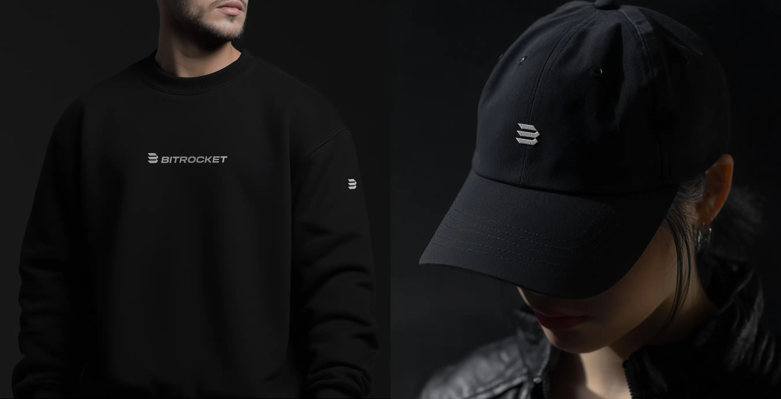
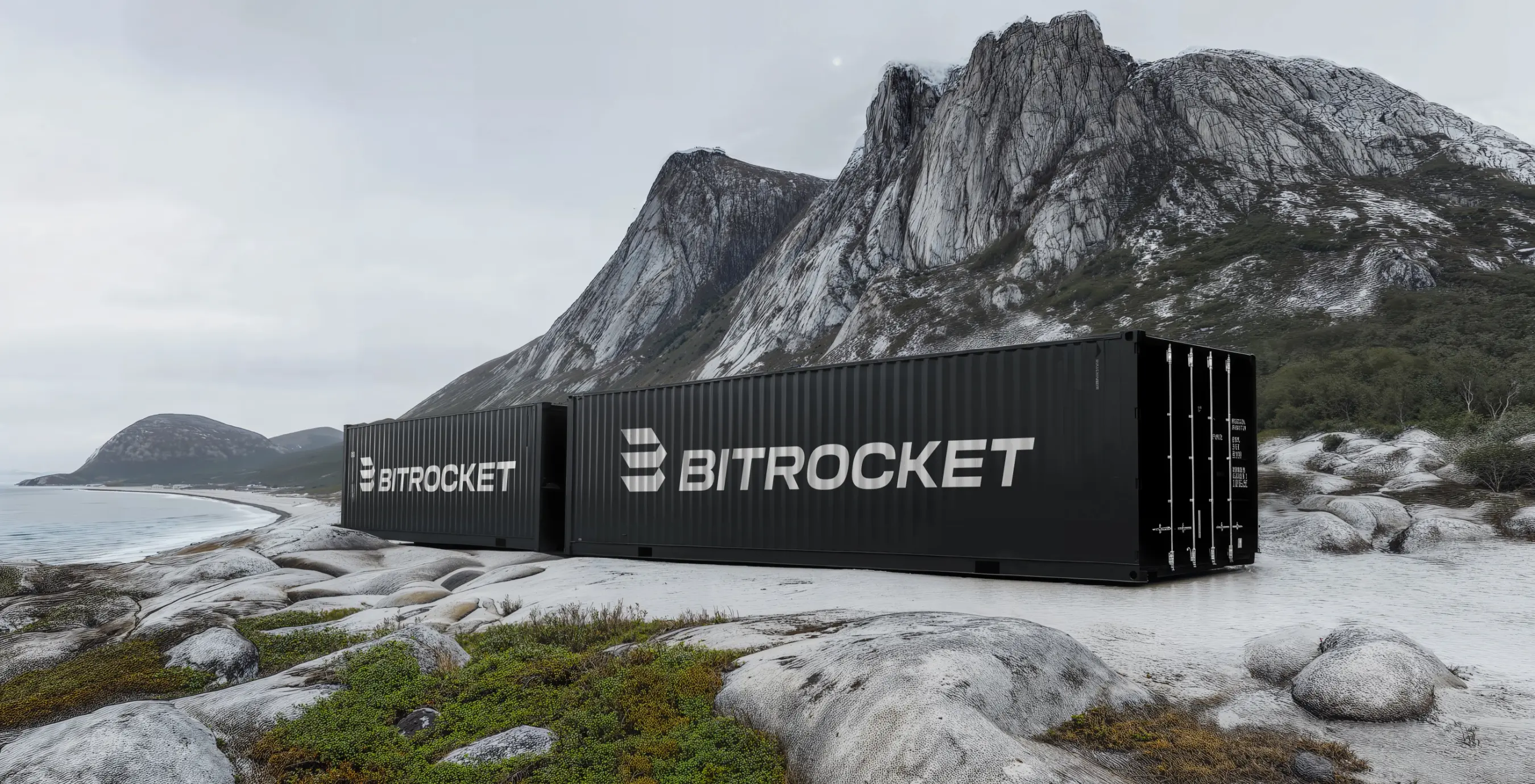
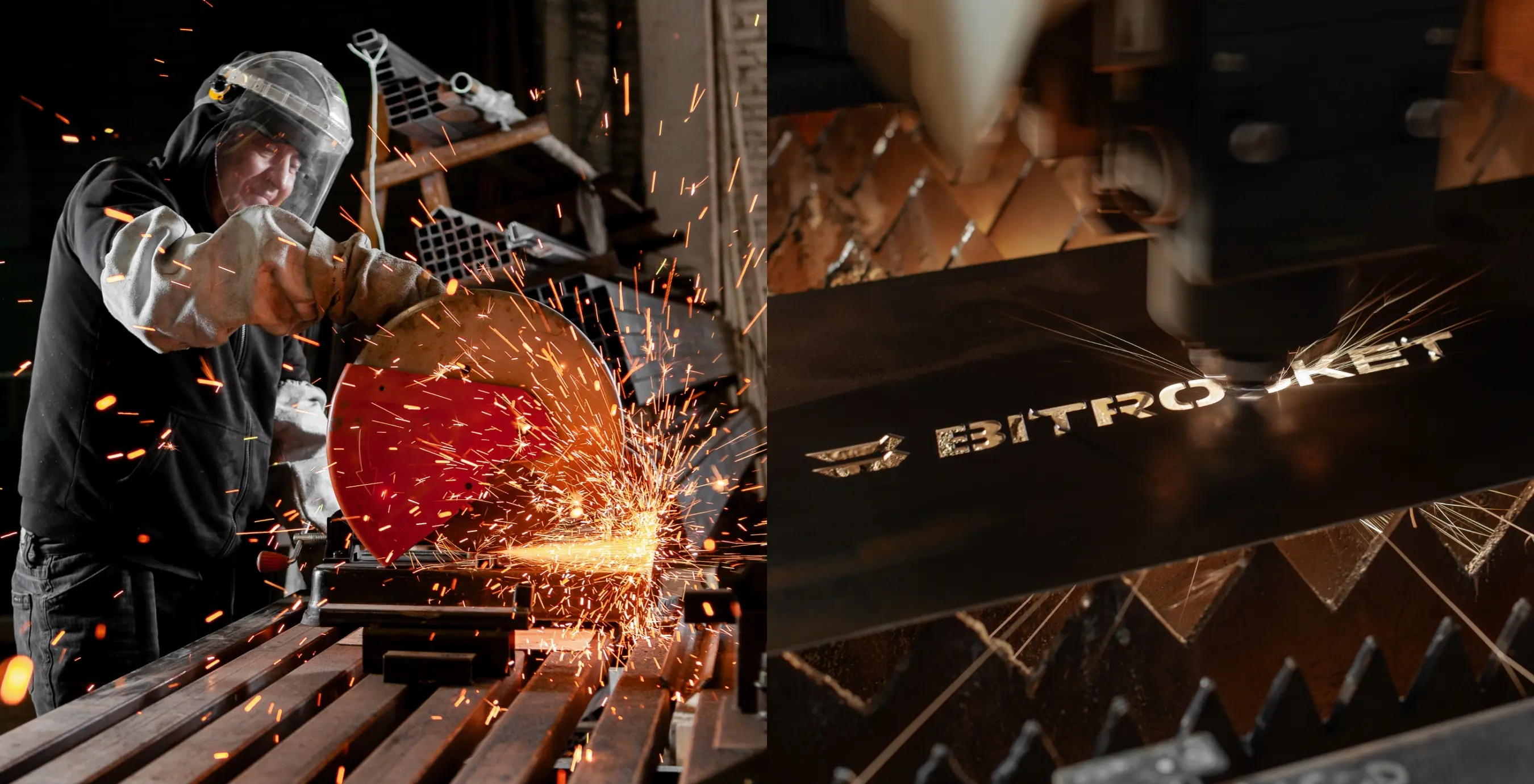
The project delivered a legally protectable, trademark-ready name, a logo, a full visual identity, and a communications design system that give BITROCKET a precise graphic and conceptual position – readily scalable from container and server-rack labeling to digital interfaces, presentation materials, and industrial wayfinding.
The BITROCKET name unites the brand’s core constants – its roots in digital computation and data, engineering precision, innovation, and ambition. Clear and intuitive, the name is easy to transliterate, ensuring effortless use across international markets.
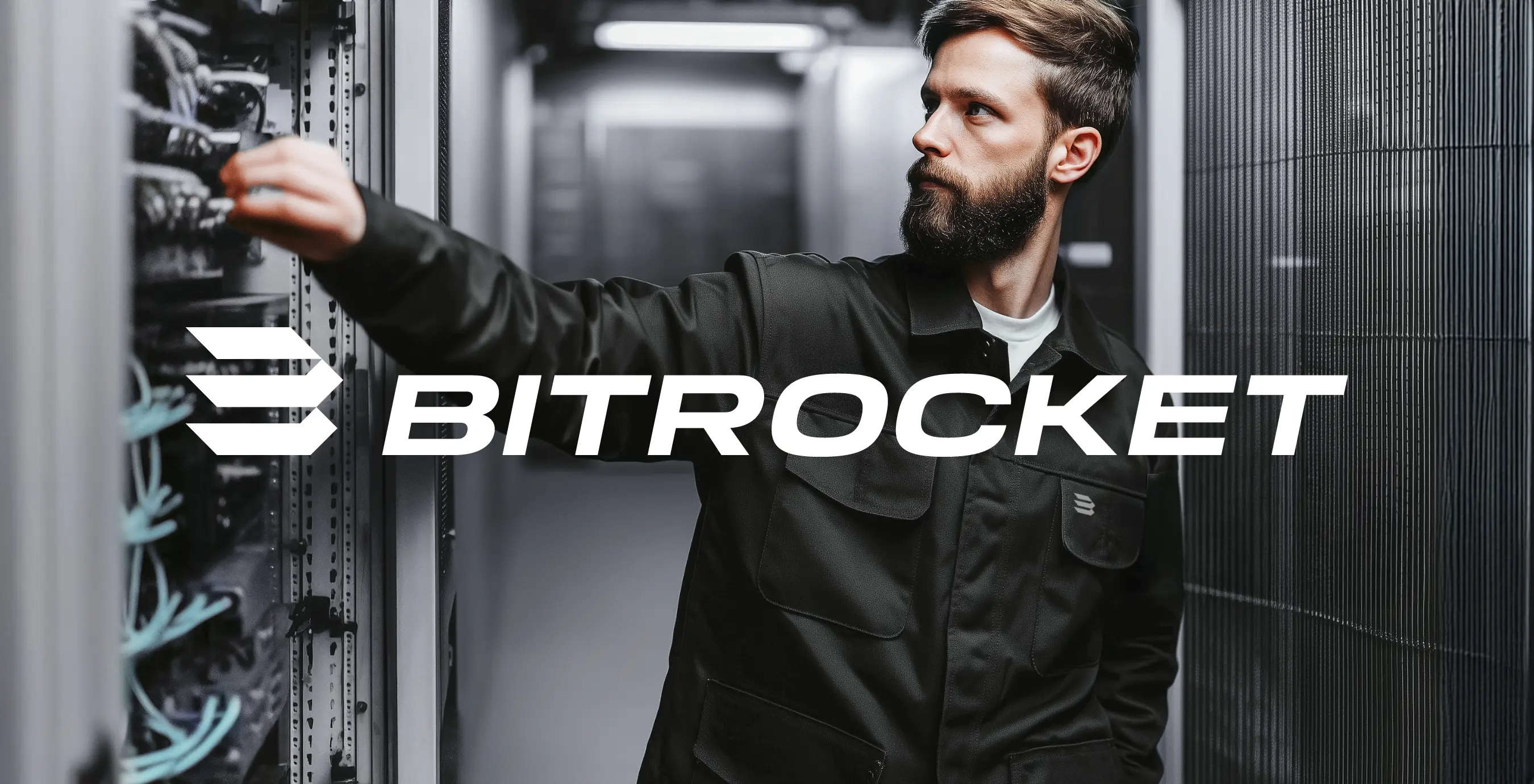
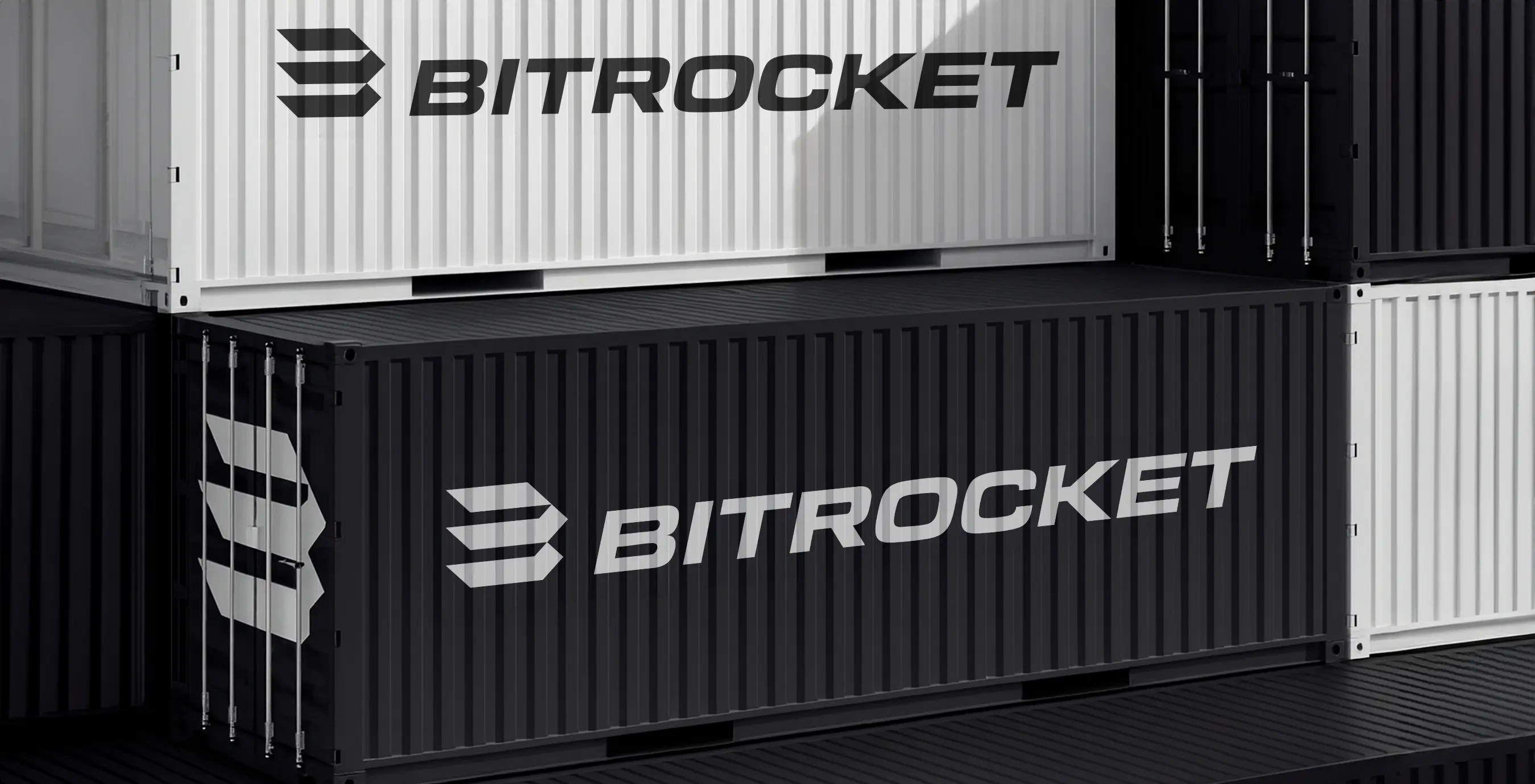
The wordmark employs a proprietary neo-grotesque cut that conveys the company’s industrial and technological character. The chosen typeface ensures high legibility in uppercase and at distance, while the forward slant adds the sense of momentum inherent to the brand.
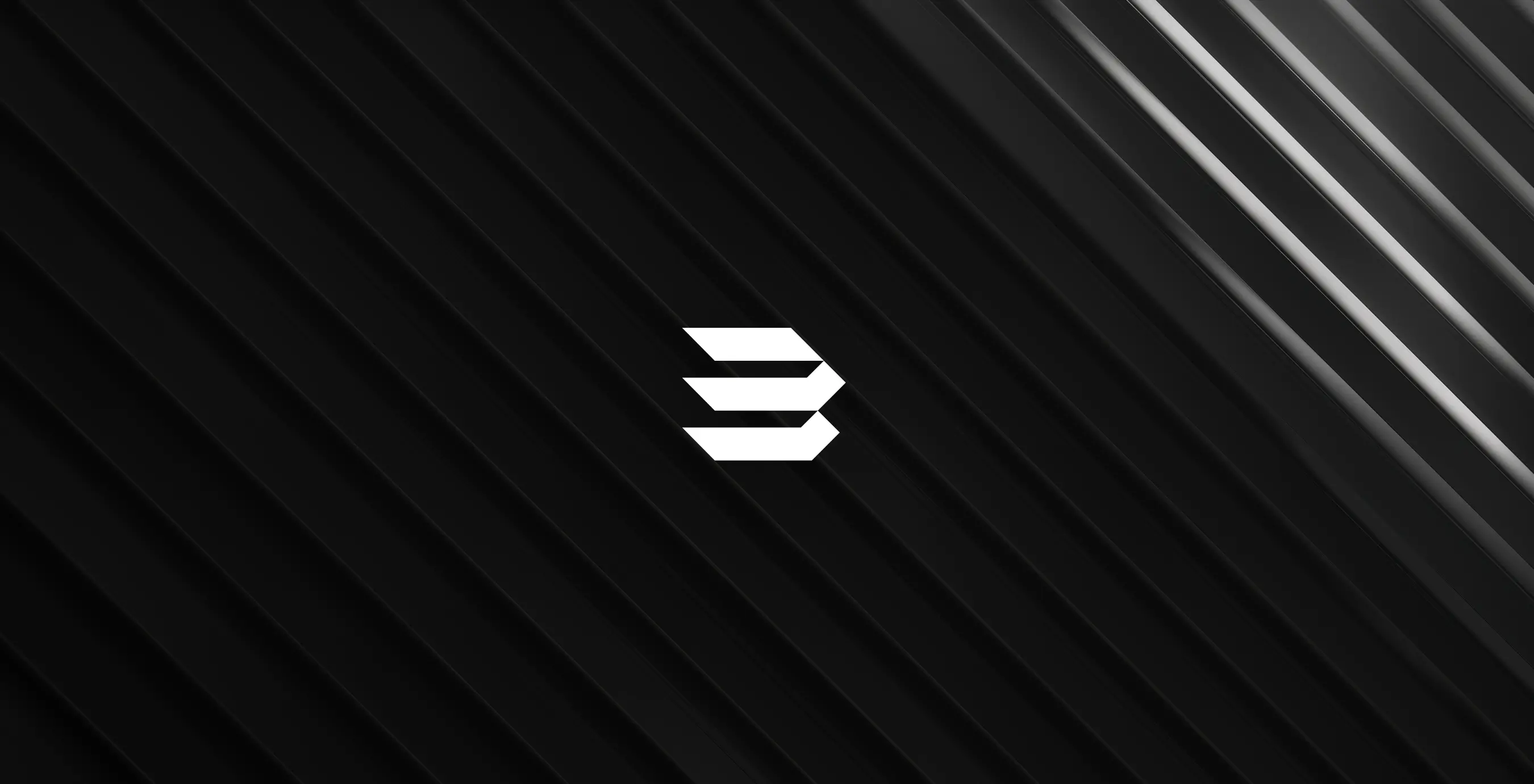
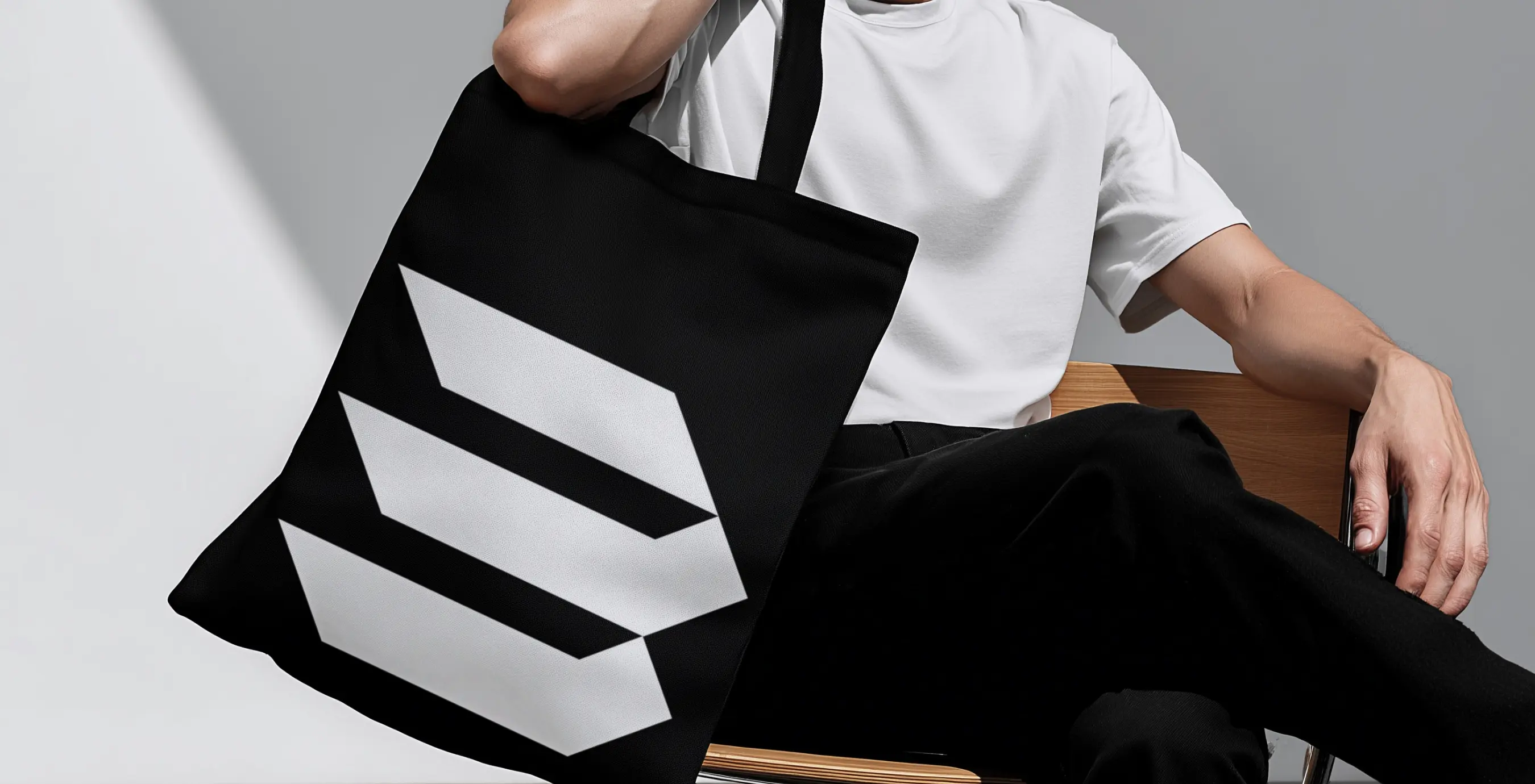
The confident geometry of the monogram – three directional bars forming the letter “B” –delivers flawless readability across industrial and corporate applications. A high-contrast monochrome palette underscores the brand’s premium stature and guarantees visibility on any application surface.
