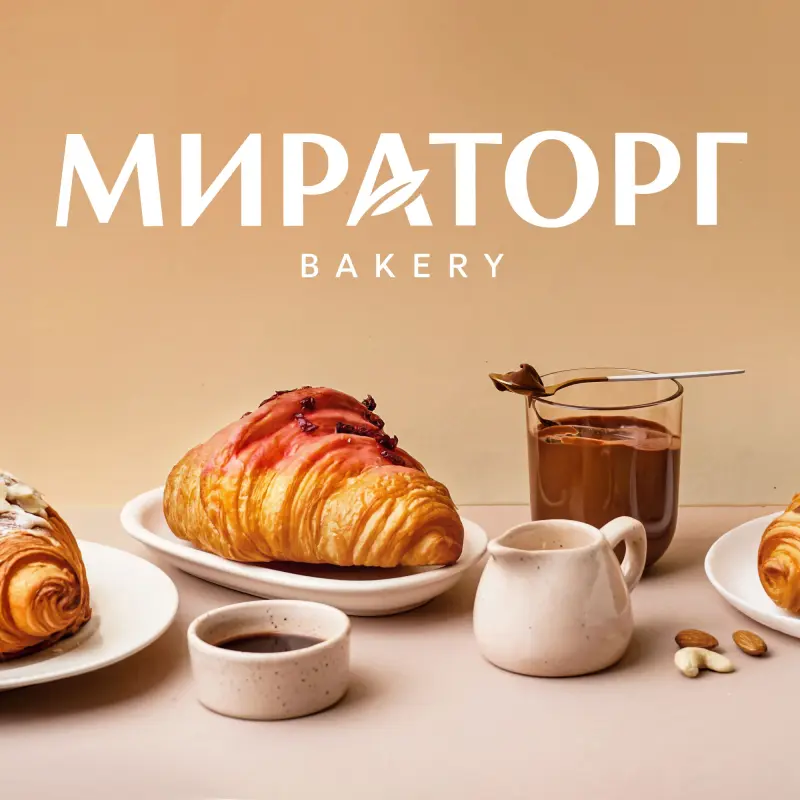
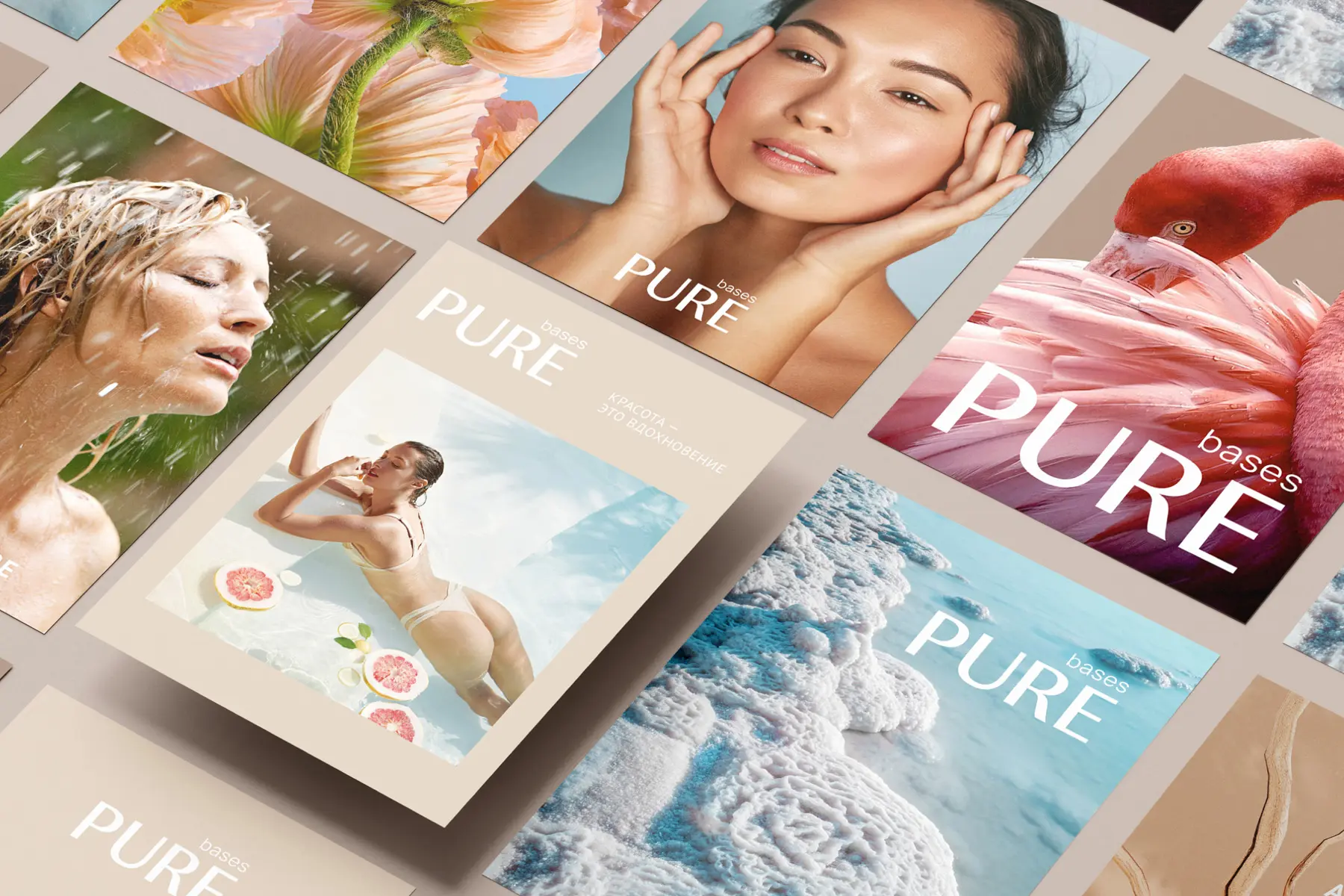
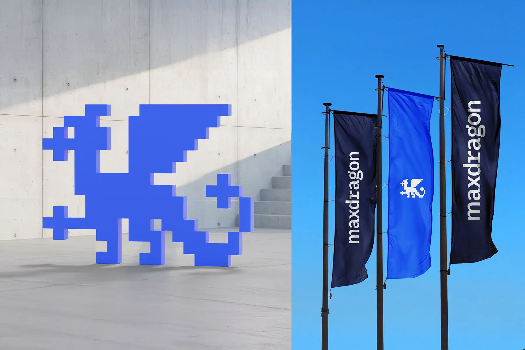
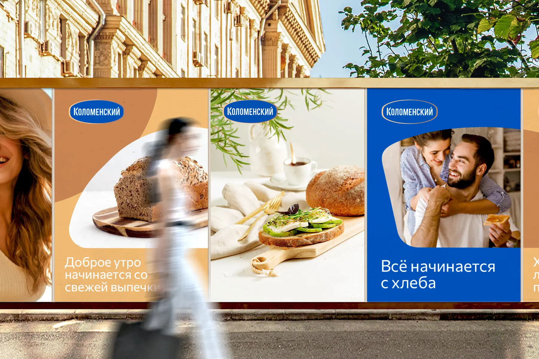
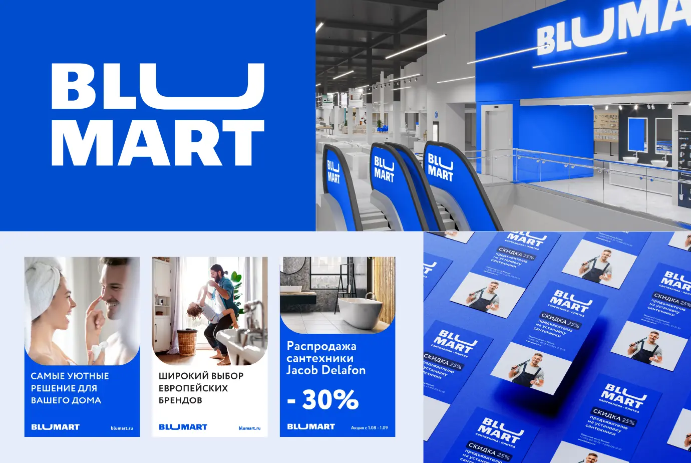
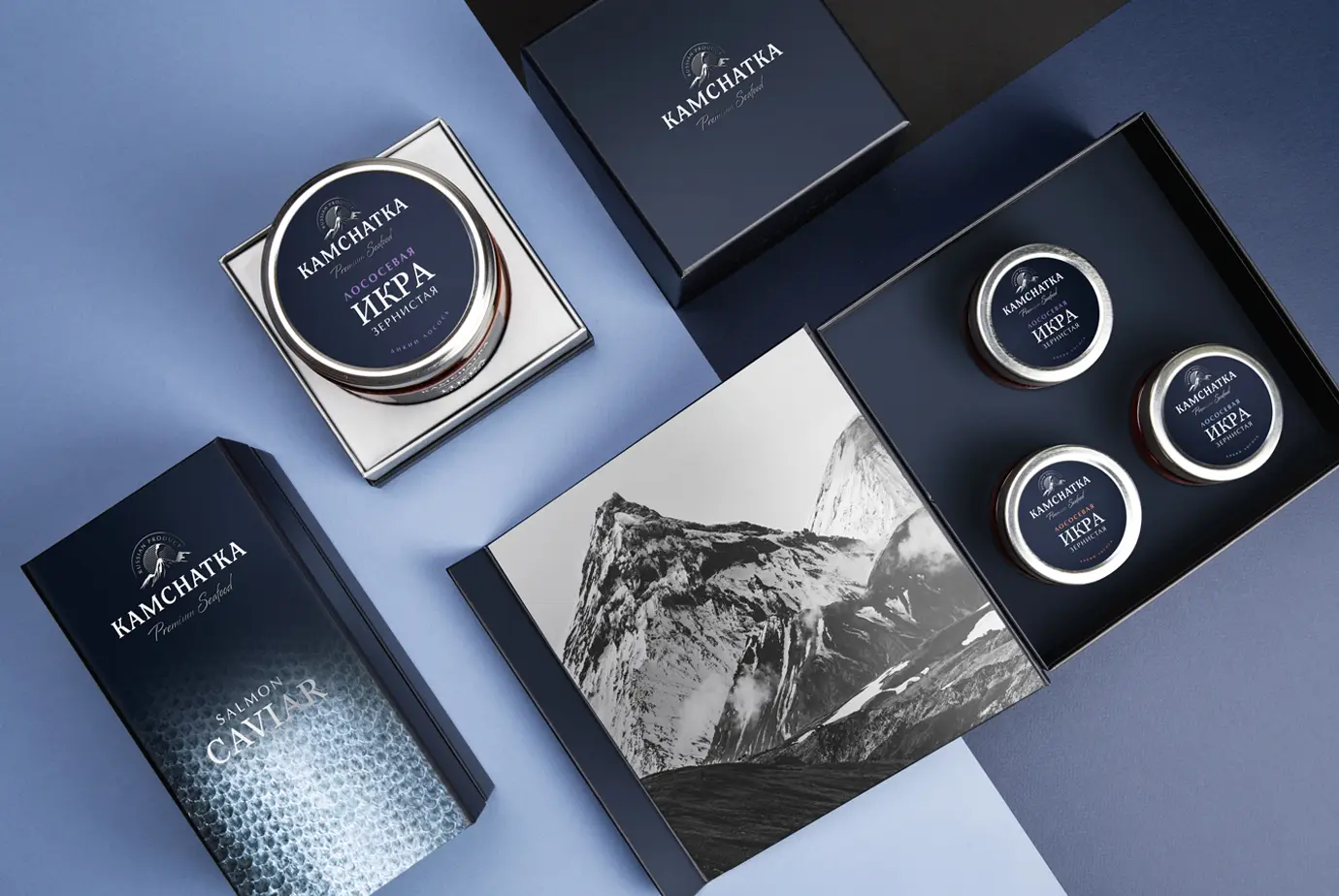
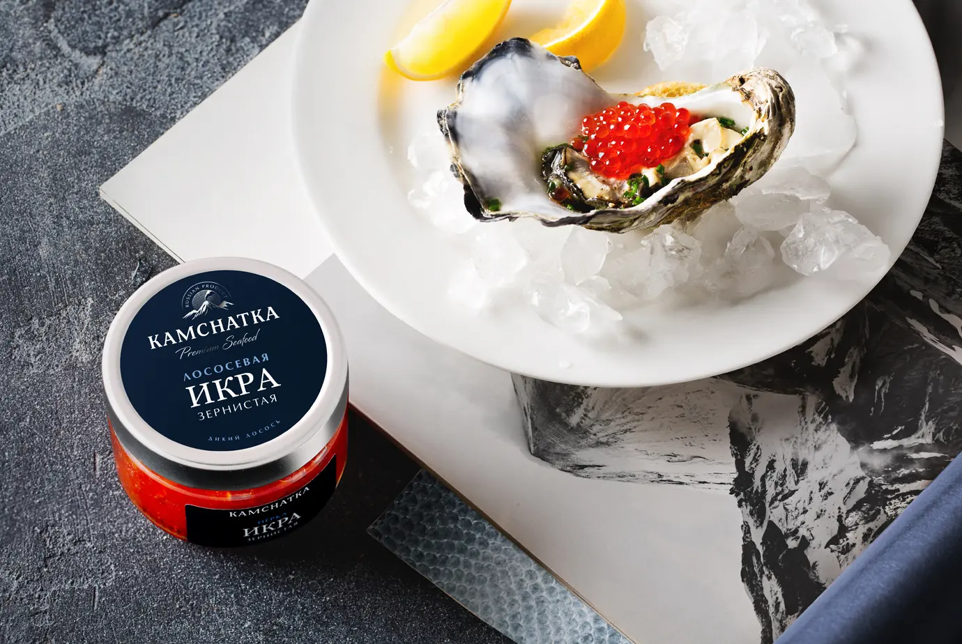
ALVITEK.

A logo is the most concentrated visual code of a brand: it helps people recognize a company in seconds and keeps the image consistent across channels. In this article, we’ll break down how visual identity works and explore the main logo types—from wordmarks and monograms to symbols, emblems, and combination marks. We’ll look at why some logos become truly iconic, how they evolve over time, and how they maintain continuity while adapting to new contexts. You’ll also learn how to assess logo effectiveness through both performance signals and professional design criteria. We’ll discuss the role of color and how a palette can reinforce meaning, tone, and recognition. Finally, we’ll cover the practical layer: what a logo guideline and a brand book should include, when trademark registration makes sense, and how logo design approaches shift across categories—from kids’ products and sports to healthcare, luxury, place branding, and ecosystem brands.


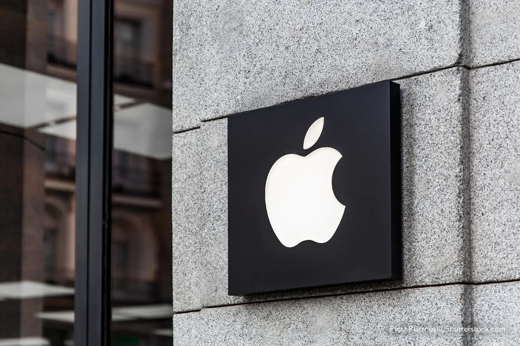
Apple’s bitten apple, Nike’s dynamic Swoosh, McDonald’s golden arches — symbols that customers recognize instantly all over the world. A logo is the face of a brand: its most concise visual expression, bringing together the product’s aesthetics and semantics.
Positioning, mission, or brand essence can tell us about a company’s principles and goals, but a logo often does it far more effectively: the most successful ones manage to convey not only the essence, but also the product’s character — using just a few shapes and color combinations. A logo’s success is defined not only by aesthetics and a clear message, but also by scalability and the ability to adapt easily across a wide range of print and digital communications.


A text-based logo is a logo that contains only the textual part — without additional symbols or images. Even though this option may seem the most straightforward (it accounts for roughly half of all registered trademarks), there are many ways to make a text-based logo visually distinctive.
A typeface logo — also known as a wordmark — presents the brand name as text, designed in a distinctive style. In this case, the brand image is shaped by the name itself, as well as by the choice of typeface and the brand’s signature colors.
The advantages of this kind of logo are maximum clarity of communication (as long as the typeface remains readable) and a minimalist approach. A professionally chosen typeface helps convey the brand’s character while staying appropriately restrained alongside other brand elements. In addition, wordmarks are easy to adapt for use across virtually any medium.
This option is often criticized for being “too simple.” Still, it’s not merely “a line of text.” A strong wordmark won’t become a magnet for customers on its own — but neither will any other image. Its role is to support the brand image shaped by the product/service and other visual assets, and a well-balanced wordmark handles that task very effectively.
When a standard typeface isn’t enough to create a memorable wordmark, designers use calligraphy or lettering to craft an expressive text image.
Calligraphy is the technique of creating handwritten lettering. It relies on clear rules for how letters are formed within a chosen style. The inscription may be drawn by hand with a digital stylus, or created on paper and then digitized. The key criterion is impeccable execution.
Lettering, while also hand-drawn, is not bound by such strict constraints. Here, the designer is more “drawing” than “writing” characters — so repeated letters may vary, and the main goal is to build a visually appealing composition.
These techniques allow designers to create an expressive, emotionally charged logo. Perhaps the largest global brand using this approach is Disney, whose handwritten logo — based on Walt Disney’s signature—both references the art of animation and evokes a sense of magic. The lettering styles of Coca-Cola, Esquire, and Carlsberg are also highly recognizable.
An abbreviation logo — also known as a lettermark — is a visual mark built from the brand name’s initials. In most cases, it is designed as a single integrated sign rather than separate letters set in a corporate typeface.
A lettermark solves several tasks at once. First, it compresses a long brand name into a compact form. Hewlett Packard, Home Box Office, and Electronic Arts are typically less memorable in full than HP, HBO, and EA. Second, using fewer characters gives the designer more freedom to experiment with shape and composition—turning a set of letters into a distinctive, memorable image.
A monogram is a written sign designed as a single unified image. Unlike an abbreviation, the letters form an indivisible visual element and can be arranged in any compositional way — interwoven, mirrored, and so on.
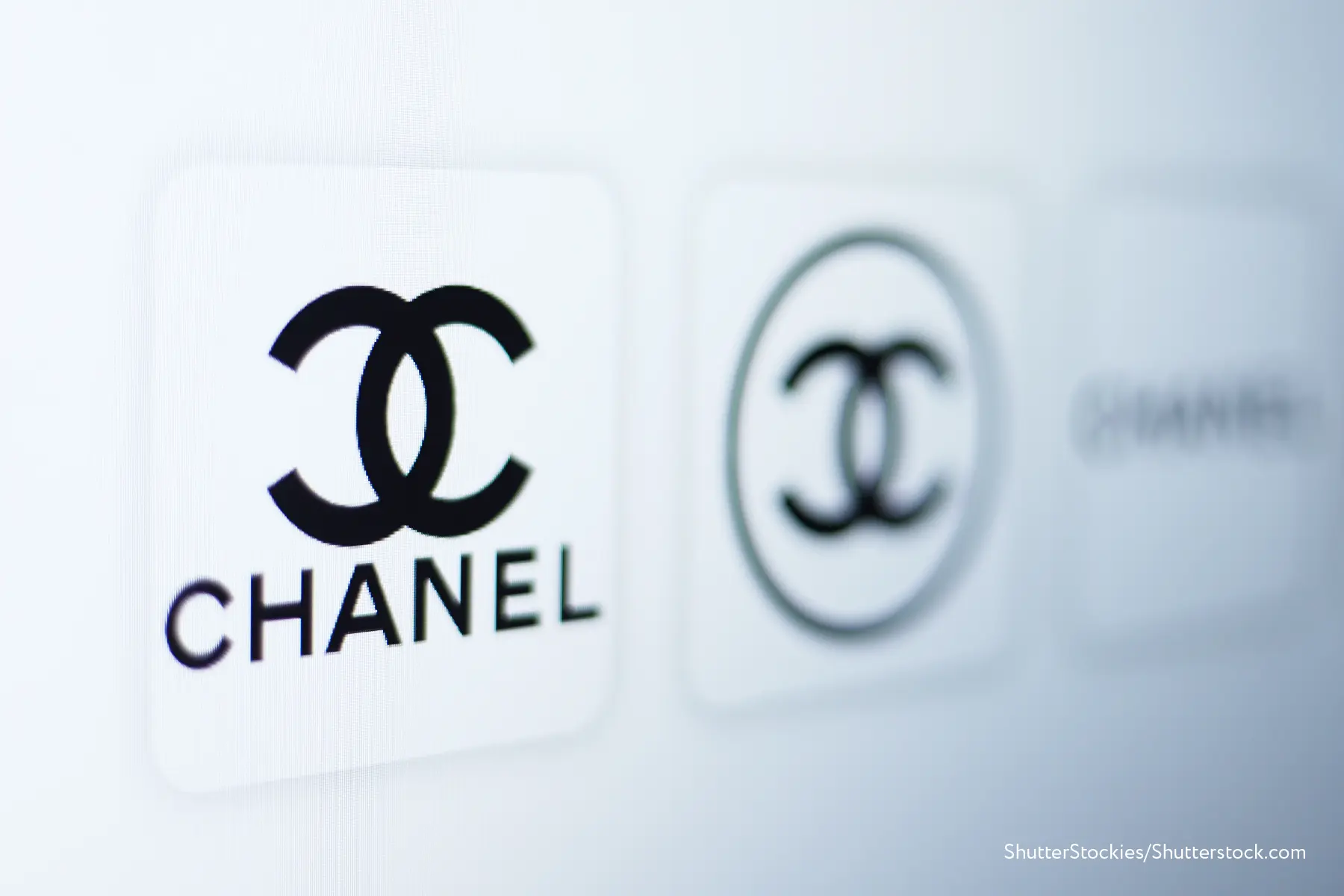
Monograms have a dual nature: formally remaining a text-based logo, they transform letter combinations into an independent, stylistically charged symbol. The monograms of Chanel, Gucci, and the New York Yankees have long become standalone marks that don’t require letter-by-letter decoding. An especially successful monogram can also create a thematic image, as in the London Symphony Orchestra logo: the interwoven letters L, S, and O form the silhouette of a conductor.
A letter logo (letterform logo) is an artistic depiction of the first letter of a brand name, used as its emblem. Unlike an abbreviation, it’s not a simple printed character but a distinct visual image whose outline echoes the brand’s initial.
Such forms are rarely used as a company’s only logo. Only the most recognizable brands — like McDonald’s, with its “M” shaped as the golden arches — are famous enough to be identified reliably by a single stylized initial. However, letter logos work excellently for corporate materials: business cards, contracts, brochures, and more. They’re also widely used in website interfaces, as well as for favicons or app icons.
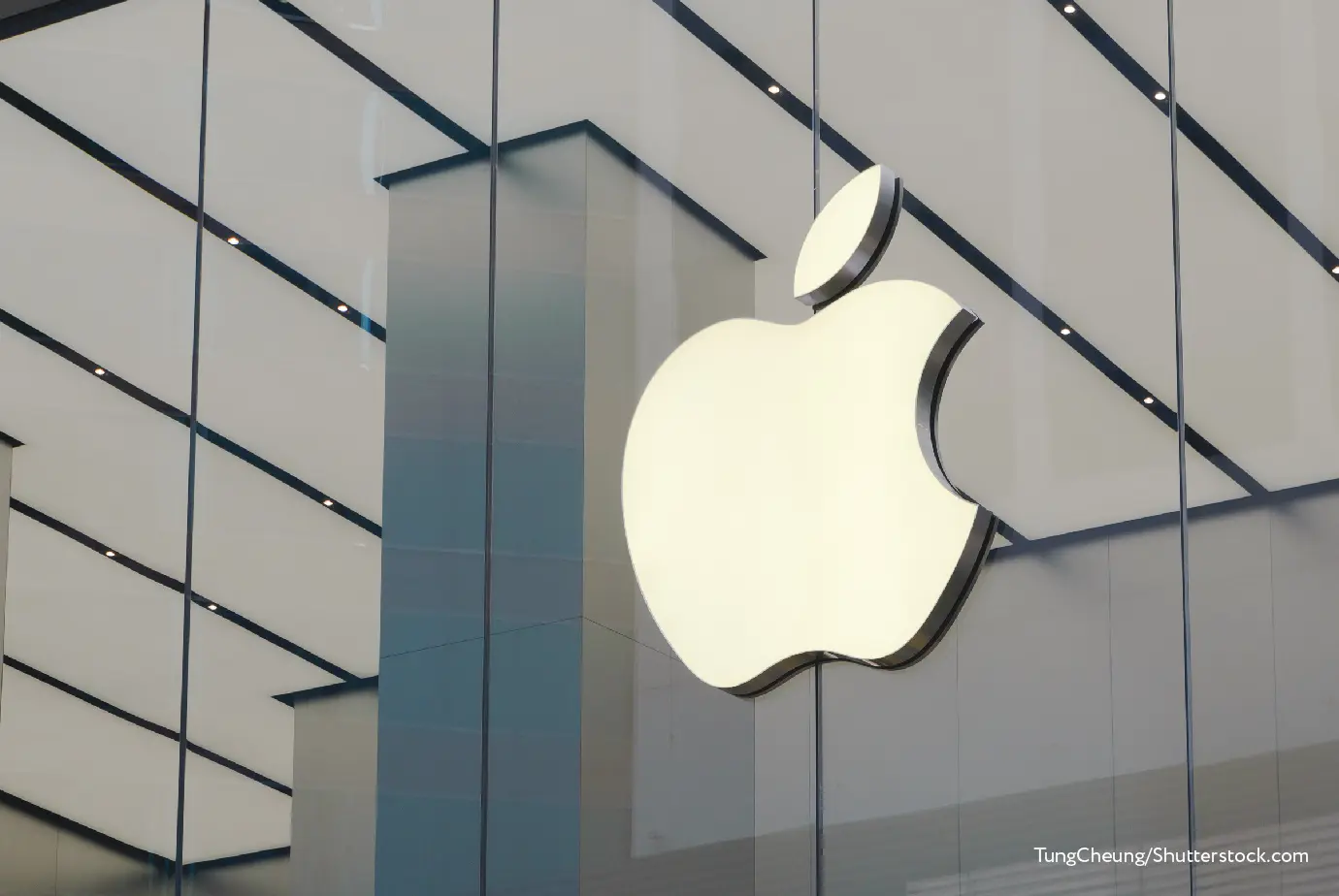
A graphic logo is an image (typically fairly minimalist) that conveys a brand’s character and aesthetics. Graphic logos aren’t interpreted as immediately as text-based ones, which is why fewer companies rely on them alone — and they’re often paired with the brand name. Still, some of the most recognizable logos in the world, such as Apple’s bitten apple or Playboy’s bow-tied rabbit, are purely graphic in nature.
A pictorial mark is an illustration of a real, recognizable object (or objects), rendered in a specific style that reflects the brand’s look and tone.
The choice of an image can be driven by different factors. The most common case is a thematic connection to the brand name. Shell isn’t known for selling seashells (even though that’s where the company’s story began), and Domino’s doesn’t manufacture game tiles — yet both logos successfully complement their names.
Sometimes the link to the brand is less obvious. For example, Toyota’s logo is often read simply as an eye-catching interlacing of ellipses that suggests dynamism and elegance. And it does work emotionally — but it’s also often explained as a nod to the company’s history: the ellipses can be seen as the eye of a needle with thread passing through it, referencing Toyota’s textile roots and symbolizing precision and diligence.
An abstract logo is an arbitrary shape that communicates a brand’s character through style rather than depiction. Unlike a pictorial symbol, an abstract mark doesn’t refer to a real-world object; its purpose is to create a feeling—to let audiences experience the brand through form and color.
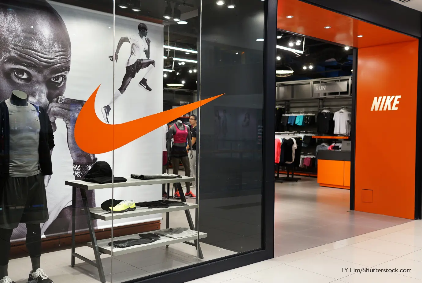
The shape choice depends entirely on the designer’s creativity and their ability to translate brand meaning into abstract imagery. The legendary Nike Swoosh, which conveys a sense of swift motion, fits Nike perfectly — despite having no direct literal link to the company’s name or any specific sporting object.
It isn’t always easy to draw a clear line between a pictorial symbol and an abstract mark. The message behind a logo can evolve over time, just as its form can.
A good example is Microsoft. Until 2012, the company used various typographic versions of its name without additional graphic elements. In parallel, the logo of its flagship product, Windows, evolved while preserving its core idea: a stylized window with four differently colored panes. In the early 2010s, the concept shifted — the updated “window” became Microsoft’s corporate logo, turning into a geometric set of four squares. Today, the colors are associated with different business directions: blue for Windows (which is why the OS logo became monochrome), red for Microsoft Office, green for Xbox, and yellow for Bing.
A mascot logo features a fictional character that embodies the brand. Mascots are usually drawn in a playful or even caricature-like style, reinforcing a friendly and approachable brand image.
Relatively few companies use a mascot as part of their core logo. Many brands introduce characters only for specific ad campaigns or during a repositioning phase. Only a small number decide to add a mascot to the logo and make it an integral part of their identity. Still, some brands are now hard to imagine without their mascots — such as Colonel Sanders for KFC.

Combined logos are the most common type, because they give a brand maximum flexibility in communicating its message by bringing together several graphic elements at once.
Combined logos most often consist of an image (or symbol) plus a text inscription. These elements complement and reinforce each other’s message.
The advantage of the combined format is that it leaves room to experiment with visual imagery that supports a specific mood and brand image, while the brand’s ownership remains easy to recognize thanks to the presence of the name (and sometimes a tagline). This makes combined logos a strong solution for new brands that have not yet built a clear associative link between their identity and consumers.
Nike and McDonald’s are classic examples of globally known companies whose logos originally included both graphic symbols and text. Only decades later (and after several logo iterations), when the golden arches and the Swoosh became universally recognizable and inseparable from these brands’ images, did the need for the “Nike” and “McDonald’s” wordmarks beneath them disappear.
One variation of the combined logo is the emblem, where the text is integrated into the image.
Emblems are used relatively rarely, since they can be perceived as a more classic design approach. At the same time, this very quality can be the reason to choose such a solution: an emblem helps create a sense of tradition and a long history behind the brand. It’s no coincidence that companies like Harley-Davidson and Warner Bros. still use variations of emblems they created more than a century ago.
One technique that helps create a memorable logo is the use of negative space. By leveraging the “empty” space within a logo, a designer can introduce hidden shapes that support the brand’s message. This makes the logo more memorable without overloading it with extra details.
As with combined logos, any mix of text and graphic elements can be used here. For example, FedEx uses only a distinctive typeface and brand colors, but the space between the letters E and X also forms an arrow, emphasizing the company’s proactive image. Another example is the Carrefour logo, where the brand name is complemented by two stylized arrows, and the space between them forms a capital “C.”
A visual identity that accurately conveys a brand’s character, embodies its principles, and clearly communicates its essence is not easy to achieve—so once a company finds the right combination of colors, shapes, and type, it will typically aim to keep it for as long as possible.
Even so, visual elements — no matter how successful — benefit from periodic updates to extend the brand’s relevance over time. In addition, even the strongest logo needs to work omnichannel: it must adapt to different platforms and placement formats, and also to sub-brands and standalone services if the logo belongs to an ecosystem.
This can be addressed with dynamic logos (also called a “logo system”). This design principle involves creating a “graphic foundation” — a base logo and core brand attributes — on which variations can be built for specific channels and sub-brands while preserving clear visual continuity.
As a rule, dynamic logos are built by adding clarifying descriptors. For example, FedEx sub-brands differ from the parent brand through extended names (such as FedEx Freight or FedEx Home Delivery) and a modified color scheme for the “Ex” part.
FedEx chose a slightly more creative solution for its Office sub-brand: by adding the six-point star from the Kinko’s logo (a well-known U.S. copy-services brand with nearly 40 years of history and a vast branch network), it managed to combine the identities of both brands within a single new mark.
A similar example is Virgin. The outlines of the iconic name and the red-and-white color scheme serve as the foundation, while experiments with typography and additional forms help tune the logos to the character of individual sub-brands.
MTS uses a comparable graphic approach as well. After the rebranding carried out in 2023, the foundation of its visual system became a red square with the name placed inside it. To adapt across different digital and print formats, a “split” version of the logo is used: the lower-left quarter of the square functions as a sub-brand marker. Where that scheme can’t be applied, alternative logos are used — designed in a style that still enables immediate recognition as part of the MTS brand.

World-famous logos are the face of their brands — an integral part of their identity, reflecting their values and aesthetics. But those aren’t the only factors considered in logo design: the clarity and expressiveness of the message are reinforced by technical thinking that ensures the logo remains recognizable when reproduced at different sizes and across different media.
A telling example of a design decision driven by functional needs — yet gaining additional aesthetic meaning — is the Apple logo. The original, highly intricate version, made as an engraving showing Isaac Newton under a tree, was replaced almost immediately. The designers then faced a challenge: with an ultra-minimal design, how could the apple remain unmistakable so that even in its smallest form it wouldn’t be confused, for example, with a cherry? The solution was to add a bite. This not only made the symbol instantly legible, but also aligned it with the brand’s ideology — built around ideas of discovery, creativity, boldness, and innovation.
A similar path was taken by the Mercedes-Benz logo. Moving away from an emblem that included the brand name, the company chose a form that was both memorable and easy to depict. The strict, assertive three-pointed star — symbolizing the use of Daimler engines on land, at sea, and in the air — helped express the brand’s confident, commanding character.
Not every visual solution starts with a direct thematic link to the product. Often, the designer’s task is to take an unexpected reference, reinterpret it, and weave it into the brand’s DNA. One of the most recognizable symbols in fashion — the Chanel logo — emerged in a similar way: drawing on ornamental details associated with the abbey/orphanage where Coco spent part of her childhood, it evolved into an anagram of two mirrored “C”s, becoming a symbol of elegance and success.
Any logo benefits from updates from time to time: a brand’s positioning may shift, a visual style can start to feel dated, or an overly complex mark can make it harder to build recognition across channels. When a logo’s core idea and color palette still serve the brand well, its design tends to evolve gradually — refreshing the familiar image without losing the features that made it recognizable in the first place.
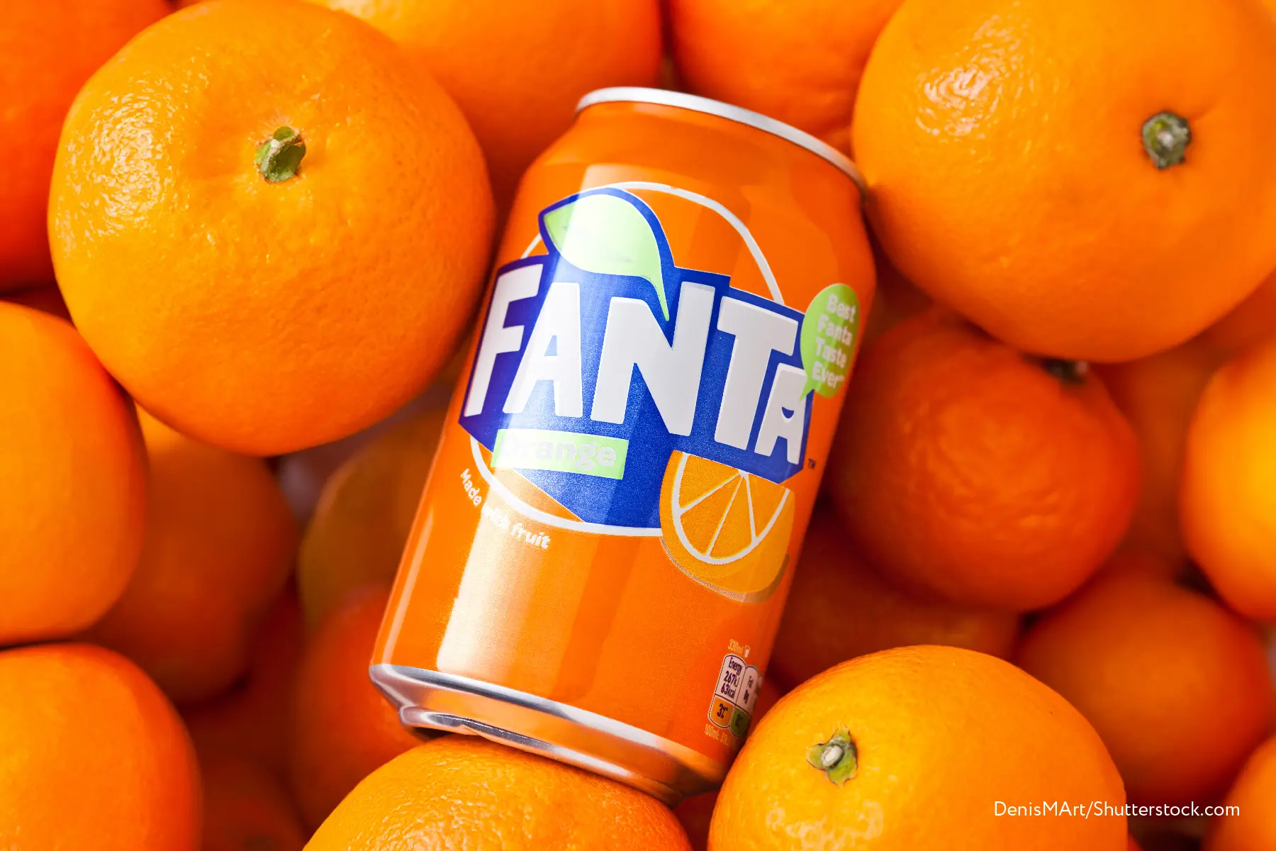
A vivid example of this kind of steady evolution is Fanta. After finding its signature style in 1995 (a bold color combination and “orange” visual cues), the brand has updated its logo regularly over the years — alternating between simplification and added dimensionality. In the mid-2010s, Fanta began experimenting with a sharper, more angular lettering style (while preserving the energetic, lively feel), and the logo as a whole became more geometric.
PayPal follows a similarly careful evolution strategy. Moving away from an early monogram that was less suited to fast reading, the company adopted a clean wordmark — and since then has refined its letterforms (for example, removing an outline and adjusting the “a”) and explored different shades of blue while keeping the established visual language. In 2014, PayPal introduced a refreshed identity, including an updated “double P” monogram used as an app icon.
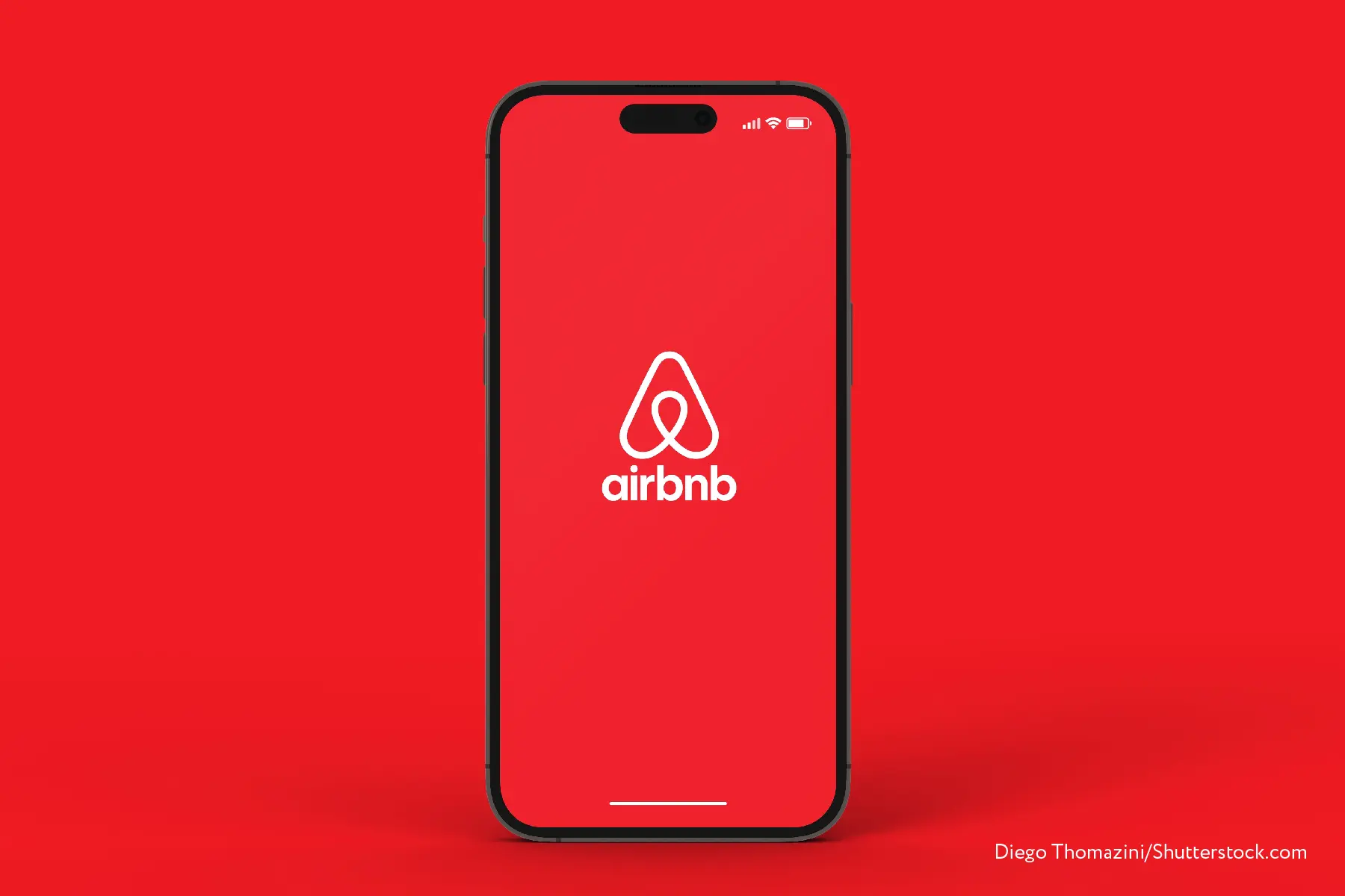
The Airbnb logo has undergone a far more dramatic transformation. While early versions still leaned on familiar stylistic attributes from the period before the name was shortened, the brand later moved toward a cleaner, more universal form. In 2014, Airbnb presented an entirely new logo: the wordmark became stricter, and it was paired with a distinctive stylized “A” (the “Bélo”), whose curves also suggest a location pin — an intuitive symbol of destination. A subtle echo of earlier versions remained in the warmer accent tone, now influenced by orange.
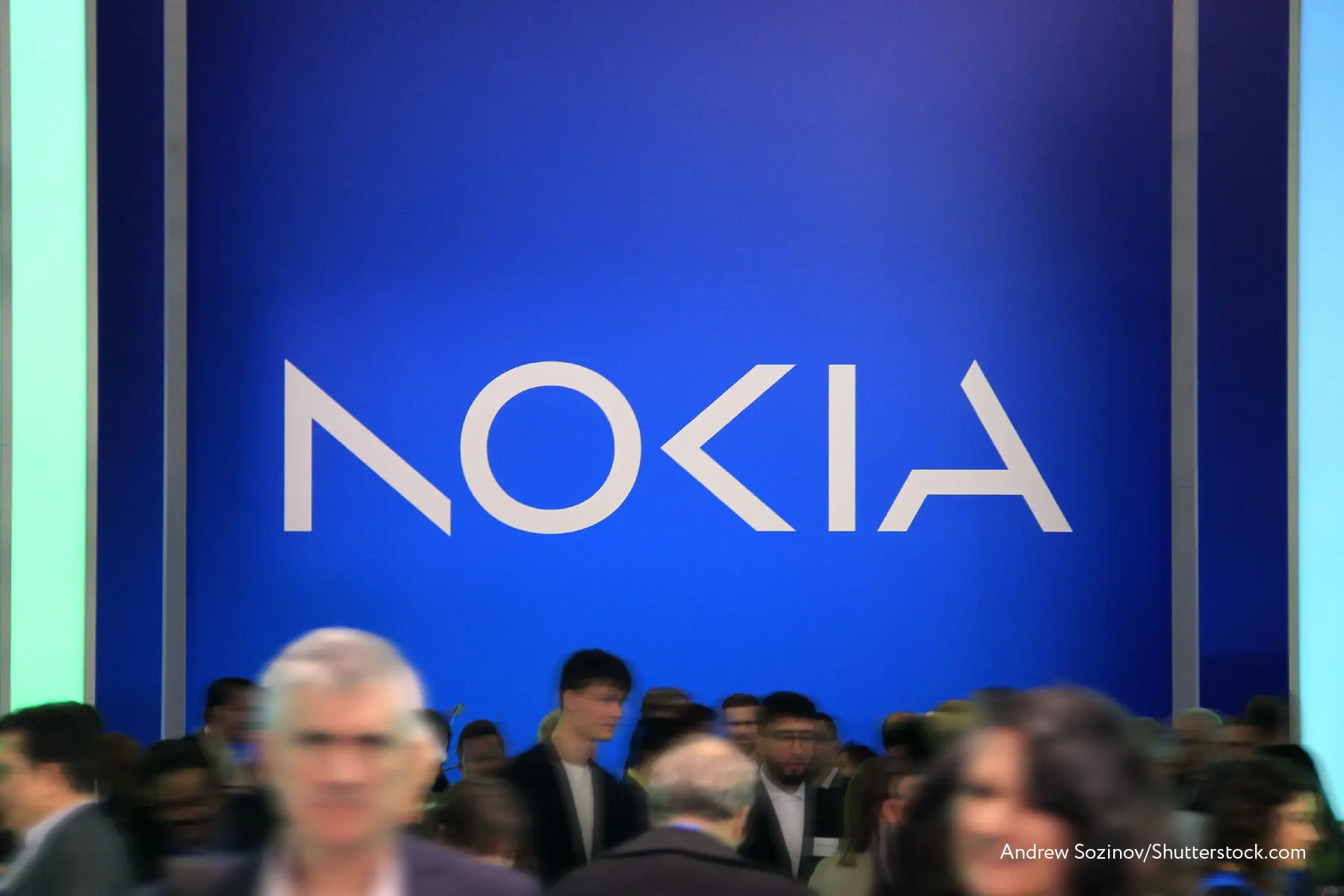
Not all brands aim to update their logos frequently. A good example of a conservative, highly precise approach is Nokia. Without going deep into the earliest iterations (the company dates back to 1865), it’s easy to notice how some core principles of its visual identity stayed consistent for decades. Only in 2023 did Nokia commit to a redesign, choosing a more geometric and unconventional rendering of its name and giving the logo a brighter, more contemporary feel through an updated blue.
In Russia, there are relatively few companies that have been refining their visual style for decades. Still, there are brands whose logo evolution clearly reflects changes in their values and ways of working.
A strong example is Sberbank, which modernizes its identity in step with internal transformation while preserving recognizable shapes and color cues. In the 1991 version, three vertical check marks cutting through a circle created the image of an open wallet. That same motif carried into the next iteration, made lighter by removing the “founded in 1841” line and warming the green tone. By 2009, as the bank actively moved toward cashless services, the center of the check marks shifted left, turning the emblem from a “paper-money wallet” into a more abstract sign of a completed task. The classic slogan appeared, the name was shortened to “Sberbank,” and the emblem gained a subtle golden volume effect. By 2020, Sber had evolved from a bank into a full ecosystem of services — reflected in the identity through an updated name, a more contemporary sans-serif wordmark (still retaining some of the predecessor’s discipline), and a renewed circle-and-check motif that signals the brand’s move into the digital domain. Solid color gave way to a gradient fill, where a brighter green now sits alongside blue and yellow.


Nike and Apple logos are globally recognizable symbols that need no introduction. It’s hard to say what drives their success more—the perfection of the design or the product behind it — but they are, without doubt, examples of exceptionally effective logos.
Measuring the success of logos for less well-known companies is more challenging. As with any other brand element, there are two main ways to evaluate effectiveness: by analyzing consumer-interest metrics and through expert assessment by industry professionals.
Consumer interest — shaped not only by positioning and naming, but also strongly influenced by the logo and visual identity — can be tracked through the following indicators:
Audience size. A strong product supported by professionally executed positioning and visual identity is likely to expand its customer base. Of course, growth rate and total reach depend heavily on the product category and overall market conditions, but the absence of positive dynamics often signals that the branding may need refinement. Stagnation or a decline in sales frequently becomes the trigger for developing a new logo and visual identity.
Audience loyalty. Attracting new customers is not enough; the goal of branding is to build a stable image that encourages people to return again and again and makes the product a first-choice option. Loyalty can be measured using Net Promoter Score (NPS) and repeat-purchase rates.
Brand recognition and legibility. It’s not enough to catch attention on the shelf with a striking color combination — the logo’s task is to convey the brand’s essence and spirit and to reinforce the link between a visual image and a set of values and characteristics. Evaluating how well customers “read” the brand’s message through the logo can be done via surveys, as well as by monitoring social media mentions and branded search queries.
Unlike consumers — whose commitment to a brand (and its logo) can be tracked using relatively verifiable metrics — experts assess logos based on professional experience and a set of qualitative characteristics a strong logo should have. These typically include:
Uniqueness and memorability. While aligning with current design trends, a logo still needs a distinct character. Startups and small companies often face a situation where a logo created “by the rules” and in line with trends remains hard to distinguish from other marks of a similar scale. At the same time, even a bold visual should remain simple and clear: excessive detail tends to reduce memorability and recognition.
Adaptability. From the earliest design stage, a logo should be built with adaptation in mind — across physical and digital applications. This is another reason conciseness matters: the mark should scale easily, look appropriate both on a large banner and in the corner of a business card, work on different backgrounds, and extend to sub-brands where needed.
Relevance to positioning. Experts evaluate not only the logo’s functional convenience, but also its semantics — how well it matches the brand’s character and the image the company aims to create. This is one of the most subjective evaluation categories, so commentary usually focuses on specific elements such as the typeface or color blocking.
Universality. While designers should consider current trends when building a visual system, the most iconic logos tend to have timeless attributes that allow them — with minimal adjustments — to remain relevant even decades later. It’s difficult to predict a logo’s “iconic potential” (it’s often easier to point out where it’s missing), so experts look at how well a new version preserves continuity with the previous one and to what extent key visual markers remain consistent across iterations.
One of the key decisions in logo development is choosing the brand’s colors. A relevant palette helps express the brand’s individuality more clearly and gives the design greater versatility. Color selection also adds depth to a logo by creating a visual link to the company’s values and personality. The right combination of colors can visually convey the feeling a company evokes in its audience.
Beyond aesthetic appeal, color helps a brand connect with consumers on a deeper psychological level. When you choose colors for a logo and a brand, you are also choosing the emotions and associations you want to trigger.
When designing a logo, it’s important to consider color psychology. The right palette can communicate the deeper meaning of your values and encourage certain actions. A poor choice can seriously damage the brand’s image.
The human brain responds to colors in different ways. By understanding how each color influences the mind and what emotions it evokes, you can build a more effective brand. Choosing color is a subtle and complex task that requires careful analysis.
How each color affects emotions and psychology
One of the primary colors and a universal symbol of strength and energy, red is extremely popular in branding. Red is a strong option if you are creating a bold, energetic, youth-oriented brand image. If you prefer a more restrained, conservative approach, red should not be on your color radar.
Common associations with red include:
Tenderness
Energy
Romance
Warmth
Love
Motivation
This warm color is a vivid expression of friendliness and cheerfulness, communicating playfulness and accessibility.
Common associations with yellow include:
Friendliness
Joy
Youth
Energy
Positivity
Happiness
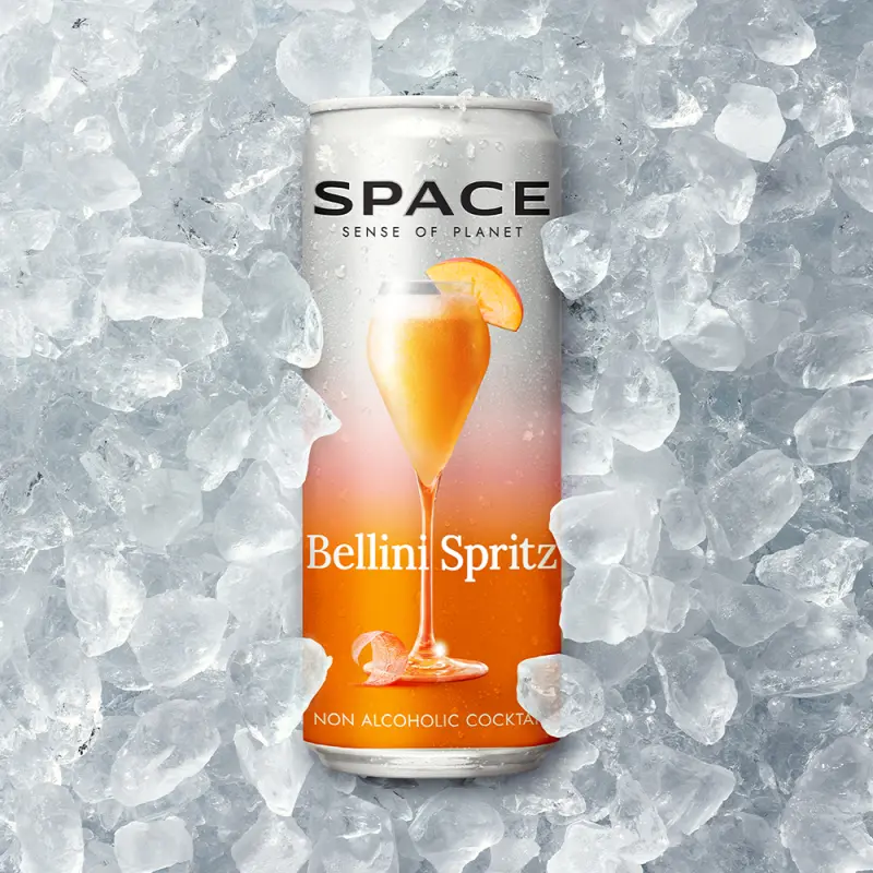
Orange is a more playful and energetic relative of yellow. It combines the lively, active emotions associated with red with the softer tones of yellow. Orange fits brands that aim to create a sense of vitality and happiness—for example, travel companies. Its assertiveness, balanced by friendliness, is meant to prompt action.
Common associations with orange include:
Energy
Excitement
Prosperity
Warmth
Playfulness
Change
For brands aiming for an atmosphere of sophistication—or even regal elegance—purple is often the best choice. It suits those who want to demonstrate creativity and calm individuality. Brands seeking broad, mass-market appeal should avoid deep purple.
Common associations with purple include:
Spiritual awareness
Luxury
Authenticity
Truthfulness
High quality
Introspection
Green is one of the most calming colors, because it doesn’t force the human eye to adjust its perception. It suggests balance and serenity, as well as a connection to nature. Brands that want to communicate a “fresh start” or a sense of safety can use green to create a feeling of peace.
Common associations with green include:
Nature
Health
Prosperity
Calmness
Harmony
Abundance
Like the timeless waters of the world’s oceans, blue evokes calm and spiritual awareness, as well as trust. Blue is a great choice for healthcare and medical brands that want to inspire confidence and reassurance. Deeper blues, on the other hand, add rigor and professionalism to corporate brands. However, excessive use of blue can make a brand feel cold or even distant.
Common associations with blue include:
Wisdom
Loyalty
Spirituality
Mystery
Sophistication
Respectability
Deep shades of brown create a sense of solidity, but unlike black—which is stronger in that direction—brown is less absolute. Its connection to natural tones makes it feel closer to real life.
Brands that want to project calm confidence and reliability can use brown. Its link to nature also creates a rugged yet warm impression.
Common associations with brown include:
Nature
Reliability
Solidity
Confidence
Safety
Friendship
Often considered the most feminine color, shades of pink are still quite versatile. As a lighter shade of red, pink can preserve a sense of energy and cheerfulness while adding soothing calm. These feelings are sometimes associated with eroticism and sensuality. Pink radiates a caring light that calms and communicates femininity.
Common associations with pink include:
Physical calm
Warmth
Love
Sensuality
Romance
Femininity
Unlike many other colors, gray is one of the most neutral shades. Brands often choose it for its timeless, practical, and impartial feel. Ideally, it is used as an accent color to create a calmer, more neutral backdrop for bold colors—though some companies (such as Apple) use it very successfully as a primary tone.
Common associations with gray include:
Practicality
Efficiency
Timelessness
Classic style
Strictness
Mystery
Often seen as the absence of color, black can be a powerful branding tool. It is associated with professionalism and a serious approach to business. It can also be used to create a sense of elegance, significance, and strength. Brands that choose black aim to make a strong impression of respectability and authority.
Common associations with black include:
Power
Strength
Intelligence
Glamour
Luxury
Modernity
White is often ignored or pushed into the background, but this seemingly neutral color is extremely important. It can work as an accent color to provide contrast and can also serve as a clean, simple background for a logo. White is a reflective color that represents purity, sophistication, and efficiency. Brands that want to convey exclusivity and luxury can use white with great success.
Common associations with white include:
Hygiene
Cleanliness
Impeccability
Clarity
Youth
Innocence
In logo design, a mark, an emblem, and a symbol play an important role in building a brand’s identity. A brand mark is a graphic element that represents a brand without using letters or words. It can be abstract, geometric, or depict a recognizable form. A mark is often used as the core of a logo, and its shape is frequently connected to the brand or its products. For example, in Nike’s logo, the mark is the Swoosh — an image associated with dynamism and sport
An emblem is a graphic element that combines a mark with typography. An emblem typically includes the brand or company name, while the mark can be placed inside the name or surrounding it. Emblems are often highly detailed and complex, which makes them distinctive and memorable. For example, the Starbucks logo consists of the siren image and the company name united into a single emblem.
A symbol is a graphic element that expresses an idea or concept connected to a brand. A symbol can be abstract or depict a specific object associated with the brand. It can be used together with the company name or separately. For example, Apple’s symbol is an apple image associated with innovation and technological achievement.
Each of these elements is a foundation for logo design. A mark can be simple and instantly recognizable, making it easy to remember. An emblem can be detailed and unique, making it easy to identify. A symbol can be strongly linked to a brand and its values, making it easy to recognize.
Choosing between these elements should align with the brand and its goals. For instance, a brand targeting a younger audience may use a more abstract, contemporary mark, while a company built around traditional, meaningful values may choose a more classic and detailed element in its logo.
A mark, emblem, or symbol can also be updated or modified over time to match changing brand needs and audience expectations. Modernizing a logo can help a brand stay fresh and relevant without losing its uniqueness and recognizability.


A logo is an important part of a brand’s identity. Registering it as a trademark protects it from unauthorized use by other companies or competitors. To register a logo, you need to complete a series of legal steps. First, choose the territory where you want protection and select the class(es) of goods or services for which the mark will be registered. Second, run a trademark search and make sure the chosen logo does not infringe the rights of other companies. Third, prepare a trademark application. It should include a description of the logo, how it will be used, the selected class(es) of goods or services, and the applicant’s contact details.
The application is filed with the relevant intellectual property authority, where it undergoes examination for legal compliance. If the application is approved, the logo is registered as a trademark and receives protection for a defined period of time.
Trademark registration protects a brand from illegal use by other companies or competitors. It can also increase the brand’s value, since the trademark can be sold or inherited. Registration makes legal protection easier and allows the owner to go to court if rights are violated.
A registered trademark is a long-term investment that may require significant costs — both for the registration process and for maintaining the status later. It is important to monitor correct use of the logo in order to preserve protection and avoid losing trademark rights.
Registering a logo is an important step in protecting a brand and increasing its value. However, successful registration requires thorough preparation and careful handling of legal procedures to avoid unwanted consequences in the future.


When people hear your company’s name, the first thing they often recall is the logo — the visual element that represents its identity. A corporate identity system defines how the elements of visual branding work together. Before starting the development of a trademark and brand identity, it is essential to research competitors and define your target audience. This helps you understand how the visual identity elements will be perceived and how they will connect to the brand.
Decide what values and ideology your brand stands for. This may include a unique offer, an approach to solving problems, or product quality. All of this is taken into account when developing the logo and identity.
Based on this information, work begins on the visual concept. Strategists and marketing specialists determine the relevant colors, typefaces, and overall visual style that will align with your brand’s ideology.
Once the concept is defined, the creation of the logo and corporate identity begins. The trademark must be unique and memorable. The identity system, in turn, should include elements that will be used across all touchpoints: packaging, advertising materials, business documentation, and digital environments.
All branding elements should be applied everywhere possible. They must become an inseparable part of your brand and help strengthen its position in the market.
However, keep in mind that developing a company’s visual strategy is only the first step in building a successful brand. To become recognizable and strong, the brand must be continuously improved and adapted to changing market requirements.
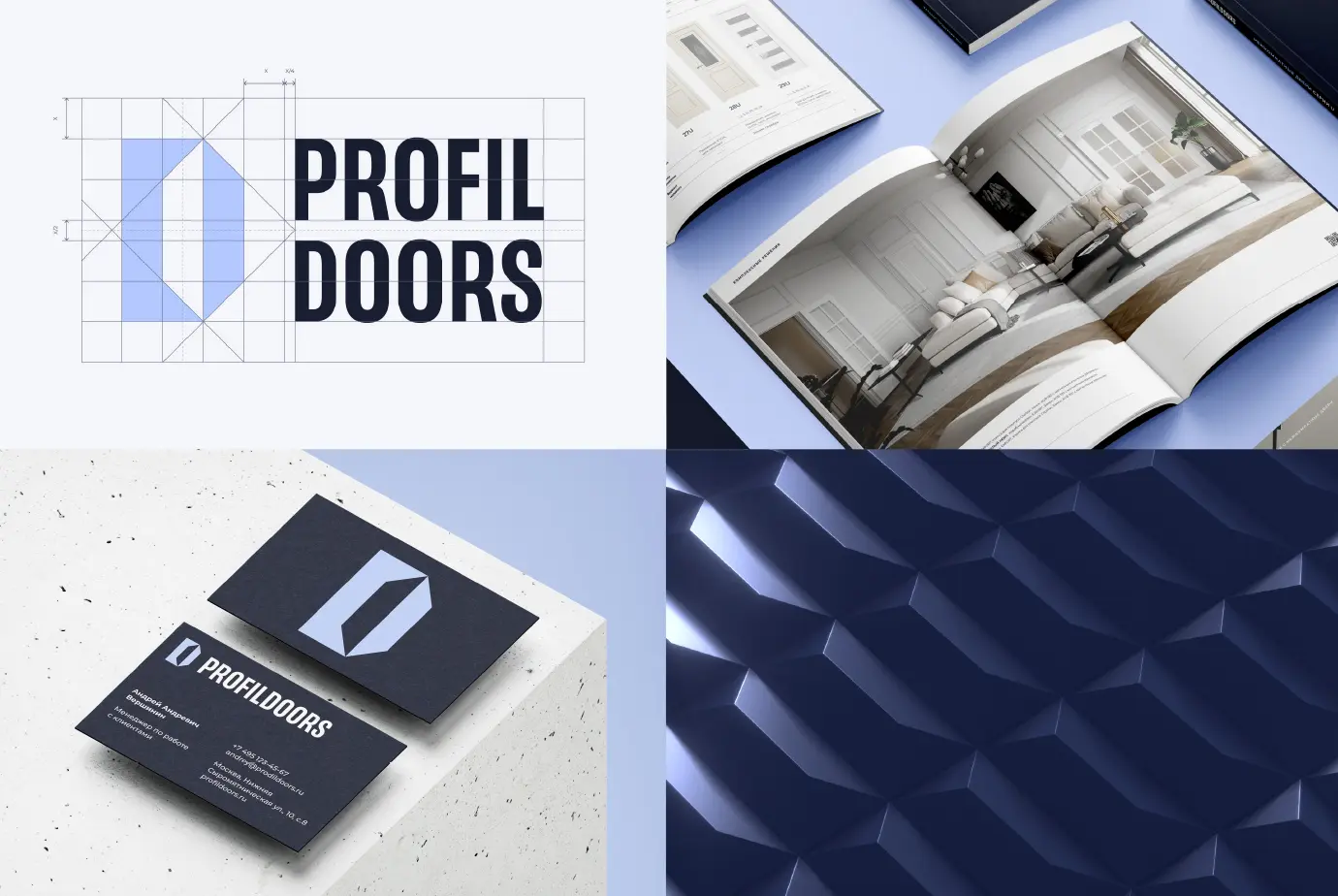
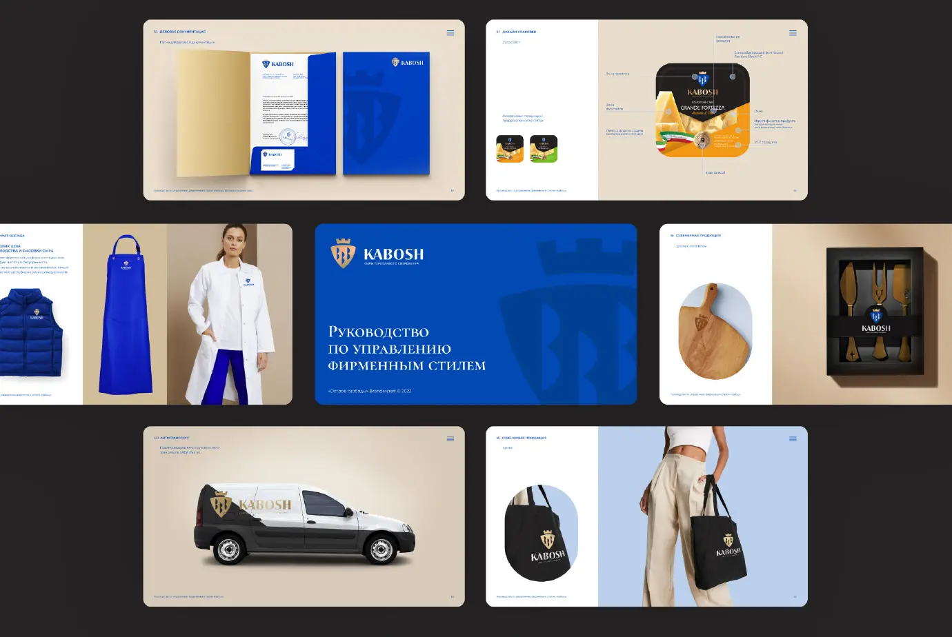
Designing a logo is one of the first steps in building a brand. It’s a visual symbol that helps your company stand out and differentiate itself from competitors. A trademark (logo) guideline helps maintain a unified visual concept and ensure consistency in branding
A logo guideline is a document that sets out the rules for using the logo. It specifies key parameters, including colors, typefaces, proportions, clear space (margins), and placement. This document helps keep the company’s visual identity consistent across all brand communications.
The guide includes a system of rules for using the logo across different formats and applications. For example, you may have one version of the mark for the web and another for printing on business cards or banners. It’s also important to consider different color options for different backgrounds. In addition, a guideline is used for quality control when producing materials that include branding elements.
An important part of creating such a document is keeping the logo up to date. From time to time, updates may be required, and these should be reflected in the guideline. It’s essential to revise the guideline whenever usage rules change or when adjustments are made to colors, typefaces, or proportions.
A logo, a visual identity system, and a brand book are core elements of a successful brand. Together, they shape your company’s image and help it stand out from competitors. A logo is the graphic representation of your business. An effective trademark is always distinctive and easy to recognize. It communicates both the emotional and the rational benefits of your company. A logo can be built from letters, symbols, graphic elements, or a combination of these.
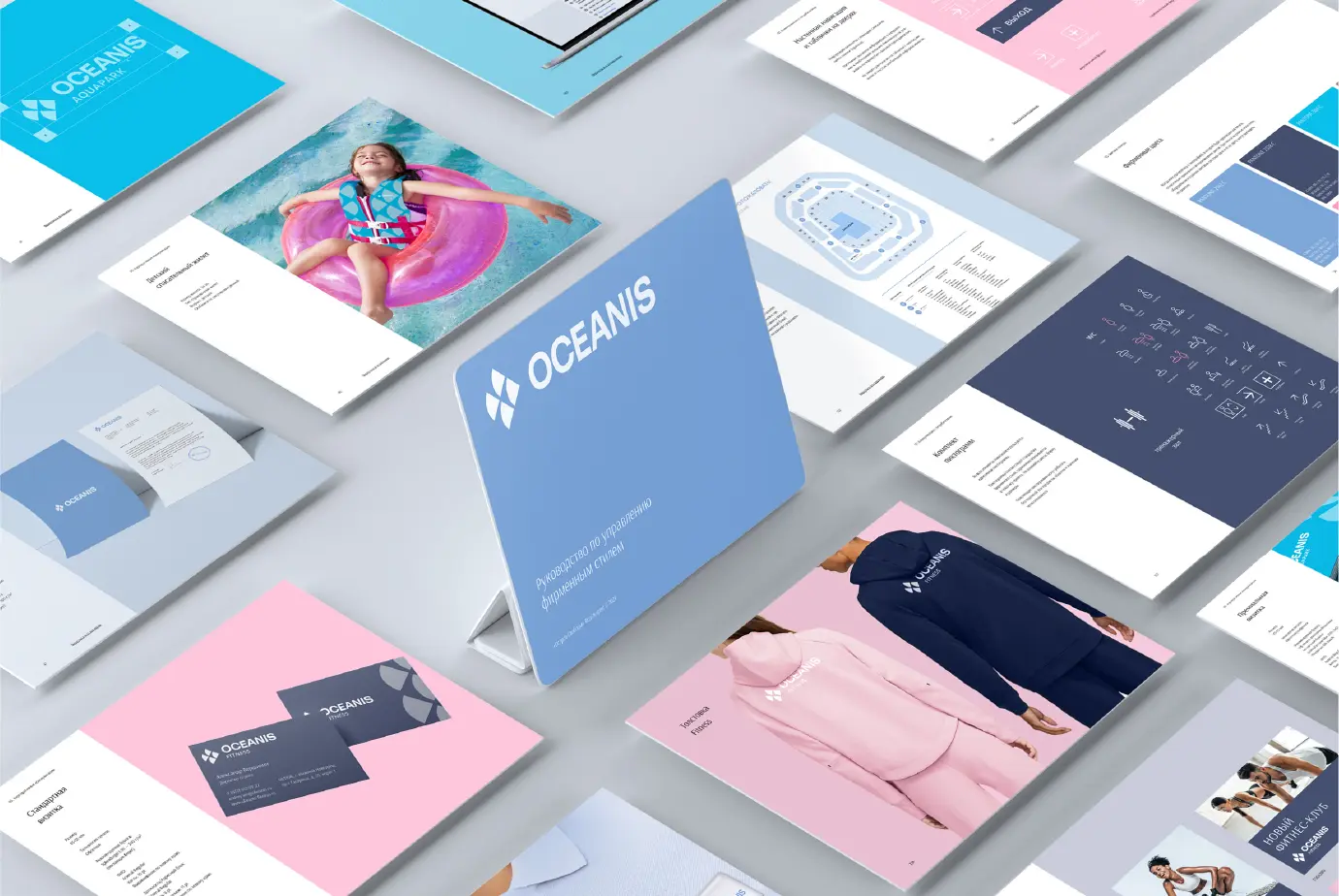
A visual identity system is a set of rules that governs how a brand’s design elements are applied — typefaces, colors, graphics, and image styling. It helps maintain a unified brand identity across all touchpoints: packaging, advertising materials, and digital environments.
A brand book is a document that brings together all the rules for using brand elements. It typically includes a description of the visual identity system, the logo, the color palette, and typography. It also defines how the branding should be applied in different contexts and media.
A strong logo, visual identity, and brand book help build a powerful company image and attract new customers. They reflect your company’s unique character and communicate its values.

Creating a product trademark (logo) is a complex process that combines aesthetic and practical considerations. A logo reflects the product’s character and essence, as well as the company’s ideology and values.
The first step in creating a logo is market research and competitor analysis, which helps identify key design trends. At this stage, the target audience is defined and the product attributes most relevant to them are highlighted.
Based on this information, a visual concept is developed, including typography, graphic elements, colors, and other details.
When designing an effective logo, it’s important to consider versatility and ease of perception. The logo should look attractive and remain clear on any medium — whether it’s packaging, a website, or advertising materials.

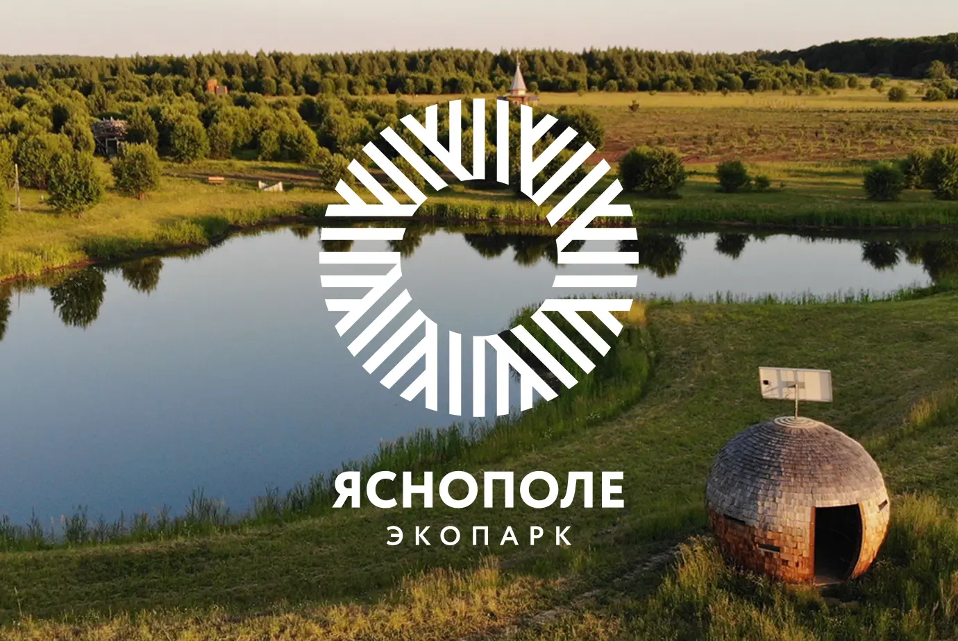
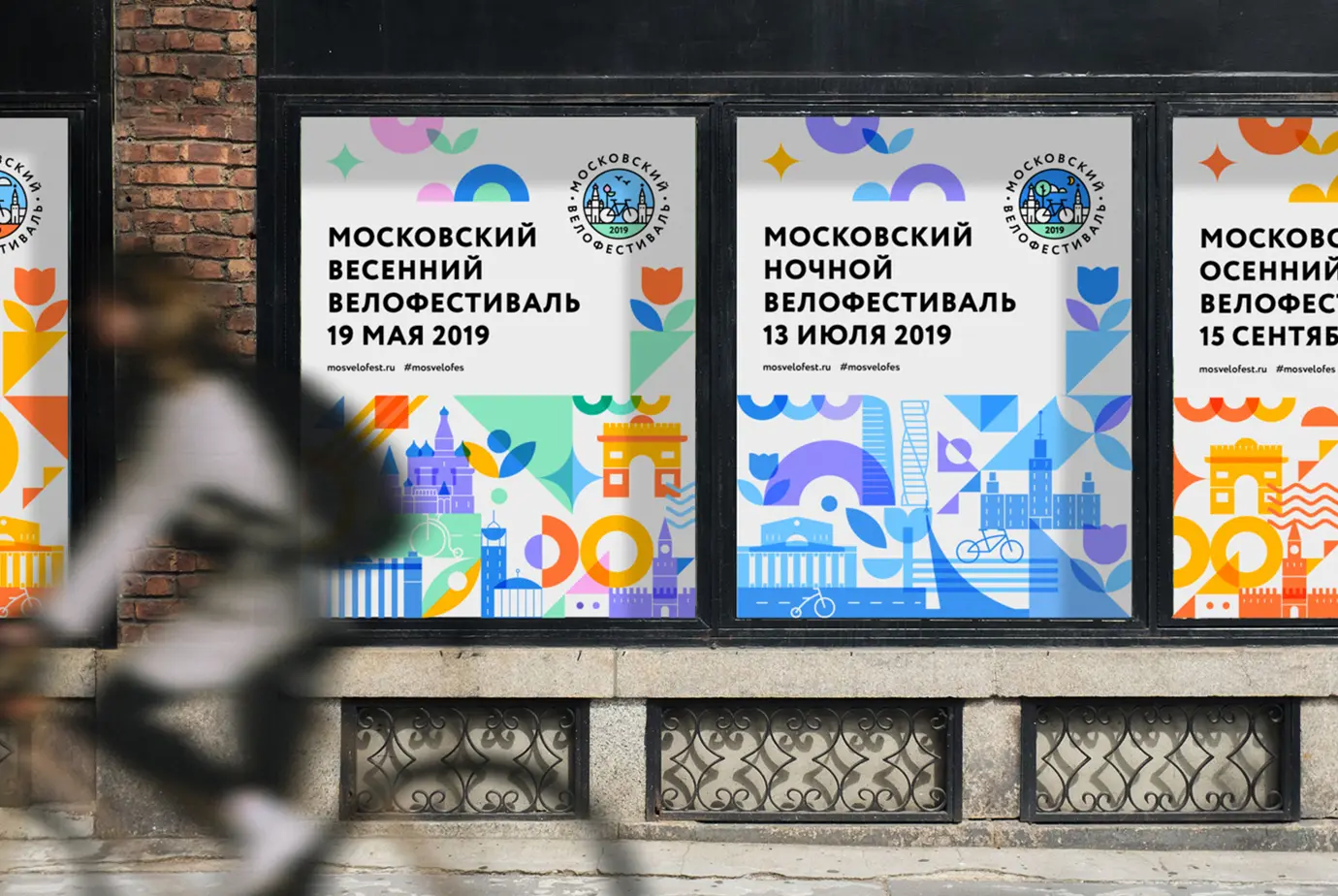
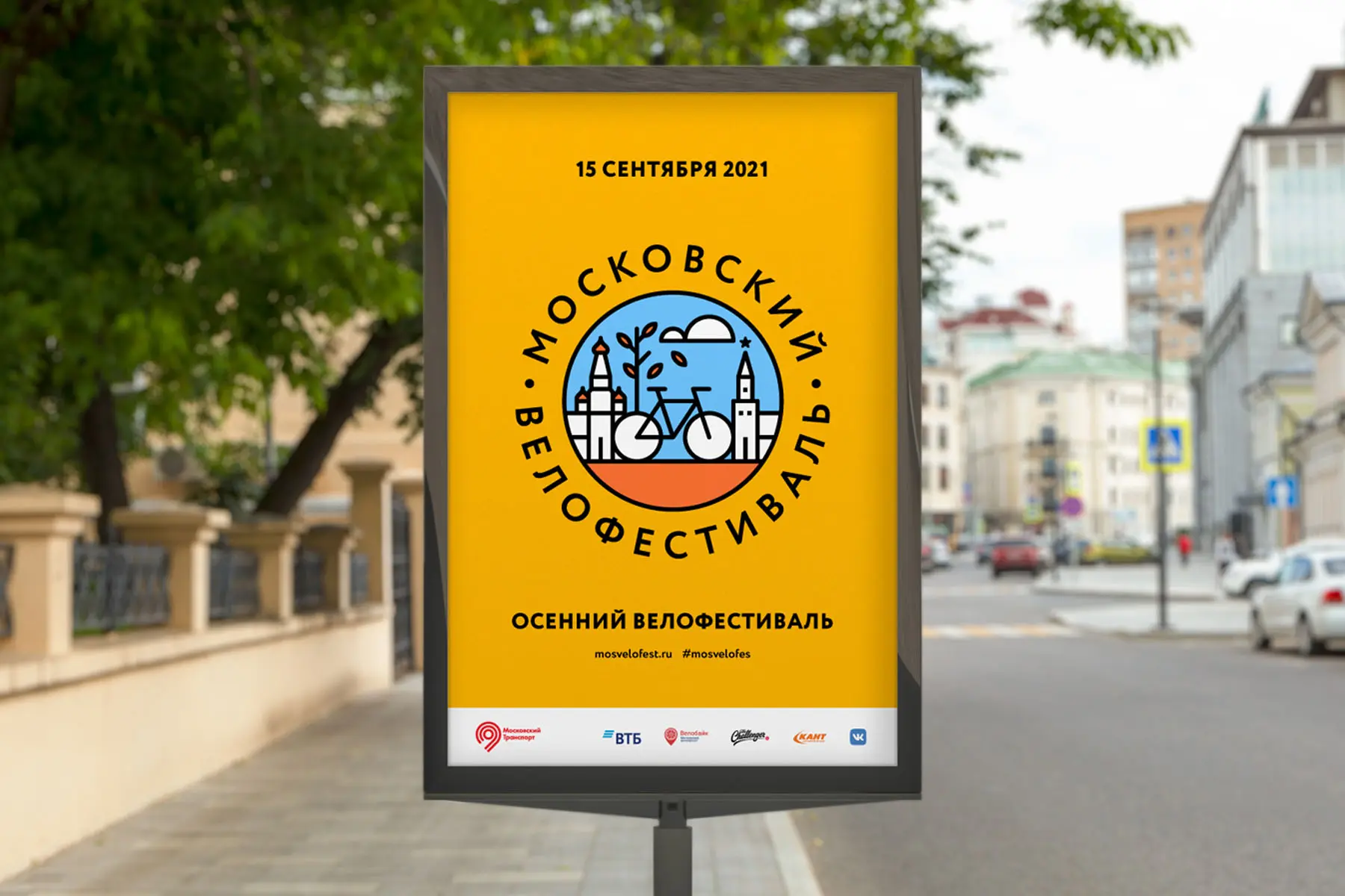
More and more attention is being paid to the development of territorial brands connected to a specific region or city. Such projects attract investors, boost tourism, and build loyalty among local residents. One of the core elements of this kind of branding is the logo, which becomes a symbol of the region or city. Its design reflects the place’s uniqueness, history, and culture.
The first step in the design process is researching the region and defining its potential. Natural beauty — as well as culture, history, and traditions — should be expressed through the visual concept.
The ideas embedded in the logo must be clear and easy to read, so the mark can be recognized and remembered quickly. Make sure the logo does not evoke associations with other brands or companies.
Designers use different elements when creating such a mark: typography, graphic details, and color. The visual image should always align with the overall concept and the brand’s values.
Along with the logo, it is important to develop a visual identity system and a brand book to ensure consistent representation of the brand in any context. The identity system includes typefaces, a color palette, graphic elements, and other components of visual branding. The brand book, in turn, provides guidelines for branding marketing materials: banners, promotional brochures, websites, and social media channels.
Designing a logo for a territorial brand is a process that requires careful attention to every detail. A well-crafted mark becomes not only an effective branding tool, but also a familiar and beloved symbol for residents and visitors alike.
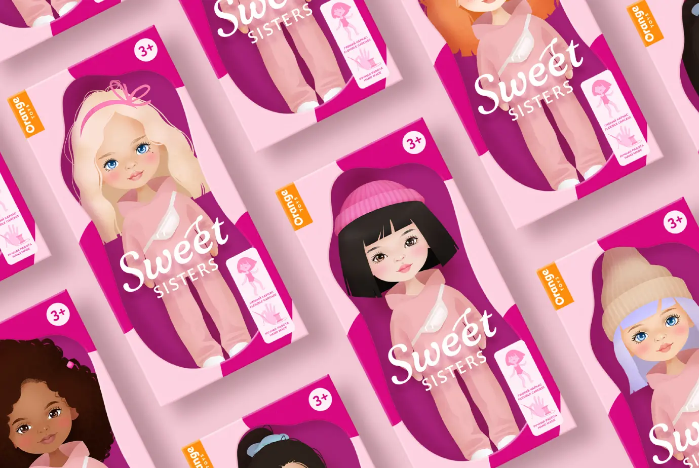
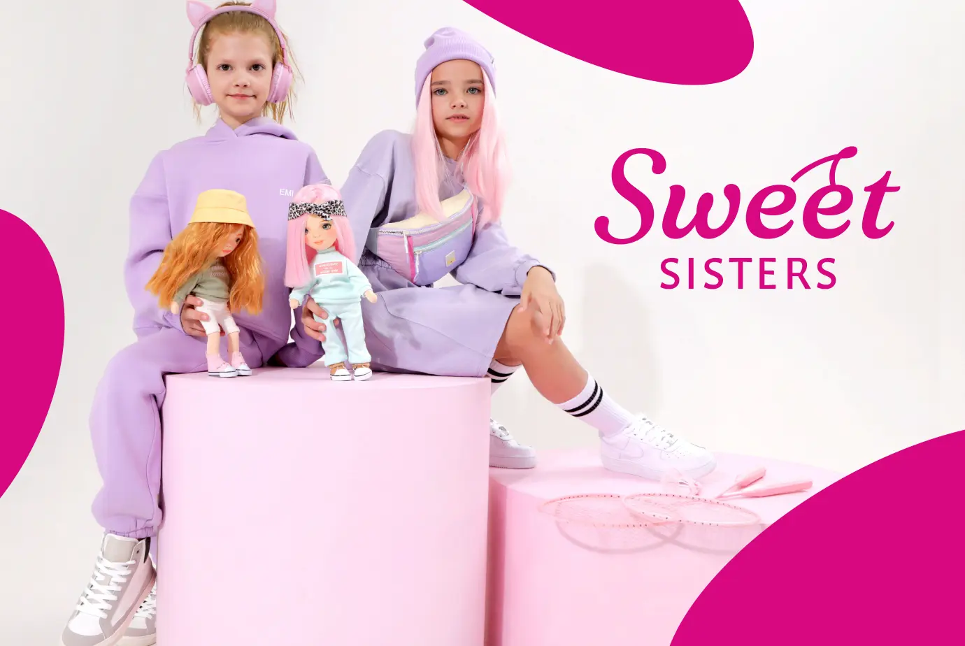
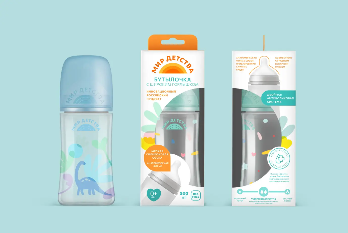
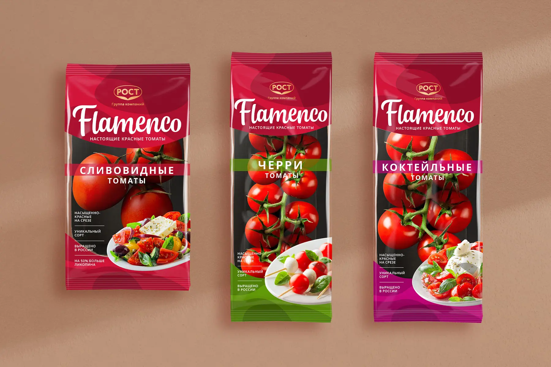
The children’s products market is highly competitive, so building a unique and memorable brand becomes a key success factor. When it comes to products for kids, the first associations are usually bright colors and fun imagery. Children love a festive atmosphere, and it’s important to keep that in mind when developing the design.
The first step in creating a logo is researching the target audience and the market. What values and interests do children have at different ages? What trends are shaping this category right now? The answers will define the visual concept.
For example, for babies and toddlers you can use light shapes and soft colors; for older children, a brighter, more saturated palette works better, along with more complex forms and elements.
Beyond visual appeal, the logo — and the branding as a whole — must align with the core values that matter to parents: safety, reliability, and eco-friendliness.
Creating a brand for children’s products is a process built on a deep understanding of the target audience and on reflecting the brand’s key values and principles. Only then can the brand attract attention, engage parents and their children, and succeed in a competitive market.
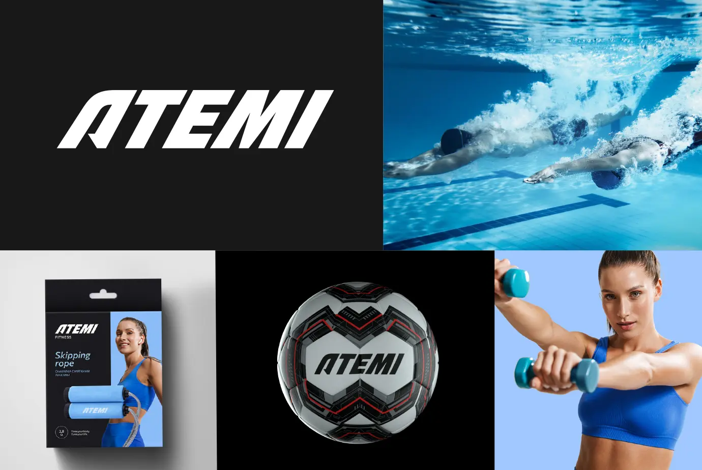
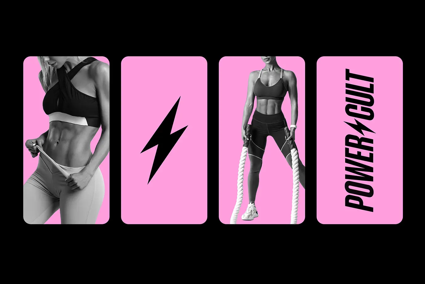
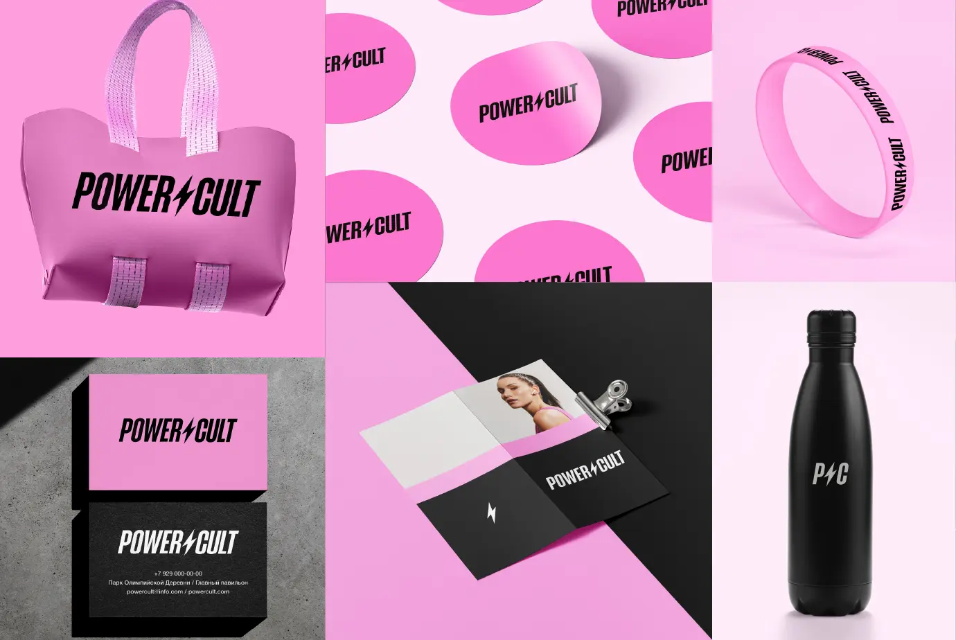
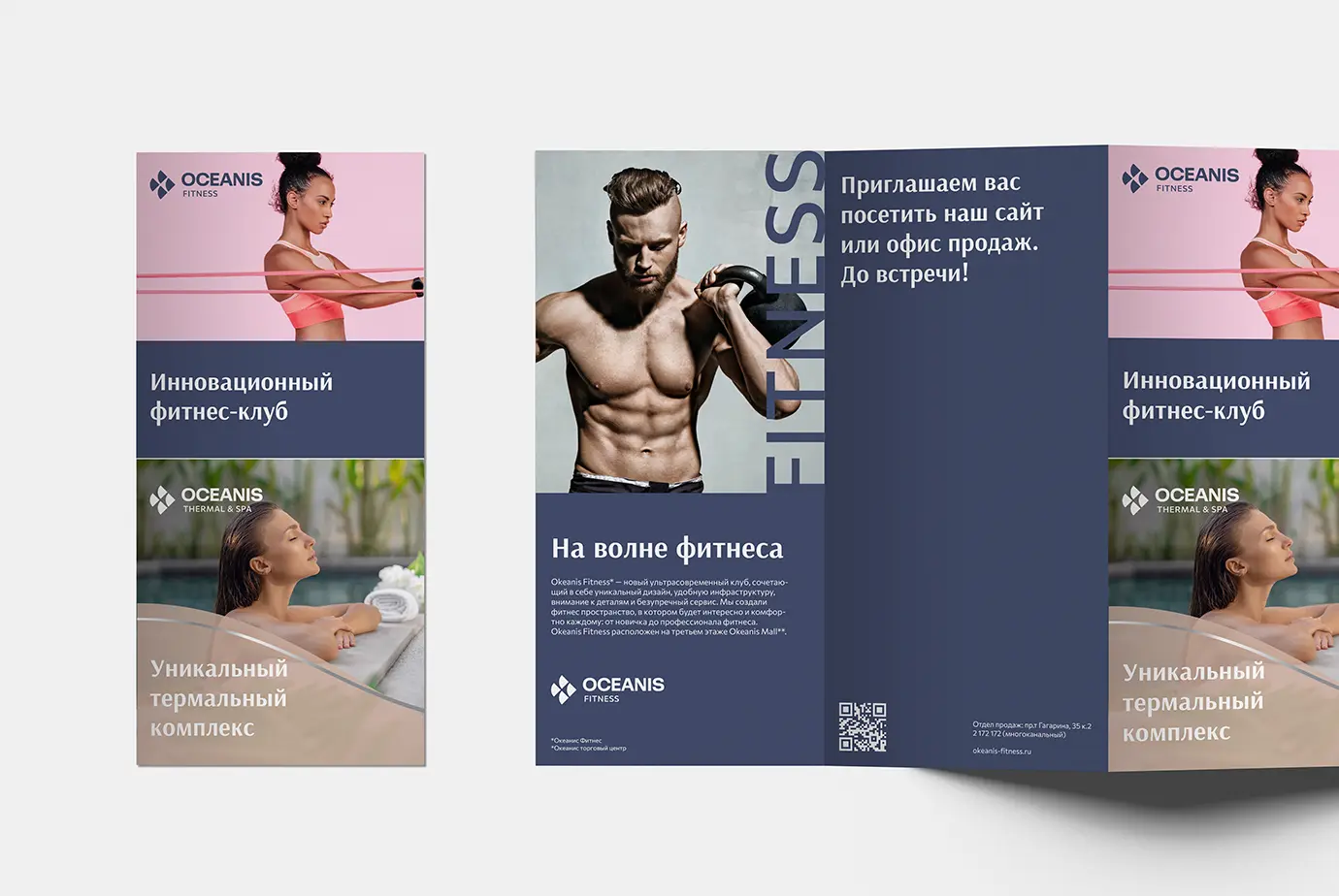
Sports brands have always been known for a distinctive style that’s reflected in the visual concept — above all, in the logo. Sports logos often deliver strong visual impact, communicating the values and spirit of sport as a phenomenon: strength, endurance, readiness to compete, and the drive to achieve.
Competition in the sports industry is intense, so it’s important to have a logo that stands out from rivals. This can be achieved, for example, by using unusual graphic forms and distinctive typefaces.
Sports brands often rely on abstract imagery to create a recognizable and memorable logo. This may be a geometric shape or a symbol that becomes strongly associated with the brand.
A logo must always be adaptable — easy to scale across different formats — and work effectively on product packaging, a brand website and apparel.
Logo colors convey the brand’s values and character. For instance, red is associated with energy and power, green with health and eco-friendliness, and blue with reliability and stability. It’s also important to consider the colors commonly used in the category so the logo doesn’t blend in with competitors.
Sports brands often aim to be innovative, using new technologies and materials in their products. A trademark can reflect this sense of innovation as well — for example, through modern graphic effects or unconventional materials and textures in its execution.

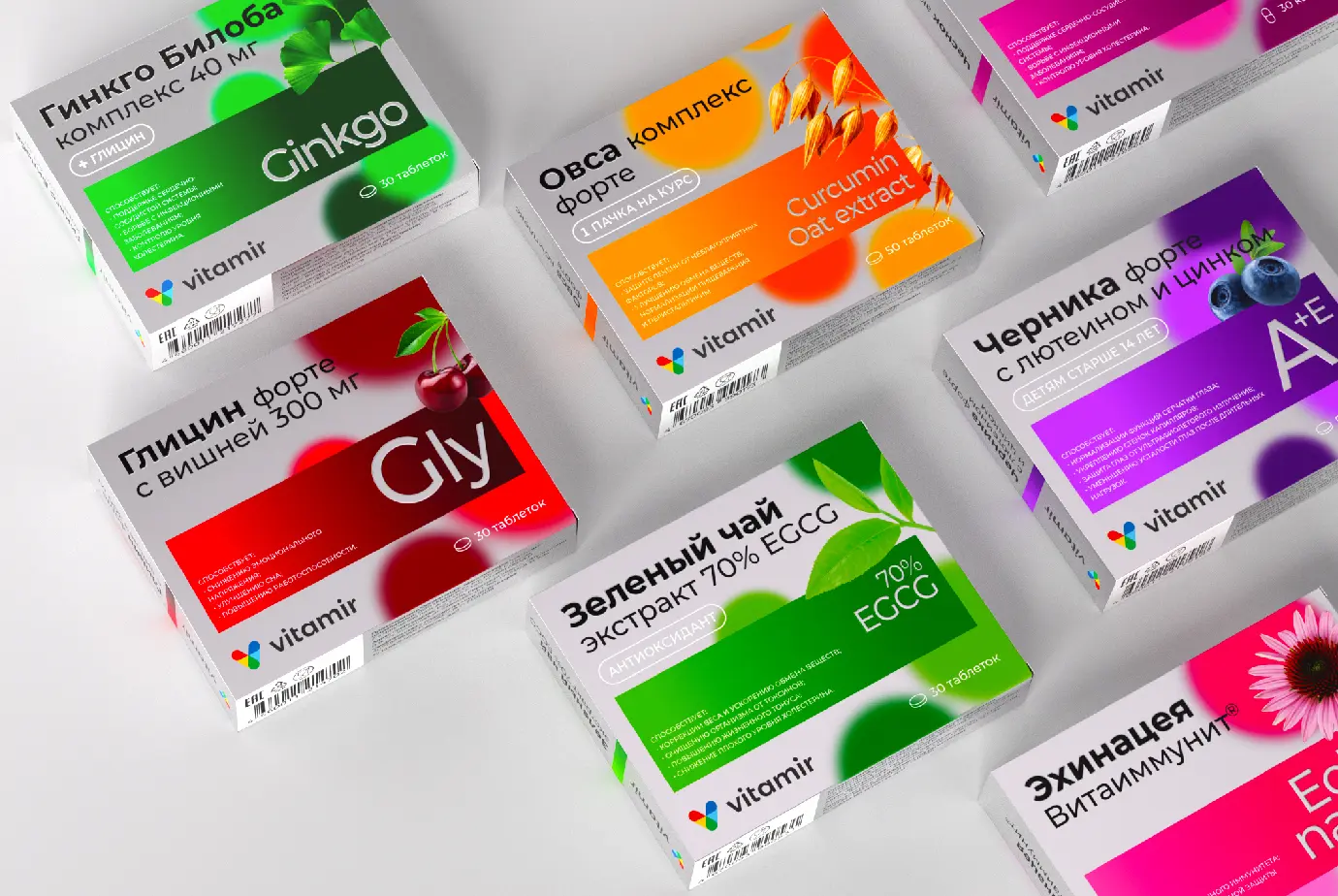

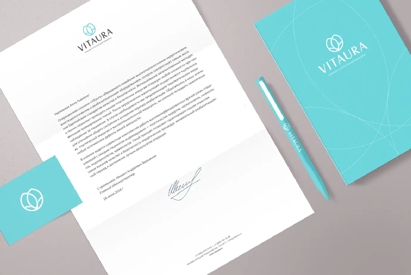

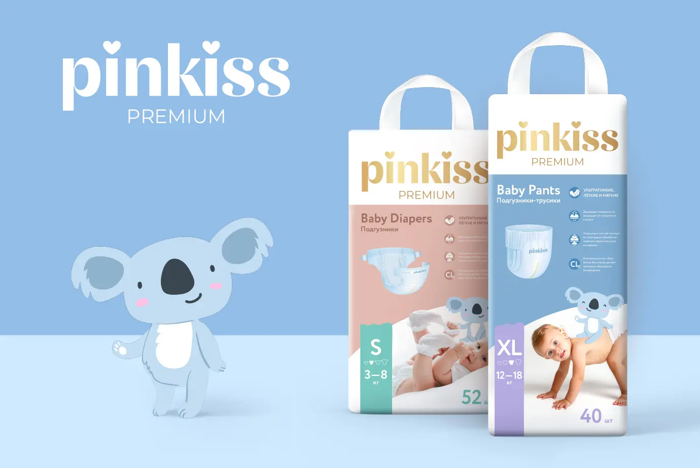
Designing a logo for a medical or pharmaceutical brand requires an understanding of the industry’s specifics and values. Most brands aim to create products and services that help people protect their health and their lives. Therefore, the logo should reflect the brand’s core values: expertise, reliability, care, responsibility and innovation.
A key requirement is clarity and recognizability. In the medical and pharmaceutical market, brands often use symbols — geometric forms, abstract shapes, and other visual elements associated with health and medicine. The logo should be easy to recognize and remember in order to attract the attention of potential customers.
Logo colors also play an important role in building a brand in medicine and pharma. Many brands use white, which is associated with cleanliness, reliability, and innovation. In addition, they may use other colors that align with the brand’s mission and values. For example, green can symbolize an eco-oriented approach, while blue can emphasize medical expertise and trust.
The logo typeface should be readable, simple, and consistent with the brand’s style and concept. Some brands use typefaces designed specifically for medical and pharmaceutical identities, characterized by clarity and restraint.
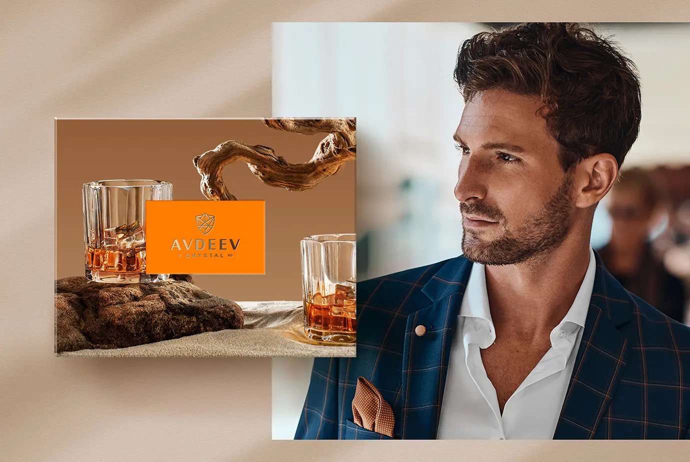
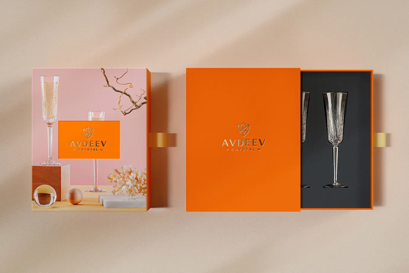
In the Luxury segment, logos play a crucial role in shaping a brand’s image and differentiating it from competitors. Developing a logo for a Luxury brand is a complex process that requires a deep understanding of category trends, strong visual thinking, and creativity.
The first thing to consider when designing a Luxury brand logo is the brand’s values and mission. Brands in this sphere aim to create products and services that communicate exclusivity and prestige.
The second key aspect is logo recognition. In Luxury, minimalist solutions are most common — defined by clean lines, balanced proportions, and harmonious color choices. Here, the choice of typeface and the proportions between its elements are especially important.
Logo colors also play an important role in building the brand image. Most brands use black, which symbolizes classic style, luxury, and prestige. They may also use other colors that align with the brand’s mission and values. For example, green can signal an eco-oriented approach, while red can suggest dynamism and energy.
There are several broader trends in Luxury logo design. One of them is monochrome palettes and minimalist geometric forms that communicate elegance and refinement.
Monogram logos are also in demand — combinations of several letters or symbols that reflect the brand name. This approach creates a concise, memorable design that is easy to apply across different surfaces and materials.
Some brands also use emblems or coats of arms, which evoke associations with aristocratic heritage and tradition, high culture and art.
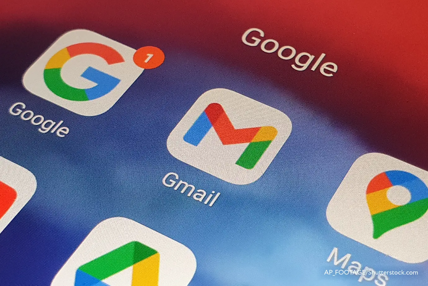
An ecosystem is a group of companies operating in different areas but connected by shared goals and values. Their logos are not only symbols of each individual product—they are also a way to show the relationship between them. A good example is Google. Its ecosystem includes many different products: the search engine, Gmail, YouTube, Google Maps, and others. Each of them has its own icon, yet all of them belong to one system unified by a shared visual style.
One of the key elements in ecosystem-brand logos is color. It helps link different companies and products into a single whole. For example, many Google product logos rely on a palette associated with Google—red, blue, yellow, and green—creating a unified association and signaling that these products are part of the Google ecosystem.
The design of such logos should reflect the company’s values and mission and also match the product category. For instance, Apple’s emblem has a simple, minimalist design that echoes the company’s product philosophy—ease and intuitive usability.
Создание логотипа: чек-лист по разработке эффективного лого

Создание логотипа: Секреты эффективности
Создание логотипа: услуги дизайн-студий

Профессиональная разработка логотипа

Процесс создания логотипа
Эстетика и охранопригодность логотипа

Дизайн логотипа: показатели эффективности


Основные ошибки в разработке логотипа

Выбор шрифта для дизайна логотипа
The article uses photo and video materials provided by the customer / BRANDEXPERT "Island of Freedom" / ShutterStock / Freepik / Unsplash / Pexels / Goodmockups / Pixpine. All materials presented in the blog are purely informational in nature and do not pursue commercial purposes. The use of text, illustrations, photos, videos and other materials is prohibited without the consent of the copyright holder.


By continuing to use this site, you agree to our use of cookies and the processing of your personal data as described in our Privacy Policy.