
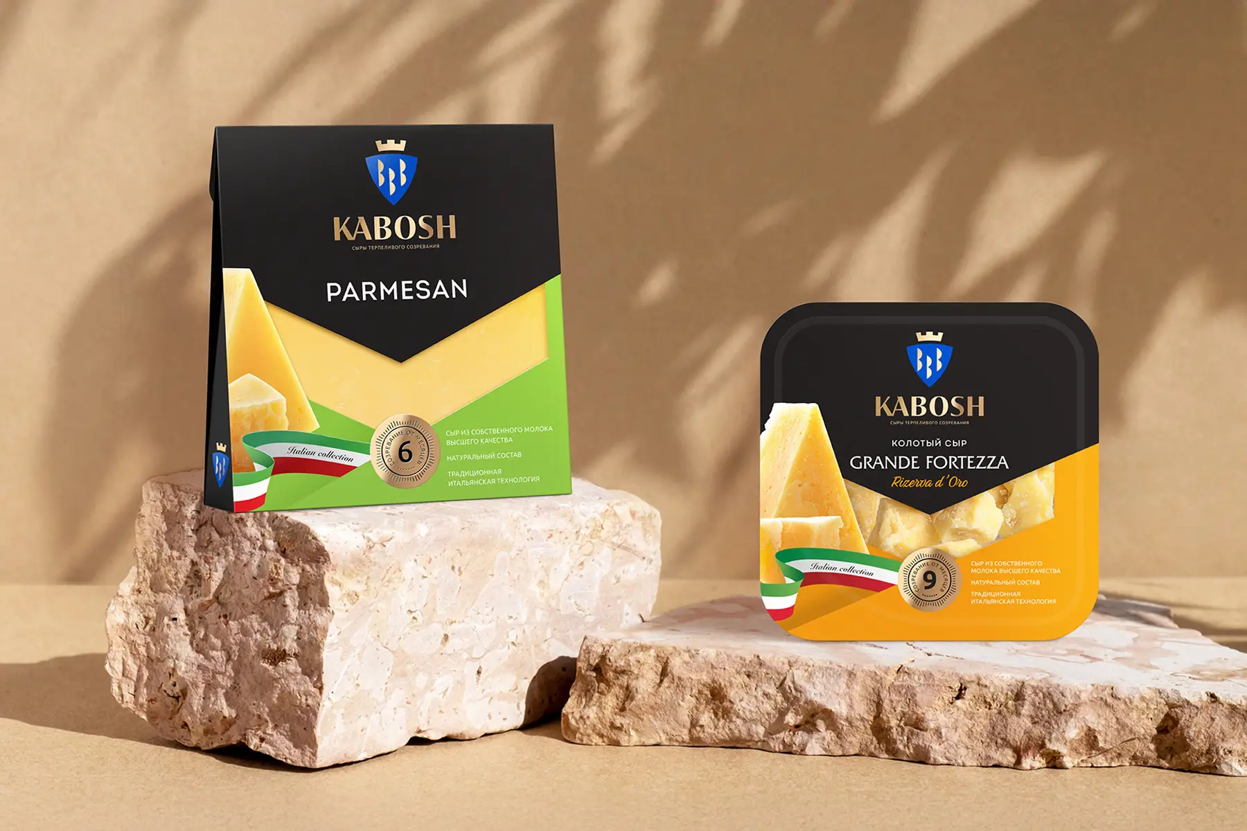
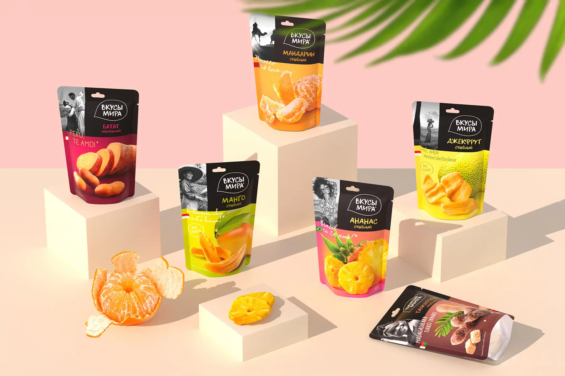
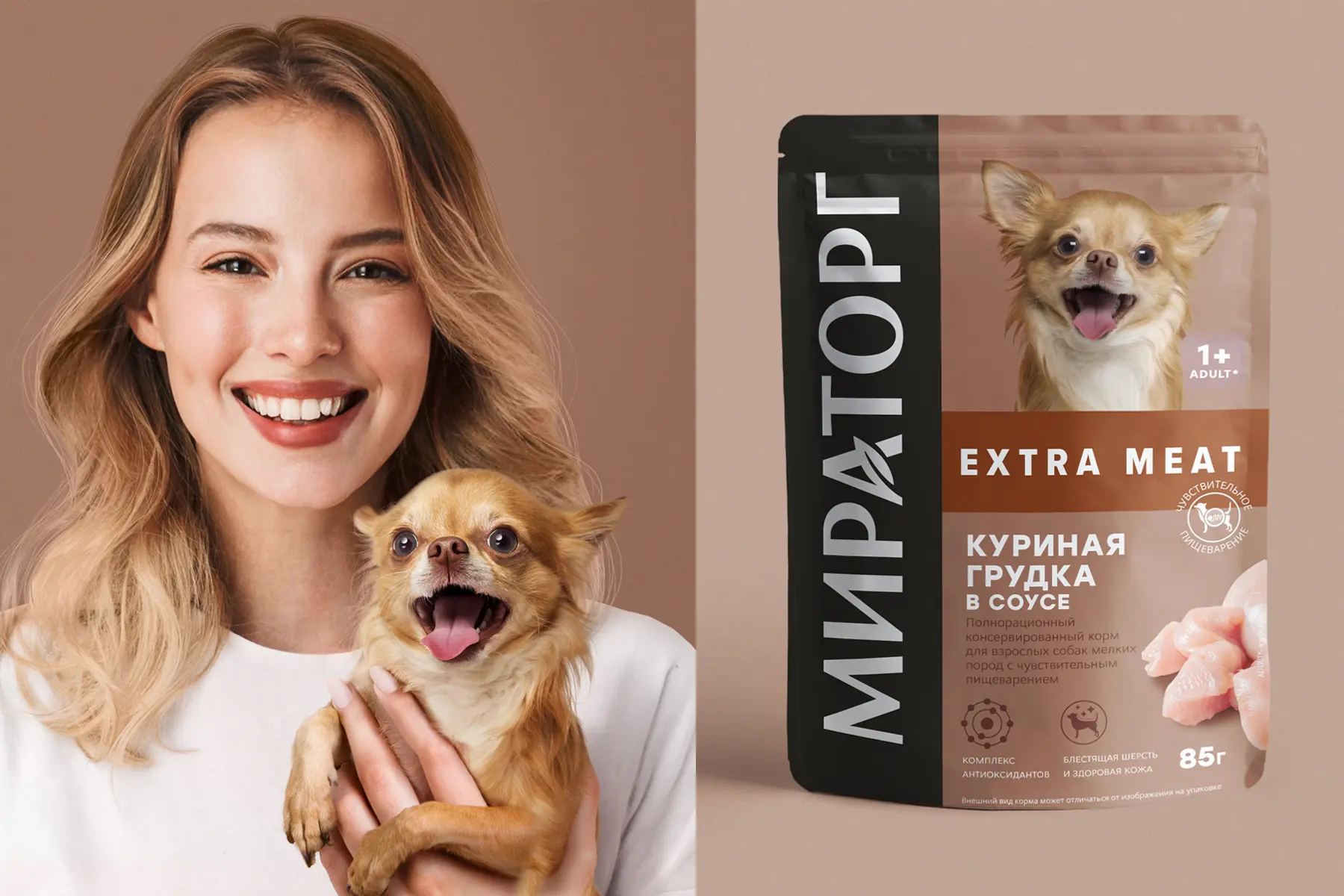
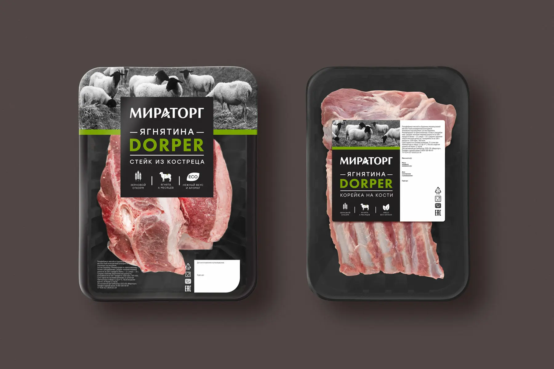
ALVITEK.

Packaging design is a strategic asset that affects conversion, average order value, and reputation. When it’s delivered through full-cycle packaging development grounded in research, engineering, and post-launch impact tracking, it stops being a cost for a pretty protective shell and becomes a predictable growth channel.


Packaging design is a fully fledged growth tool that operates right at the moment of decision. It creates initial trust, speeds up brand recognition, and helps the buyer select the right variant in the line — both on the shelf and on the e-commerce product page. Representative surveys confirm that for most buyers, packaging design has a noticeable effect on choice.
Business impact doesn’t come from aesthetics alone but from a managed process. NIQ BASES studies show that optimized redesigns add about 5.5% to forecast revenue on average, while the vast majority of spontaneous rebrands bring no meaningful uplift. The practical takeaway: packaging design must be built on hypotheses, testing, and clear messaging architecture; otherwise the potential won’t be monetized.
In online sales, more than looks matter — the unboxing experience does too. Thoughtful protection and neat presentation reduce damage and returns, while a pleasant unboxing increases the probability of repeat purchase. E-commerce industry reviews consistently link packaging quality with loyalty, making packaging design a lever for customer retention.
Engineering and logistics are another layer of effectiveness. Proper form factor, materials, and dimensions reduce shipping damage and lower last-mile costs. Major marketplaces and retailers directly link certified packaging standards and packaging types with acceptable delivery defect rates, and invest in algorithms for selecting optimal packaging types to reduce weight, volume, and material use. For brands, this means packaging development must account for supply-chain requirements, not just shelf appeal.
Sustainability has shifted from fashionable attribute to economic reality. Joint McKinsey and NielsenIQ research shows that products with credible sustainability features outpace comparable alternatives, and a substantial share of buyers treat sustainability as a key selection factor. Prioritizing recyclable materials and transparent labeling builds trust and long-term market share, so packaging development should include environmental metrics alongside financial ones.
Form defines ergonomics, shelf stability, front readability, and e-commerce delivery economics. In packaging development, align with dimensional and protection requirements to reduce last-mile unit costs and returns. Marketplace certification practices directly link construction, void minimization, and reduced damage with sustainability and fulfillment costs.
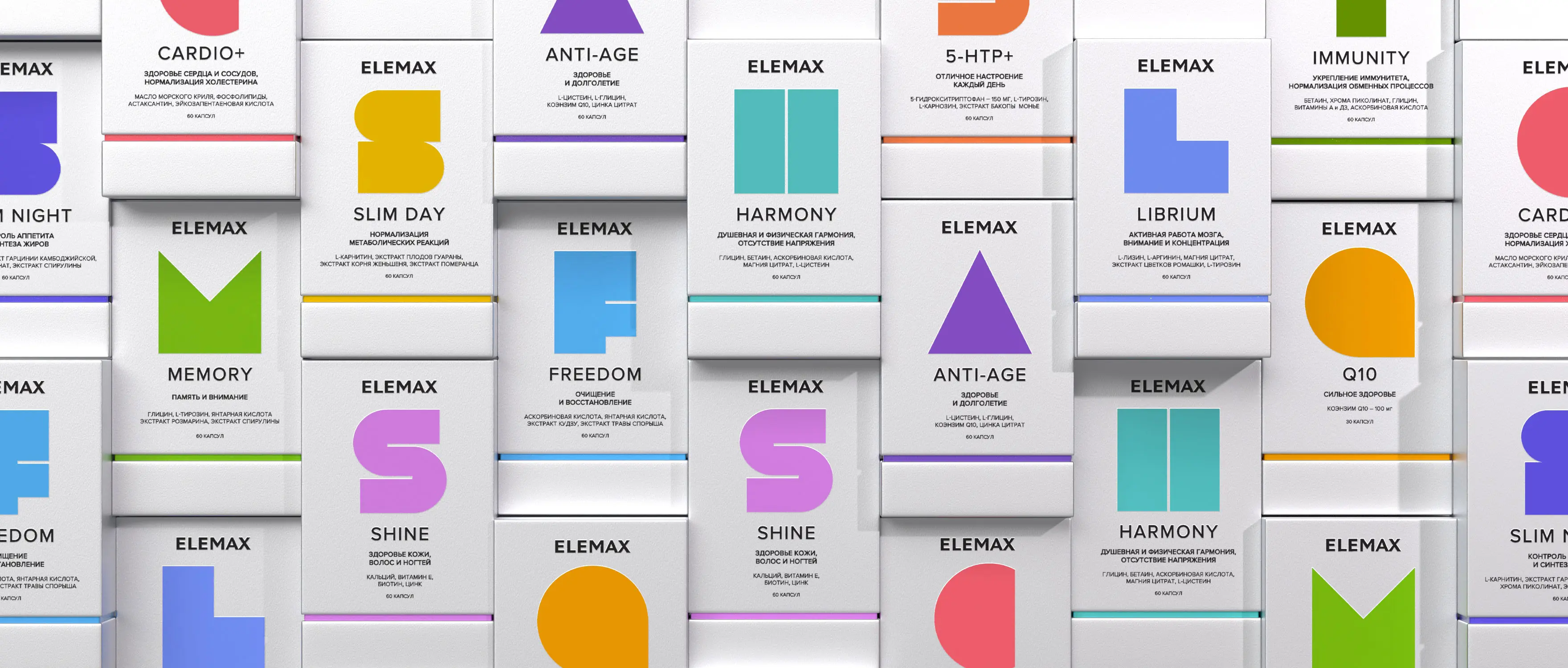
The logo must perform as a distinctive asset, instantly identifying the brand and supporting mental availability. Build a clear hierarchy into packaging design: lead with the logo and key brand code in the eye-path, then the product name and the primary promise. The Ehrenberg-Bass approach recommends measuring and protecting such assets on par with media channels.
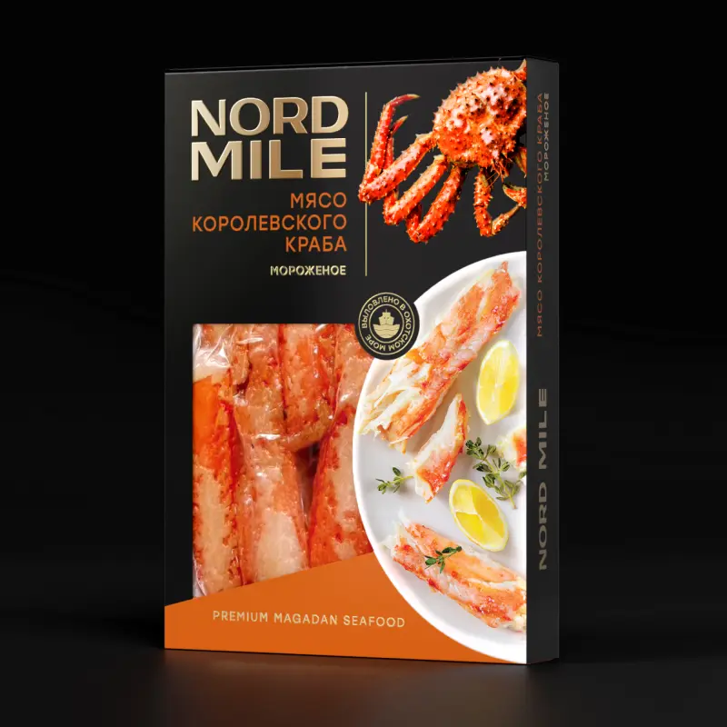
Shoppers want quick answers: what it is and why it’s good, how and for whom to use it, and whether it’s safe — put this on packaging’s first screen. In reality, people look first for use-by date, ingredients, allergen warnings, and country of origin. On foods, simple, clear front-of-pack information — especially concise claims — accelerates understanding and choice.
For non-food categories, the key blocks are compatibility and instructions, safety measures, materials and care; everything must read effortlessly, since tiny type and weak contrast impair comprehension and cause misuse.
Provide a convenient digital route into detail: a QR code to extended instructions, certificates, authenticity and provenance checks — this builds trust and declutters the front.
A window or transparent area can increase trust and trial intent, but the effect depends on category and context. Studies show transparency boosts perceived freshness and purchase intent in some scenarios but can reduce perceived premiumness or aesthetics in others — so decide based on shelf tests in your price tier. Build prototypes with different openness levels into packaging design and verify appeal in practice, considering how your shoppers behave.
Emotion makes packaging noticeable and memorable: it speeds up fixation of the gaze, increases recognition, and raises the probability of choice.
Embed a clear emotional idea into packaging design — color, imagery, tactility — and test it on your audience rather than on team taste.
Validate the strength of response through research: rapid tests, eye-tracking, and neurometrics connect impression to sales and reduce the risk of a wrong bet.
Above all, balance: the emotional layer must not degrade legibility or messaging hierarchy. Address this early in packaging development.
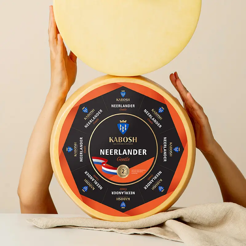
Icons, pictograms, short benefit badges, and clear signposting simplify complex information and speed up selection. In food categories, an effective system of front-of-pack cues in packaging and labeling increases product understanding and helps orientation in naturalness and healthfulness. The principle also works in non-food where quick explanation of features is needed. Watch hierarchy readability and test badge sets on a real shelf.
The back is the place for extended information: instructions, benefits, tables, compliance marks, and barcodes. Regulators require legible, detailed presentation of composition and characteristics, and clear positioning of mandatory statements. Practical guides advise checking layouts at real size for type size and leading — this packaging development habit lowers print-run error risk.
Color stability, halftone accuracy, and cross-site repeatability are ensured by standards and print discipline. ISO 12647 and related certifications are critical for developers and plants: Fogra Validation Printing System to verify proofing, and Idealliance G7 to align proof-to-press and unify gray balance. Legally binding EAEU requirements pertain chiefly to packaging safety and labeling (TR CU 005/2011); color and print tolerances aren’t regulator-mandated and are applied as voluntary industry quality standards. Bake these into packaging development to reduce mismatches and returns.

Packaging design is a multi-stage process that demands a comprehensive approach and attention to detail. Each stage below plays a critical role in developing packaging that not only protects the product but also communicates effectively with consumers, boosts sales, and strengthens brand position.
Start with consumer jobs and purchase contexts: why this product type is chosen, which barriers exist, and what must be visible in the first seconds. Lock in information priorities for different scenarios — shelf, online PDP, marketplace, delivery. This sets the semantic framework for the subsequent packaging design.
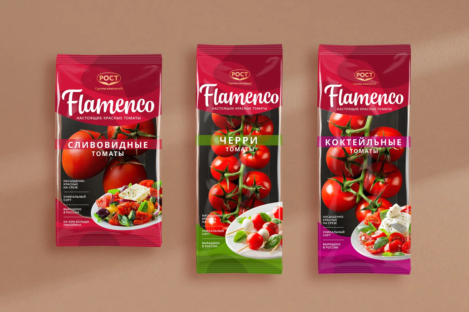
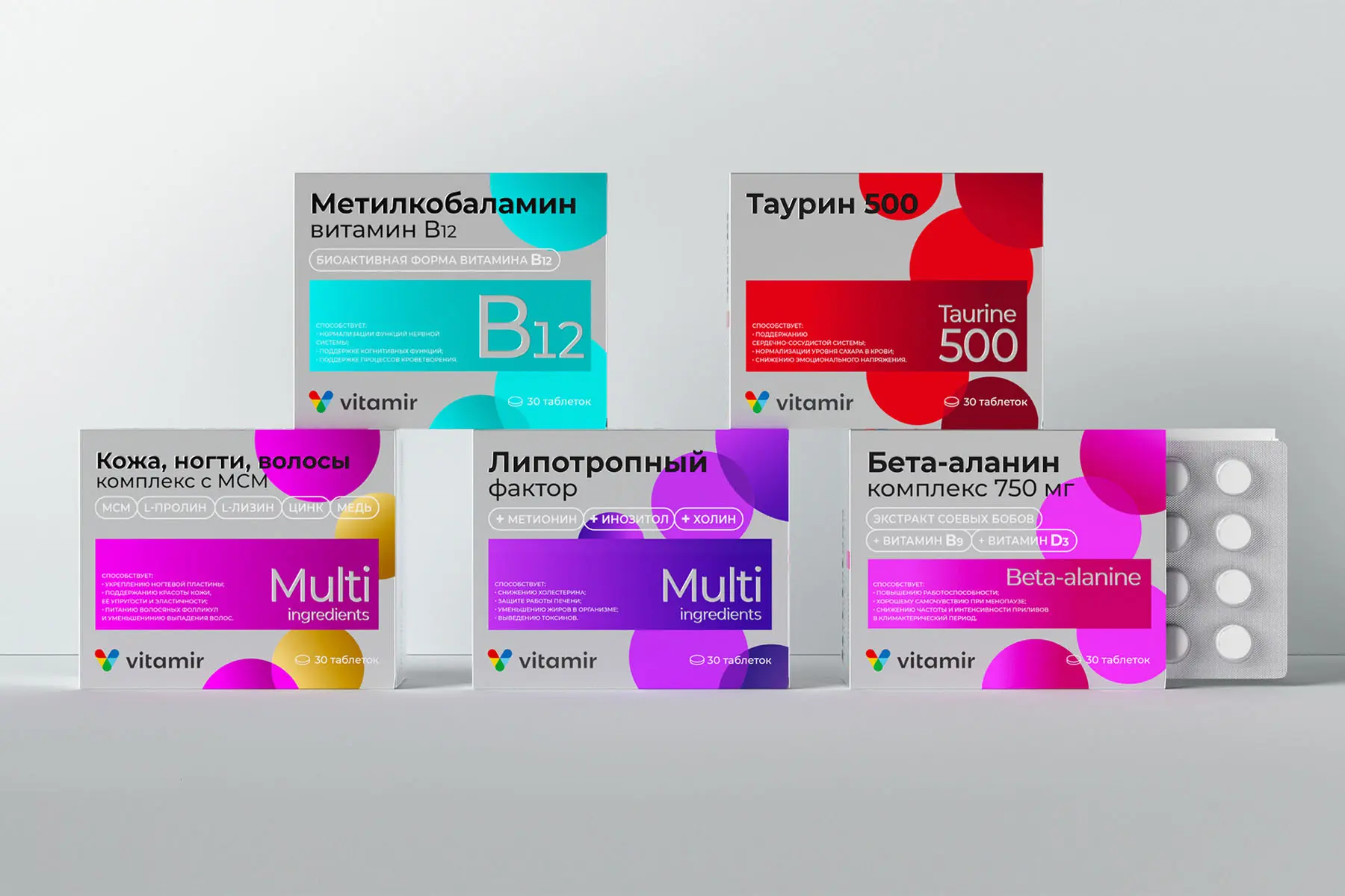
Collect the category’s display and break it into codes: form, color, composition, type, infographics, tone, materials, ability to see the product. Note repeating templates and clutter zones, as well as leaders’ distinctive elements. This is the base for packaging design that stands out yet reads within category expectations.
Pin down the minimally sufficient set of answers a person needs without effort: what the product is, why it helps, how and for whom to use it, what it’s made of, and whether it’s safe. For foods, EAEU technical regulations require: product name, ingredients and allergens, quantity, manufacturing date, use-by date and storage conditions, nutrition and energy values, producer and address, country of origin. All of it — in Russian. Plan this at the layout stage, or you risk late-stage edits.
Simultaneously plan operational elements: the EAC mark placement, room for barcodes, and — where mandatory digital marking applies — space for the “Chestny ZNAK” Data Matrix code. Barcodes need quiet zones and proper placement for reliable scanning in retail and warehousing. You plan these not after the fact, but alongside the packaging design.
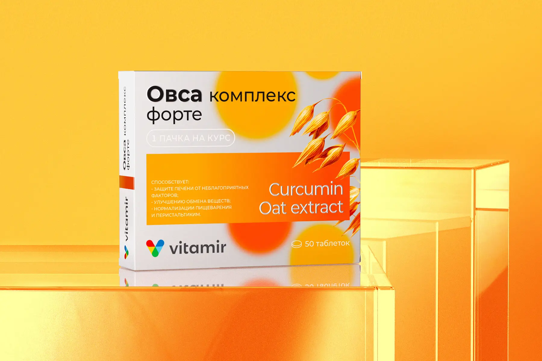
Write a concise value promise and a reason to believe. The front must show a clear hierarchy: brand code and logo, variant name, primary promise, and supporting markers. That’s how packaging design works as a communication channel rather than a decorative shell.
Naming is the foundation of brand creation and the connective tissue of the branding system. A registered name becomes a core brand asset and a primary reference in packaging design. It should read easily in small sizes, work across media, and accommodate line extensions to support mental availability alongside the logo, color, and other distinctive assets. Control it by measuring recognition and uniqueness — not just “like/dislike.”
Build the front- and back-panel architecture: color navigation across the line, type for multiple sizes, infographics and badges, benefit icons, and possibly a product window. For e-commerce, provide protective delivery packaging and compactness, plus an unboxing scenario.
Packaging design for marketplaces is more than front/back graphics — it’s rigorous packaging development for platform rules: neutral transport overpack, clear label areas, correct barcodes and markings, product-specific protection, and legible consumer information. This cuts intake refusals, reduces returns, and sustains stable e-commerce conversion.
Verify what buyers see first, remember, and what gets in the way. Shelf simulations, rapid surveys, and attention tracking are ideal. Specialist research firms have mature methods linked to volume forecasting. Scientifically grounded packaging design delivers proven revenue impact, while cosmetic tweaks often fail and simply depress the business.
The goal is to match the contract proof and press result, and to achieve cross-site and cross-run repeatability. Use ISO 12647-8 and Fogra VPS/VPC certifications for validation proofs. Widely employ the G7 methodology and G7 Master plant status to align proof-to-press and harmonize gray balance. This is part of prepress discipline: it reduces mismatch, saves the run, and protects your investment in packaging design.
Track metrics: shelf and PDP visibility, conversion, return rate, reviews. If packaging design stops doing its job, update it in a controlled way: hypotheses, competitive tests, pilot, scale-up. BASES data show optimized redesigns average about +5.5% to forecast revenue, but success requires rigor in managing change.

Packaging design isn’t just graphics. Equally important are the construction that protects the product and saves logistics, and the unique form that enhances recognition and ergonomics. Well-run packaging development integrates marketing, engineering calculations, platform requirements, and industry standards — from strength and barcodes to sustainability and recyclability. For Russia and international markets, the pillars are EAEU technical regulations, catalogs of standard constructions, and e-commerce test methods.
Construction is the combination of packaging level (primary, multipack, transport), material, closure, stiffness zones, fixation points, and marking. The usual practice is to start from standard off-the-shelf solutions: for corrugated, FEFCO codes define proven box types and speed the path from brief to production. That reduces errors, provides predictable strength, and simplifies coordination with printers and warehouses.
For e-commerce, test construction not only for static load and drops but also for vibration reflecting real shipping profiles. Globally, ISTA 6 procedures for Amazon flows are the benchmark: sequences include multiple drops and random vibration. Even if you don’t sell on Amazon, the methodology describes last-mile risks well across marketplaces.
Reserve zones for barcodes and labels from the outset: GS1 recommends stable quiet zones, high contrast, and predictable placement — otherwise rescans and accounting errors rise. For 2D codes, follow separate guidance for curved shapes and films.
Using standard FEFCO constructions and applicable GOST standards reduces variability and eases automated gluing/erection, especially when adding new SKUs or formats.
A unique form is a tool for differentiation and ease of use. It’s justified when it strengthens positioning, improves grip, dosing, and storage ergonomics, and delivers economic benefit through lower mass or better stackability.
Respect industry interfaces: for example, PET finish standards are unified. Switching from the older 28-mm PCO 1810 to the lighter PCO 1881 allowed the market to cut resin usage and cap mass without compromising seal integrity — a good example of form and standard aligning marketing with economics and sustainability.
Strong packaging design begins with understanding the substrate: barrier properties, print and finishing, ergonomics, logistics, and recycling all depend on the base material. Proper packaging development considers industry technical standards and EAEU requirements for packaging safety.
Paper substrates offer high flexibility and tactility, accept offset, flexo, and foil stamping well, and work great for gift and FMCG packs. Corrugated uses the unified FEFCO system: box style and flute profile drive compression resistance, stackability, and material use — your base for form development and logistics planning. FEFCO’s quality/GMP guides help align packaging design with warehousing and print.
Priorities are strength and readability of operational information. FEFCO styles bring predictability, and board grade/flute profile balance strength and mass. For e-commerce, vibration and drop testing ensures packaging design survives the last mile without excessive cushioning.
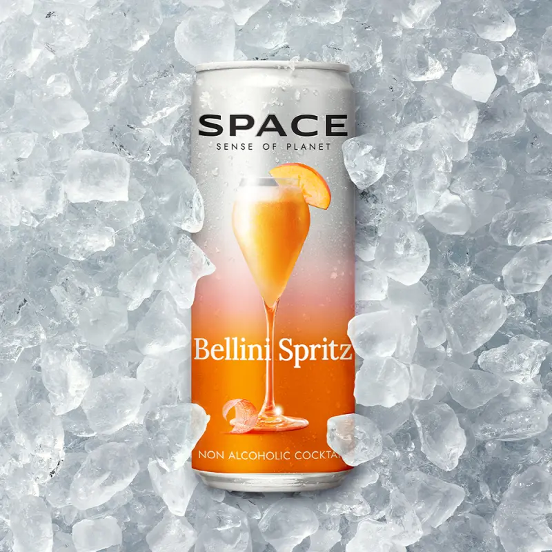
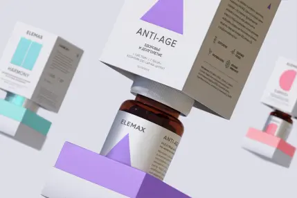
Glass is inert, a full barrier to gases and moisture, non-interactive with contents, and infinitely recyclable without quality loss — a strong base for premium positioning and stable taste/aroma. This dictates packaging design accents: form, glass color, embossing, and varnishes; use darker glass for light-sensitive products. In a circular economy, glass is exemplary thanks to repeated recycling and return.
Metal provides total barriers to light, gases, and oxygen, tolerates extreme temperatures and pressure, and suits pasteurization/sterilization. Aluminum is light and highly recyclable, with consistently high recycling rates in Europe. In packaging design, consider emboss zones and the limitations of metallic inks/coatings and of fine lines over tight radii.
PET combines light weight, strength, and good CO₂ and moisture barriers — common for beverages and oils. HDPE resists chemicals (home care, dairy), PP offers higher heat resistance and impact strength for food containers and cosmetics. For packaging design, consider recycling: adhesive and label choices affect compatibility with recycling streams.
Films (PE, PP, PET, PA) deliver high barrier at low mass and form doypacks, flow-packs, and sachets. Here, packaging design must ensure flexo/gravure printability, legible small type, and clear front architecture despite stretch and seal areas. The sustainability challenge is recycling multi-layer laminates; if your brand claims sustainability, packaging development needs to reflect this constraint.
A multi-layer structure based on paperboard with thin PE and aluminum layers provides long shelf life without cold chain. For packaging design, plan fold and seal zones and local recyclability requirements for such composites in advance. Producers cite shelf-life and logistics advantages but acknowledge recycling complexity.
For Russia and the EAEU, TR CU 005/2011 sets core requirements for packaging safety and processes for storage, transport, and disposal. It’s the umbrella for any packaging development regardless of material and should be considered from briefing and construction choice onward.


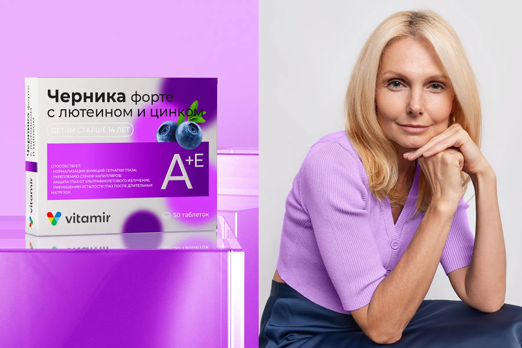
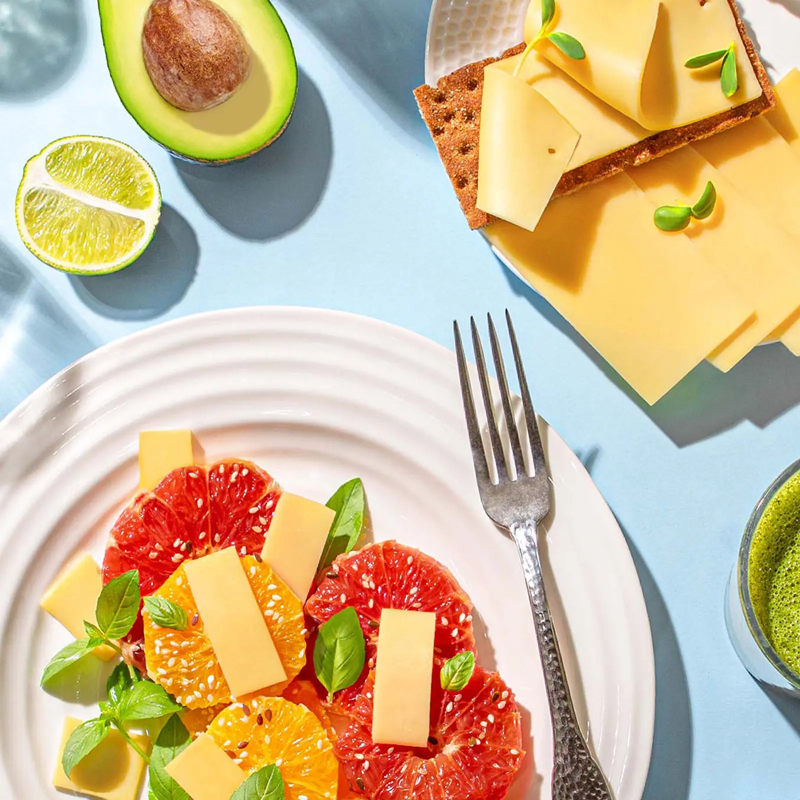
Packaging design doesn’t work without photography. Images show form, materials, texture, and color as intended and convert those meanings to sales — on shelf, in e-commerce, and across brand communications. To avoid gaps between layout and reality, combine packaging design and the shoot into one roadmap — from technical brief and color management to marketplace requirements and image quality control.
Draft a shared brief: which angles are stylistic “heroes,” whether you need transparent areas, which details merit close-ups, and what the lifestyle set looks like. For catalog and PDP consistency, use GS1 image standards: they regulate image types, angles, formats, file naming, and GTIN linkage, streamlining content exchange between manufacturer, retailer, and service providers.
Color is part of identity and line navigation, so the shoot must be done in a controlled color environment. Use ISO 3664 D50 viewing conditions for evaluation to reduce differences among monitor, proof, and print. Manage ICC profiles end-to-end and embed sRGB for the web to ensure consistent rendering in browsers/devices. If you use contract proofs to align with packaging print, validate them to ISO 12647-7 using a Fogra MediaWedge. This ties packaging design, print, and retouching into one system.
Gloss, emboss, soft-touch, metallics, windows, and contents behave differently under light. Plan hard/soft sources, polarization, black/white flags, gradient reflections, and specular highlights. For beverages/cosmetics, plan droplets, condensation, and liquid handling to convey freshness and premium. Ideally, anticipate these decisions in the layout: packaging design should assume how it appears through the lens, not only in vectors.
Online storefronts have their own rules. As a global baseline, use Amazon’s requirements: a primary image on pure white, without text overlays; the product should fill most of the frame with sufficient resolution for zoom. This builds trust and prevents PDP suppression for non-compliance.
Russian platforms set their own standards to consider before shooting/retouch:
Ozon. Accepted formats include JPEG, PNG, HEIC, WEBP; some categories require a 3:4 vertical ratio, with file-size and quality limits. The platform prescribes card display rules and media recommendations.
Wildberries. Technical photo specs: formats, minimum resolutions, limits for image count and file size; a public list of common mistakes.
Yandex Market. Requirements for product images and media quality recommendations for PDPs: supported formats, dimensions, and best practices.
When packaging design and photography account for platform rules from the start, PDP rejection risk drops and search-list conversion rises.
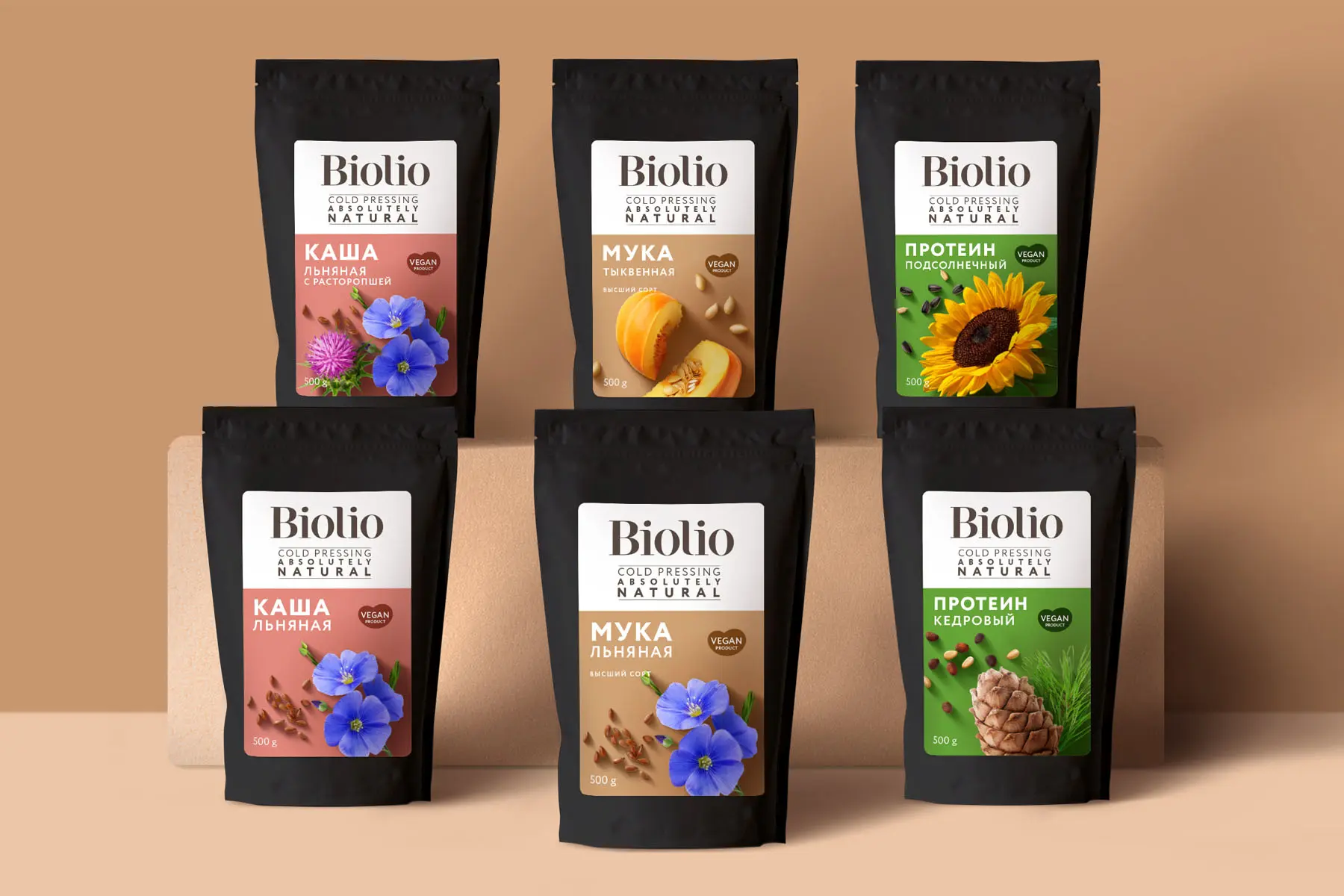
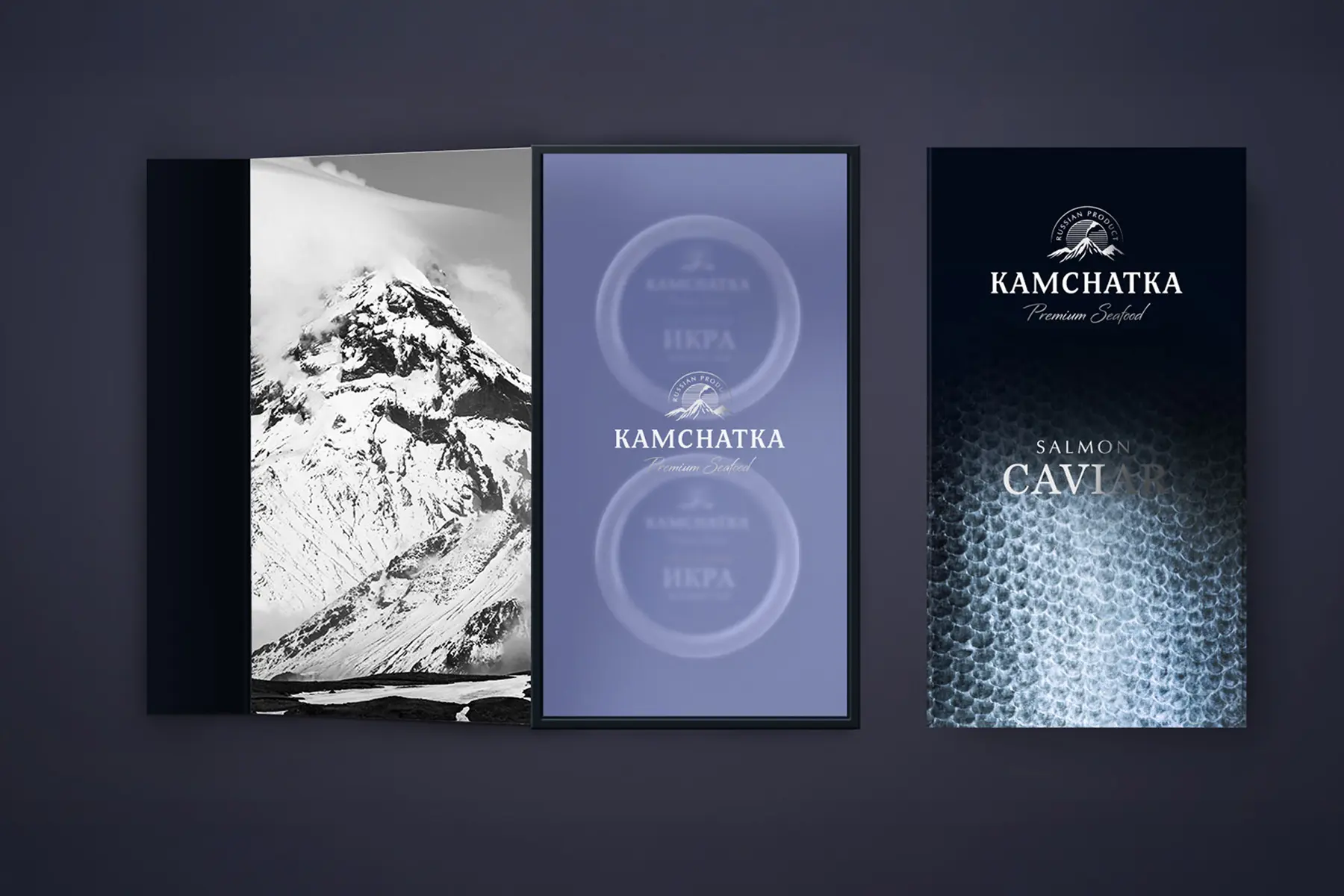
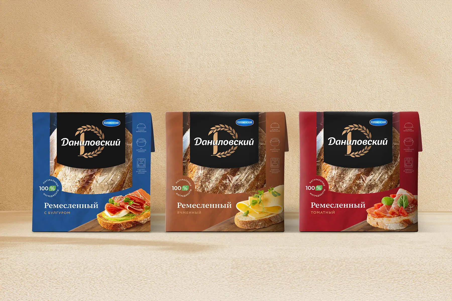
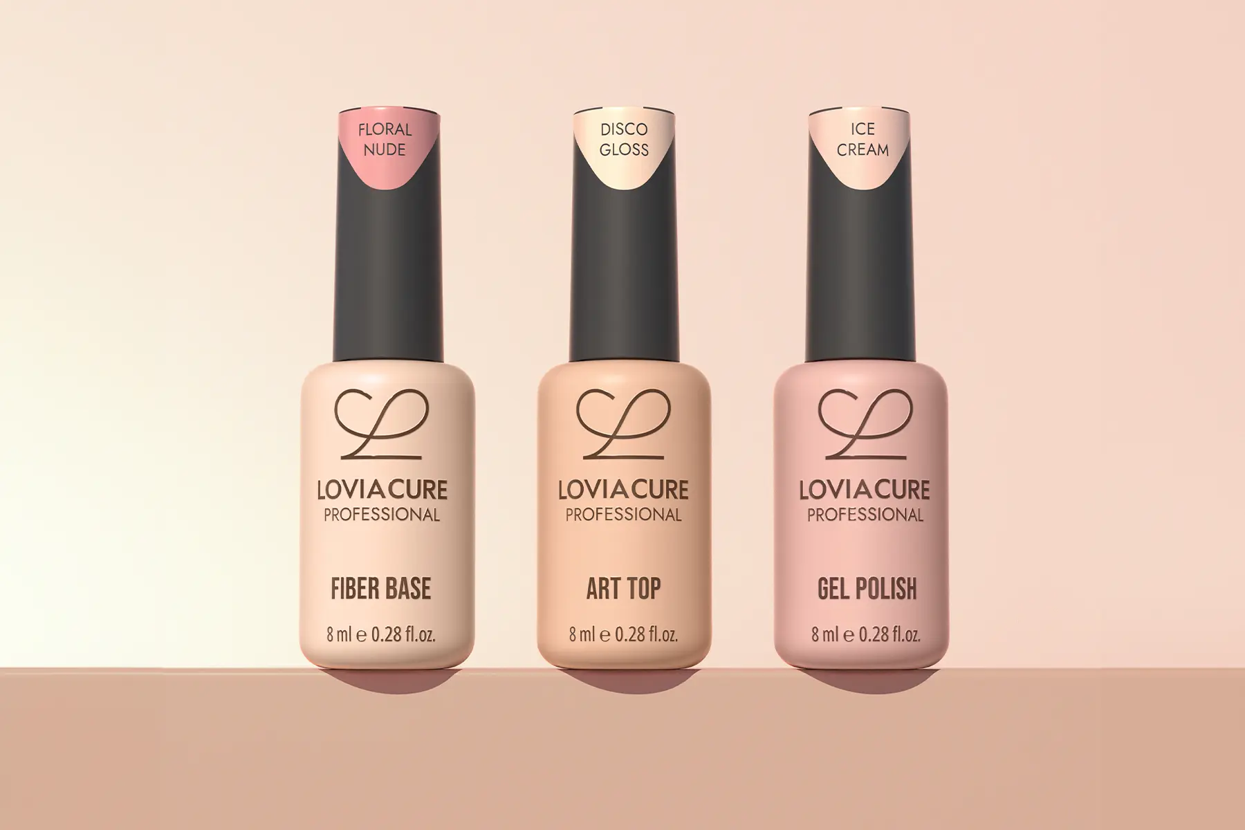
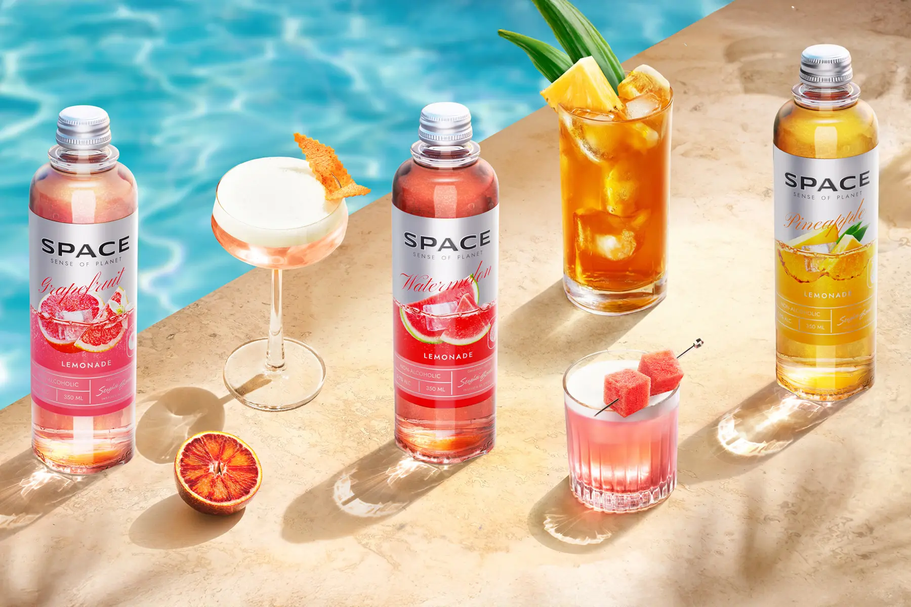

Illustration in packaging design is not decoration but a positioning tool. It quickly conveys product essence, locks in mood and origin, and drives distinctiveness on shelf and in marketplace search. Field studies and meta-reviews confirm that packaging visuals influence attention, perceived quality, and purchase decisions; thus, a thoughtful illustrative approach can raise conversion all else equal.
Illustration excels when the product needs emotional context, origin story, cultural codes, or a delicate cue to properties difficult or expensive to shoot “honestly.” It offers tighter control of style, scale, and detail, simplifies complex ideas, and increases memorability via visual narrative. Branding practice routinely uses illustration to tell terroir, craft origins, and brand character—an economical language understood on any shelf.
Do remember the anchoring effect of imagery: whatever is depicted on pack sets product expectations and shifts judgments of taste, freshness, or healthfulness. Composition, style, and realism should match actual product attributes.
An illustrative front must read clearly in thumbnail. Check the cover at 3–5 cm on the short side: is the variant name legible, does the key image hold, and does fine texture clash with algorithmic compression? Market case studies emphasize that visuals remain primary click/choice triggers online—especially where product photos are unavailable or generic.
Поэтапная разработка концепции дизайна этикетки
Требования к дизайну упаковки


Подготовка к разработке дизайна упаковки

Преимущества и недостатки эко-дружественной упаковки
Стильный дизайн упаковки: тренды 2019
Как работает дизайн упаковки

Четыре способа не прогадать с дизайном упаковки


Критерии эффективности дизайна упаковки
Стильный дизайн упаковки
3 принципа хорошего дизайна упаковки
Pre-launch: comparative shelf tests, preference surveys, and visibility metrics. NIQ BASES finds optimized packaging design can add up to +5.5% to forecast volume. In market: track sales speed/revenue, marketplace PDP conversion, return rate, and the strength of distinctive brand assets (especially visual ones like logo and identity).
Short answer: yes. Packaging on the product page is as important as on the offline shelf, because appearance and readability drive conversion. Professional photography powers your “online shelf.” Marketplaces enforce strict image rules for instant recognition: Amazon requires a pure white background and clean product presentation; Ozon and Wildberries have their own specifications for format and resolution. Plan a readable front architecture and legible claims that work even in thumbnails.
Leverage distinctive brand assets: form, color, logo, and patterns must be recognizable and measurable for fame and uniqueness. Test eye-path before print—first-seconds visibility and brand availability are better predictors of packaging design performance than taste debates.
Outperform on three fronts—distance visibility, instant brand recognition via codes, and a clear value promise. This isn’t theory: that process yields measurable gains in categories where decisions are made in seconds.
Tap current Gen Z/Alpha codes: a clear story expressible in a second and honest sustainability signals without slogans. Research shows strong interest in convenience, safety, and sustainability, yet final choice still hinges on practicality and value. Bold type systems and collectible drops can work—but always test with your audience.
Strongly recommended: in Russia, protect form and overall appearance as an industrial design, and label/graphics as trademarks and copyrightable works. 3D trademarks are possible but face strict distinctiveness tests. Protection is territorial, so secure key markets strategically.
The article uses photo and video materials provided by the customer / BRANDEXPERT "Island of Freedom" / ShutterStock / Freepik / Unsplash / Pexels / Goodmockups / Pixpine. All materials presented in the blog are purely informational in nature and do not pursue commercial purposes. The use of text, illustrations, photos, videos and other materials is prohibited without the consent of the copyright holder.


By continuing to use this site, you agree to our use of cookies and the processing of your personal data as described in our Privacy Policy.