ALPINA Beer Brand Rebranding: Logo, Brand Identity and Packaging Design
BRANDEXPERT Freedom Island carried out a comprehensive rebranding of the ALPINA beer brand for one of the leading producers of beer and non-alcoholic beverages in Khakassia. Founded in 2002, the company supplies its products across Russia as well as to China, Kyrgyzstan and Kazakhstan.
The objective of the project was to modernize ALPINA’s visual identity, strengthen the brand’s character and shelf visibility, and create a consistent visual positioning system for the beer brand across retail and HoReCa.
The new brand concept is built around the idea of “the peak of taste and quality,” inspired by the mountain landscapes of the region and European brewing traditions. The brand combines the purity of natural water and carefully selected ingredients with modern production technologies emphasized by the manufacturer.
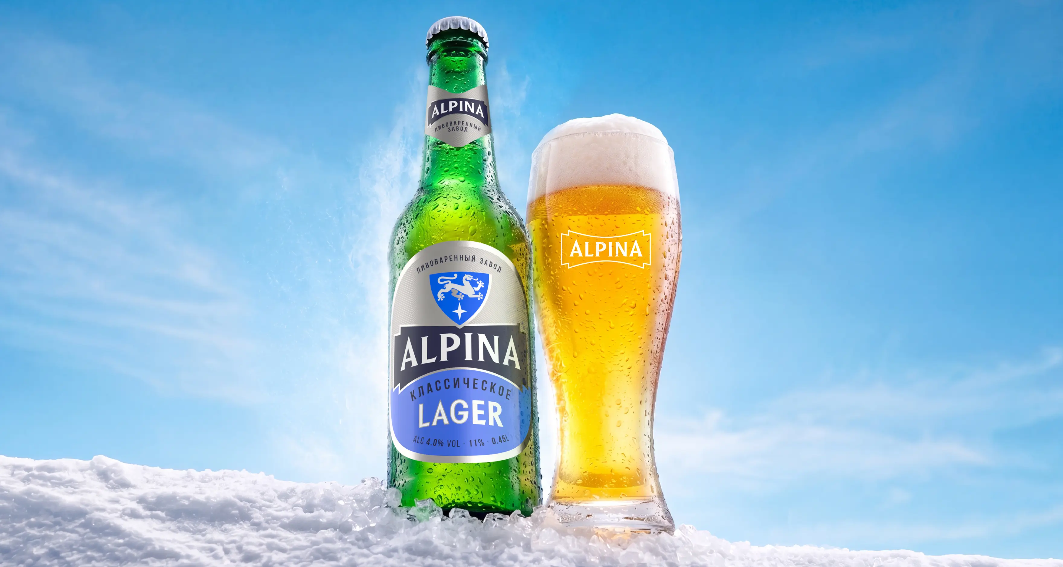
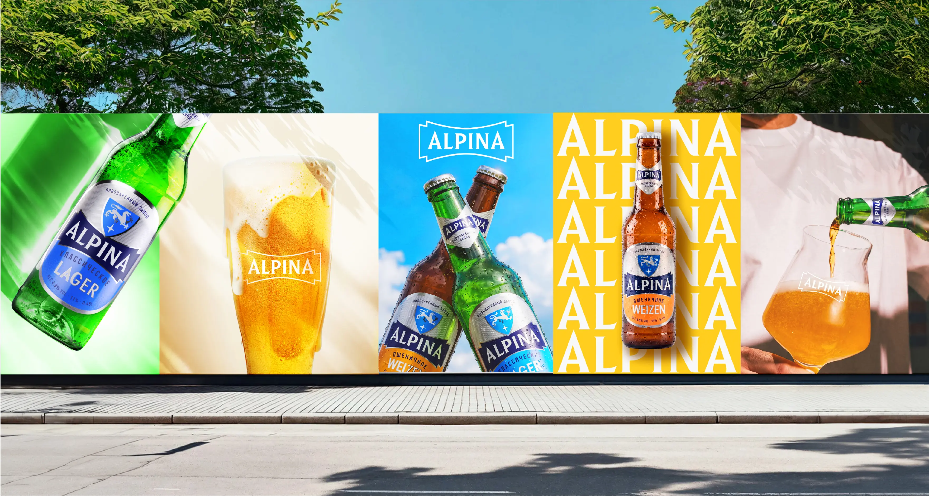
The visual brand strategy conveys the freshness of mountain peaks and the openness of a clear blue sky. ALPINA’s signature blue, dynamic compositions and bold typography create a confident, masculine brand character.
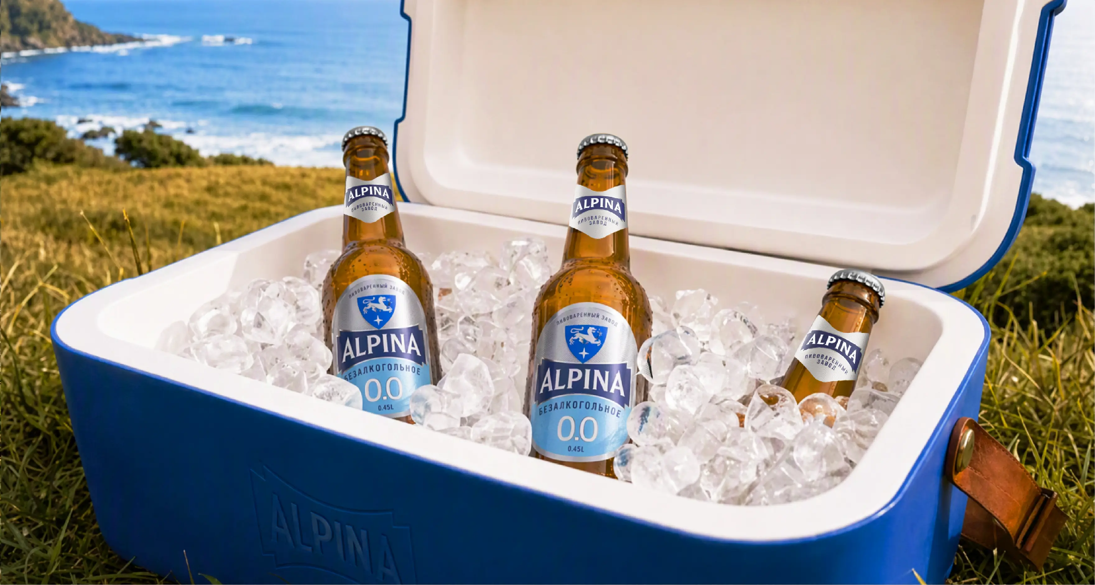
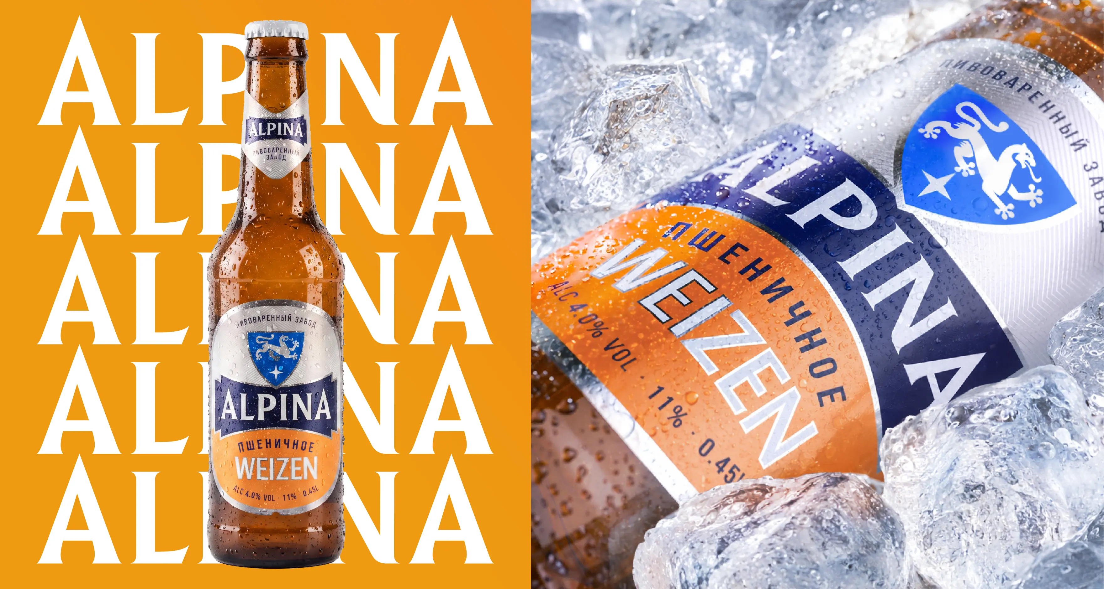
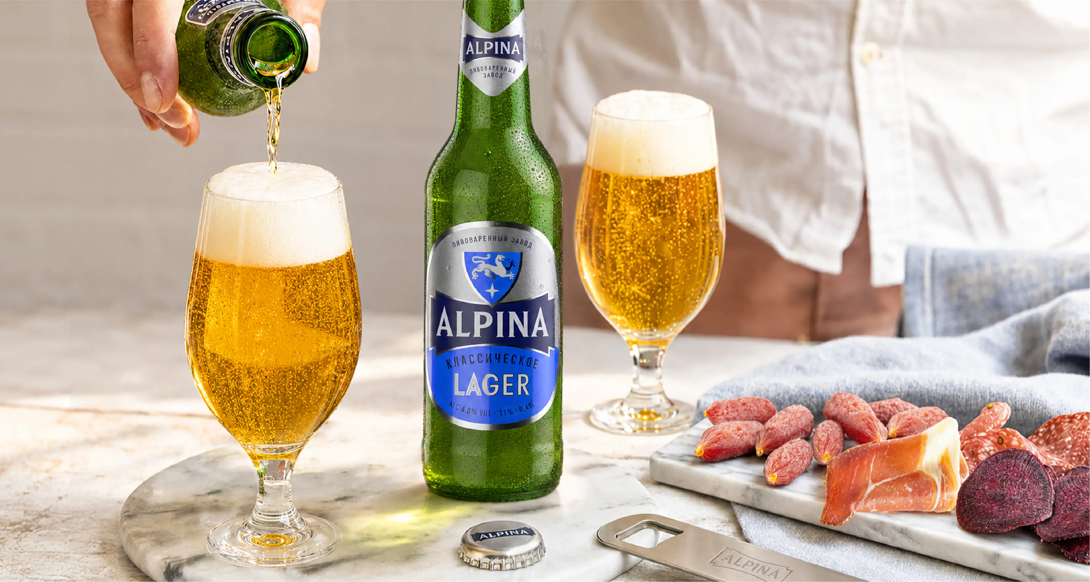
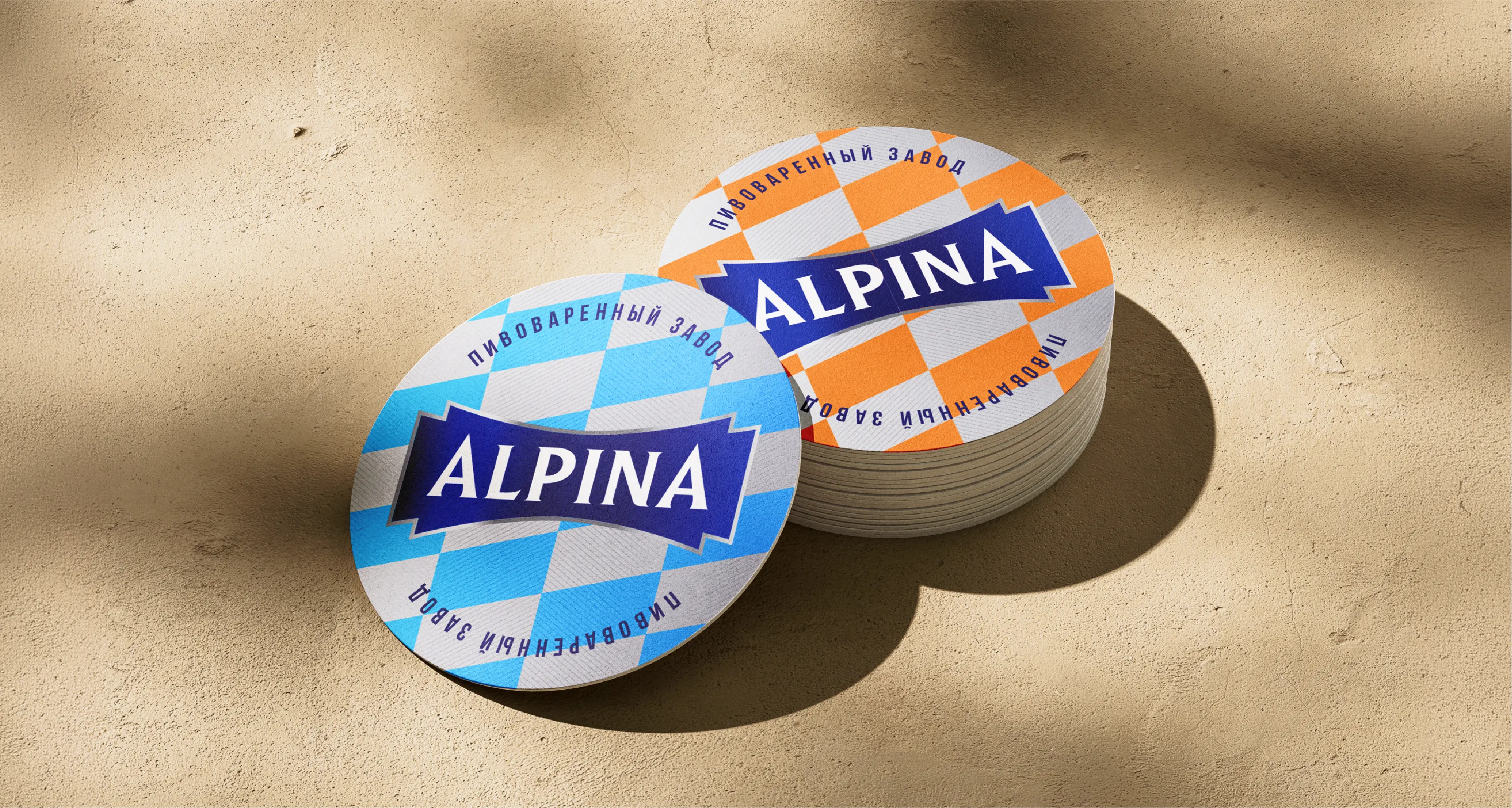
The central element of the new ALPINA brand identity is the logo, designed as a strong visual anchor across beer packaging and brand communications. A heraldic shield featuring a lion and a star reinforces associations with European brewing culture. The visual identity system also includes patterns, graphic modules and layout principles that can be consistently applied across beer labels, digital media and branded merchandise.
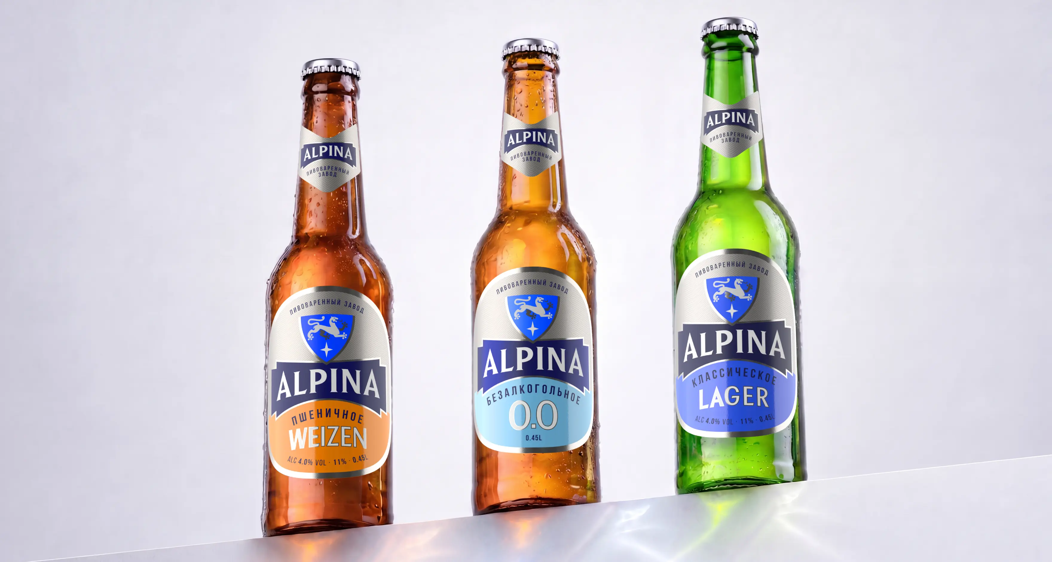
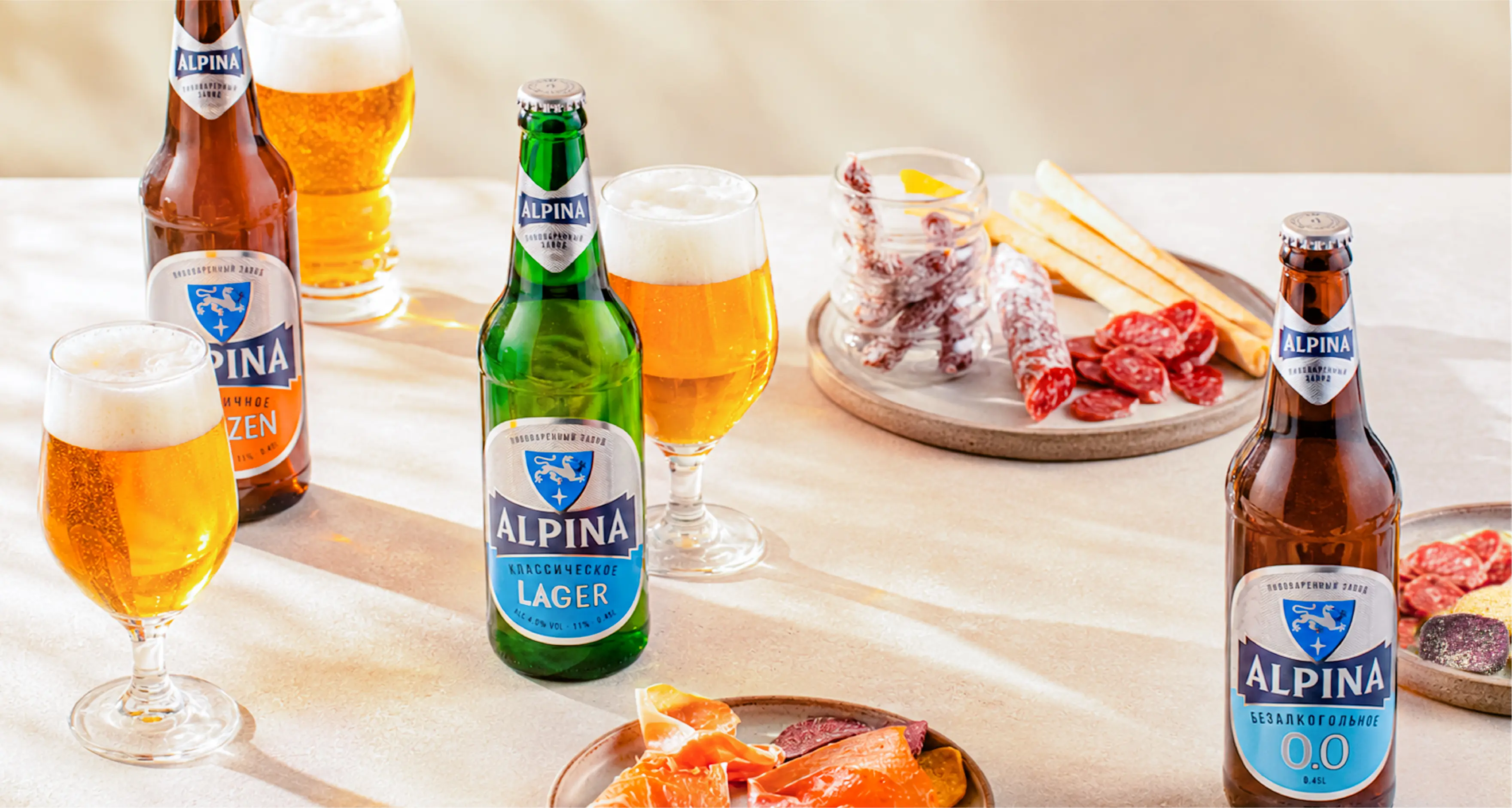
The new beer packaging and label design introduces a clear and easy-to-navigate product architecture. ALPINA remains the main visual focus, while individual beer varieties are differentiated through color coding and a clear typographic hierarchy. ALPINA Classic Lager and Weizen share a consistent packaging structure and label shape while retaining their own distinct character. Green and light blue communicate the freshness of the lager, while warm orange highlights the richer profile of the wheat beer.
The renewed ALPINA identity highlights the brand’s regional origins and modern production standards. The new branding system strengthens ALPINA’s presence in the beer category, improves shelf recognition and gives the brand a distinctive, scalable visual identity for further growth.