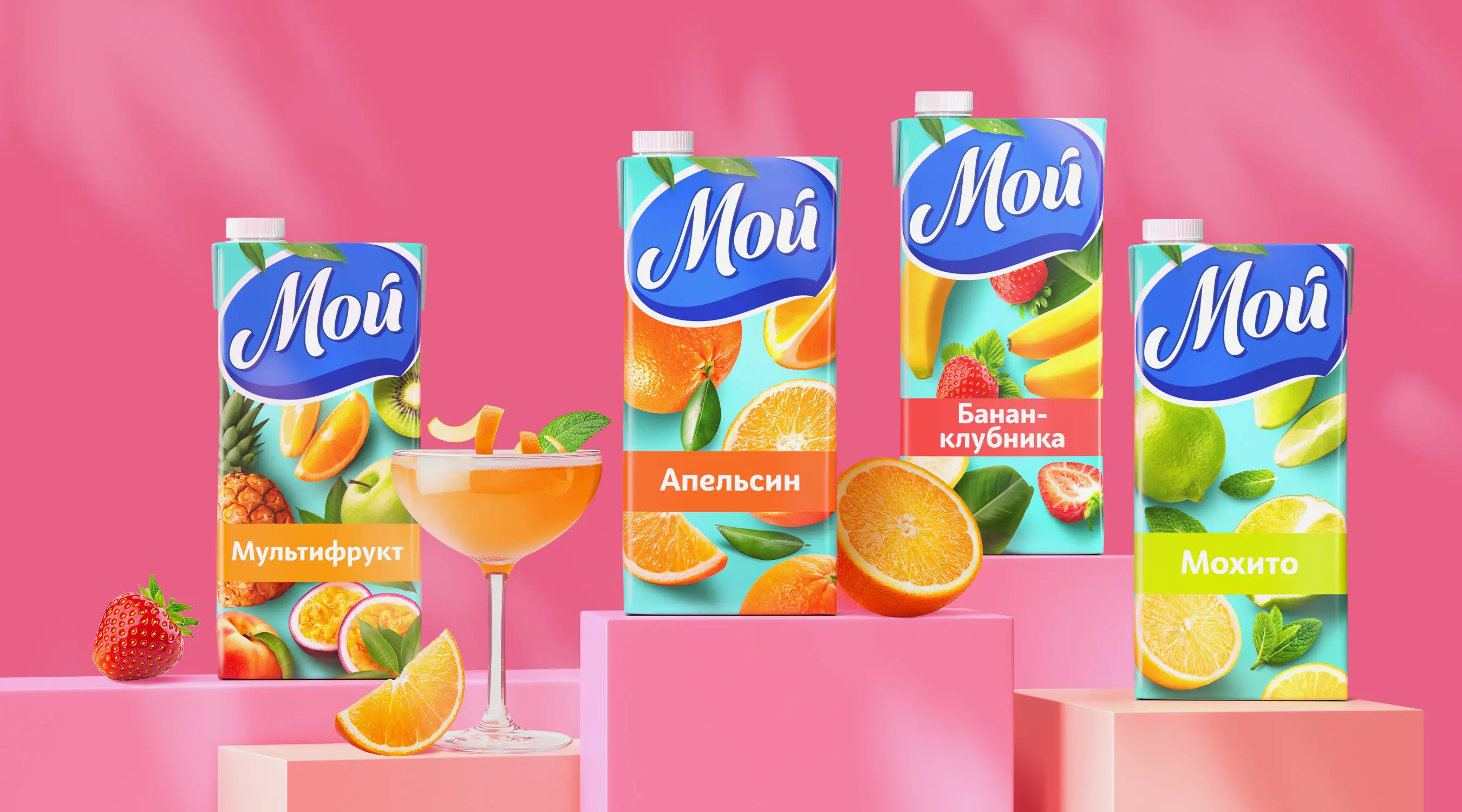
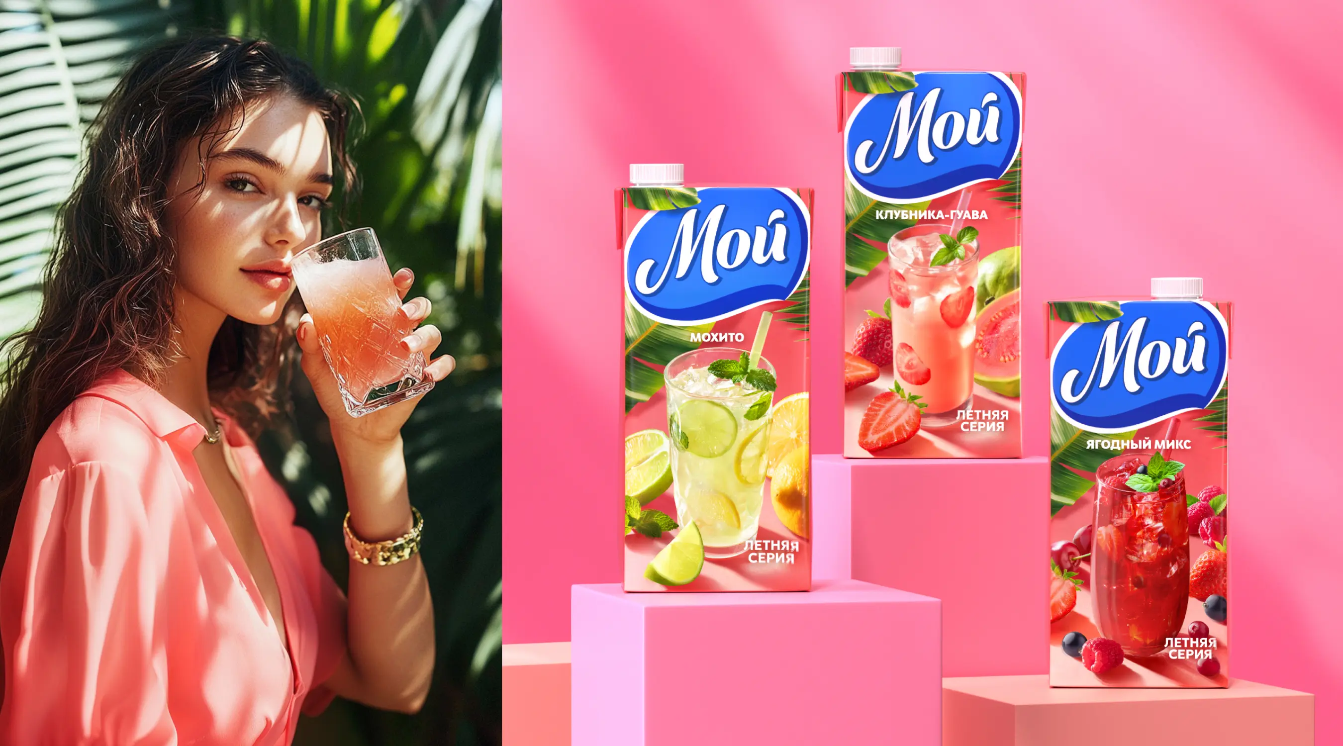
MOY — rebranding, logo development, packaging design
BRANDEXPERT “Ostrov Svobody” rebranded the “MOY” trademark — one of Sady Pridonya’s key brands. The project became a large-scale effort to rethink the brand’s image: updating the logo, packaging, and visual communications, and creating a modern website. Every element was designed to strengthen the brand’s position in Russia and the CIS, while shaping a more contemporary and appealing perception among its audience.
Sady Pridonya is one of the leaders in the Russian market for natural juices, nectars, and baby food, with a full production cycle — from growing fruit to packaging finished products.
The “MOY” brand holds a special place in the company’s portfolio: it is a long-established label, widely known to consumers, with a broad palette of flavors and a high level of trust. The agency’s task was to preserve recognition and the emotional connection, while renewing the visual code and aligning the brand with current consumer expectations.
The logo was reimagined to feel more lively and dynamic, while maintaining continuity. The packaging received a bright, appetizing look with an emphasis on realistic fruit imagery, a clean background, and clear color navigation. The design became juicy, fresh, and versatile — easy to scale both within the category and beyond it.
In addition, professional product photography was carried out, providing the brand with high-quality assets for use across all communication channels — from digital to BTL.
To ensure strong confidence in the digital environment, a website was developed based on the new visual solutions and executed within a unified design concept: light, intuitive, emotionally appealing, and bringing together information about product ranges, flavor collections, and ingredients.
Today, the updated “MOY” brand stands out confidently on the shelf: it is easy to recognize, creates an emotional response, and reinforces audience trust — continuing to evolve in a new visual format. The project is an example of a holistic, strategic approach to rebranding, where design, packaging, brand architecture, and digital were developed as a single system that positively evolves the brand’s DNA.