Orange Toys — rebranding, brand development, logo & visual identity, packaging and label design, B2C/B2B e-commerce website. BRANDEXPERT agency made rebranding of Orange Toys, developed the master brand and the brands of toy collections. The project included logo and visual identity development, packaging and label design, preparation of advertising and website creation
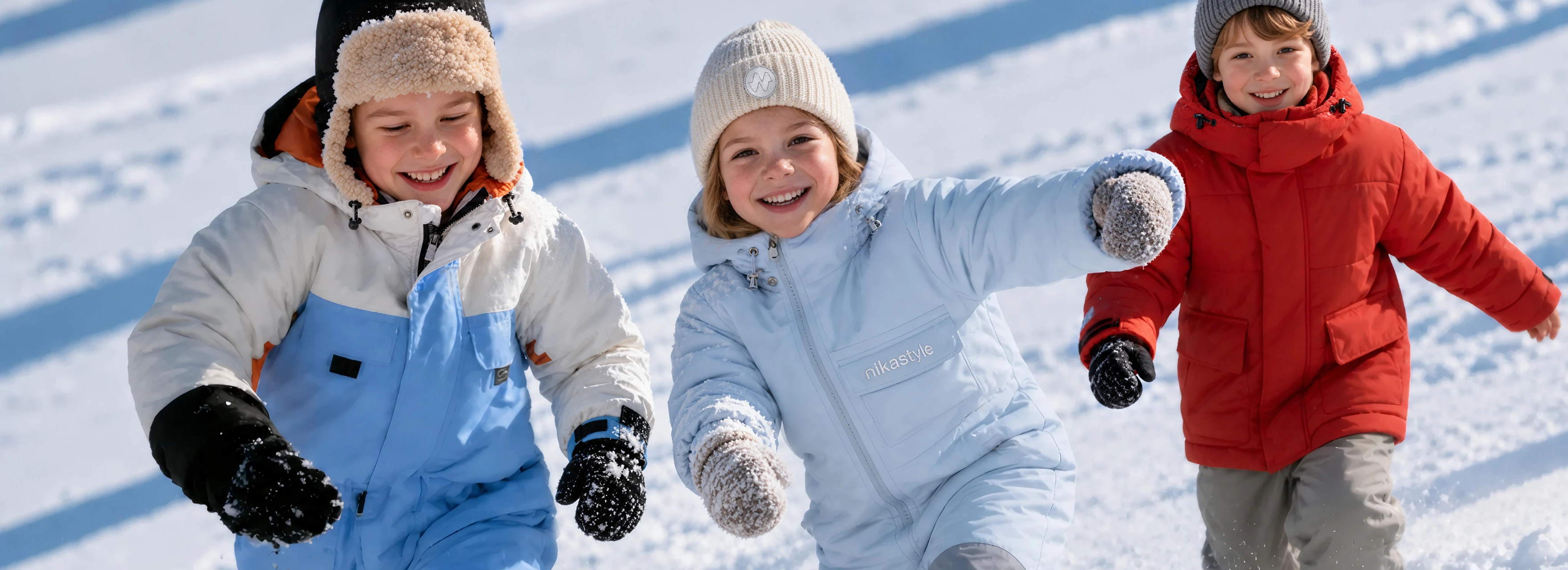
NIKASTYLE — Company Rebranding, Logo and Brand Identity Design, Packaging and Label Design, and Children's Clothing Store Design
NIKASTYLE creates clothing for a childhood full of movement and discovery. Since 2004, the Russian manufacturer has been creating collections for children and teenagers, combining contemporary design with technology that protects against the elements. Membrane fabrics, a comfortable fit and thoughtful details help children walk, play and explore in comfort. At the heart of the brand is a simple idea that resonates with families: every kind of weather offers children a new adventure.
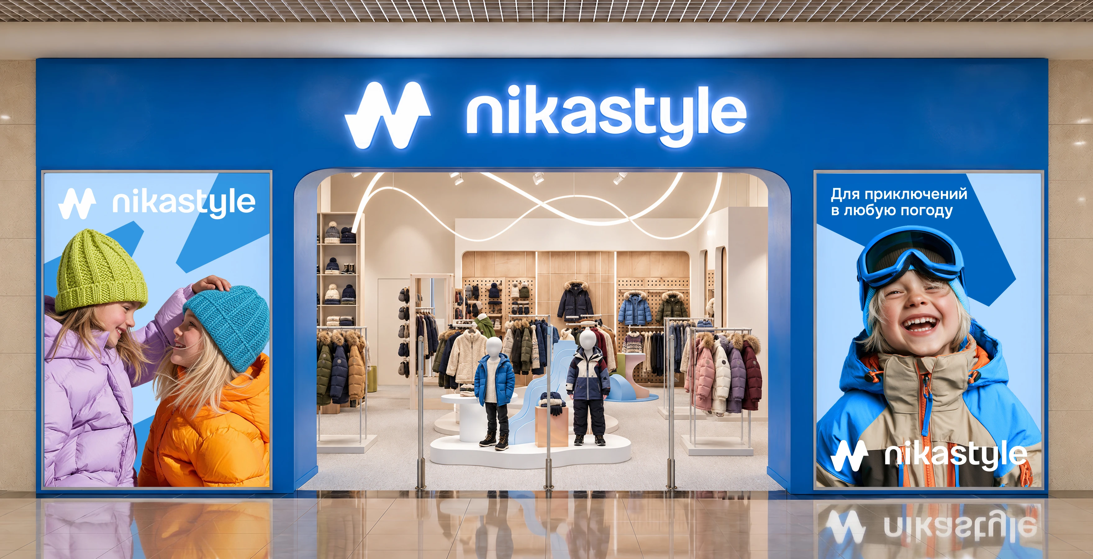
Having established a strong position in online sales, NIKASTYLE took the next step by developing its own retail chain. Physical stores allow families to explore the collection in person, feel the fabrics, check the fit and choose clothes together with their children. This new stage called for a cohesive brand identity that would work equally well in advertising, on products and in the store environment.
Branding agency BRANDEXPERT Freedom Island rebranded NIKASTYLE and developed a unified visual strategy for the brand. The project brought together logo and brand identity design, packaging and label design, advertising and comprehensive design for the retail chain. Every solution serves a shared purpose: to express the energy of an active childhood and create an engaging, approachable and memorable brand experience.
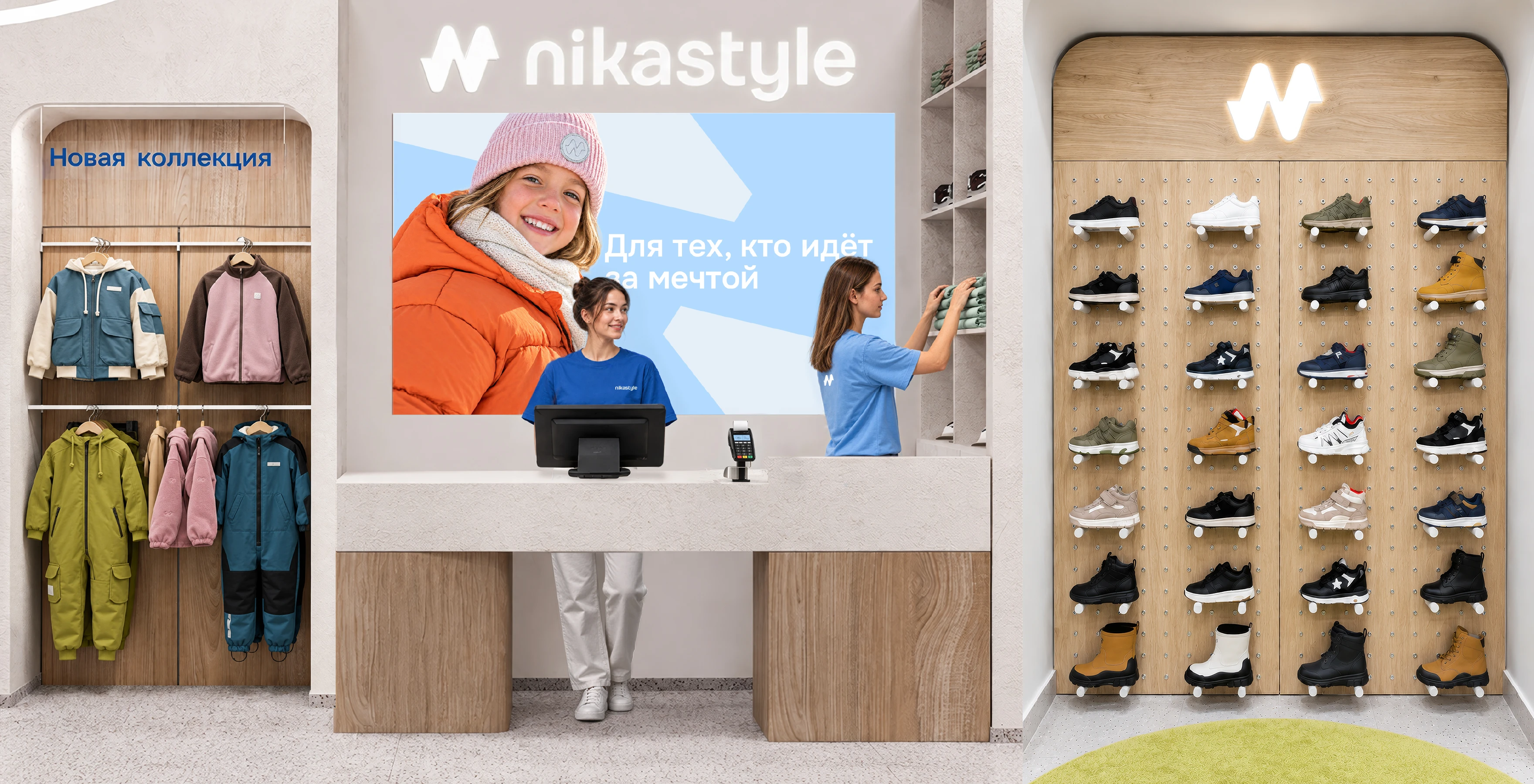
A vivid blue storefront creates the first impression of NIKASTYLE's new retail concept. An illuminated logo, large photographs of children and an open entrance form a striking composition that stands out along the shopping mall concourse. The brand's character is immediately apparent: freedom of movement, the joy of outdoor play and a spirit of adventure.
Children's clothing store design continues this story inside. The entrance, retail fixtures, checkout area and advertising displays share a consistent visual language. Clothing, footwear and accessories are presented as parts of a single collection, making it easy for the whole family to explore the range.
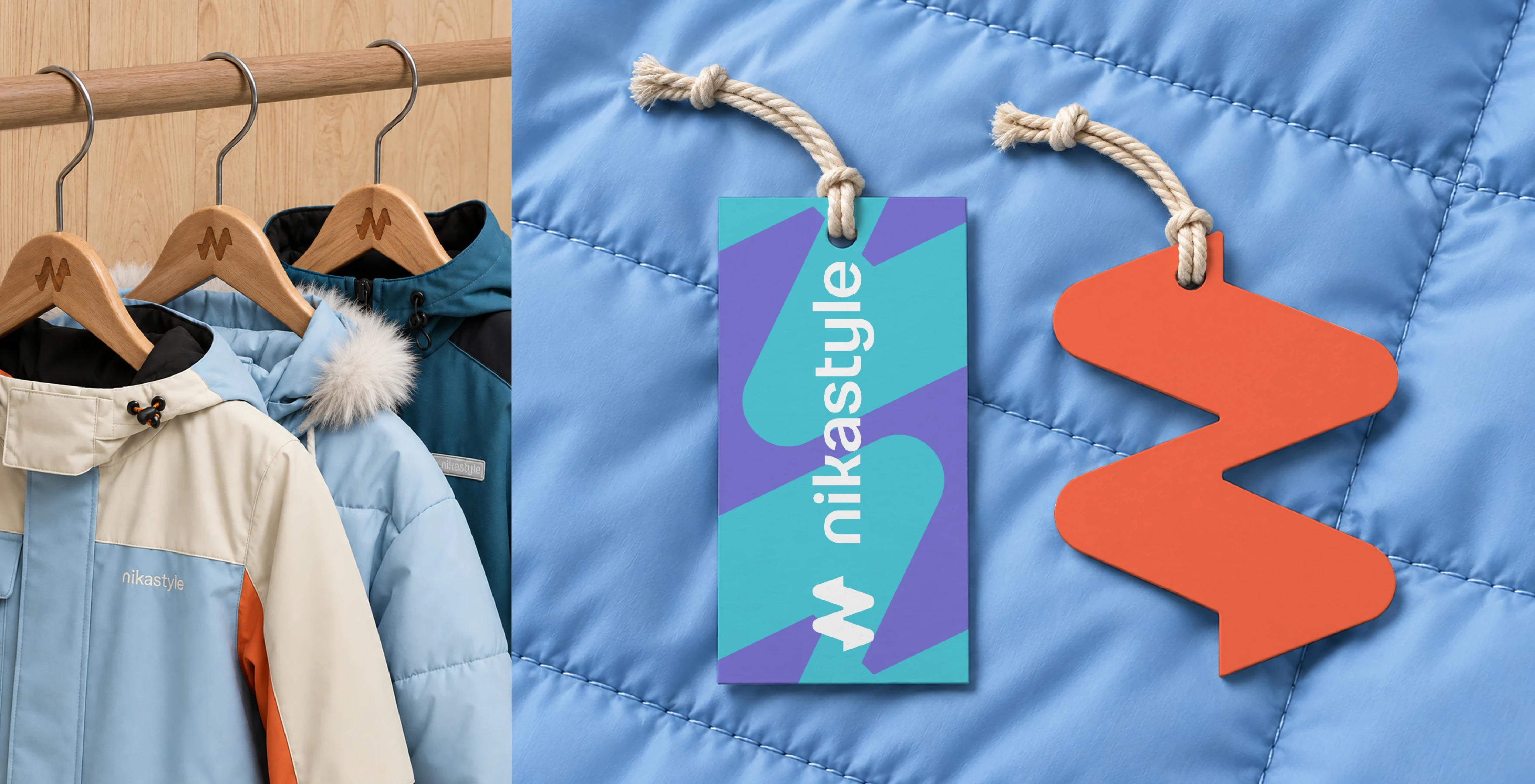
The NIKASTYLE logo design became the foundation of the refreshed brand identity. Lowercase lettering and soft, rounded letterforms reinforce the brand's friendly personality. The compact zigzag symbol, with its rounded contours, conveys movement and suggests mountain peaks and a path toward adventure. It works both alongside the brand name and independently, on a hanger, hang tag or small garment detail.
Brand identity design develops these flowing forms into bold graphics and vibrant color combinations. Blue, turquoise, lime green, lilac and coral create a lively palette that feels at home in children's fashion. Elements of the symbol scale up and down to form patterns and connect different applications. This flexible system allows seasonal communications to evolve while keeping NIKASTYLE recognizable.
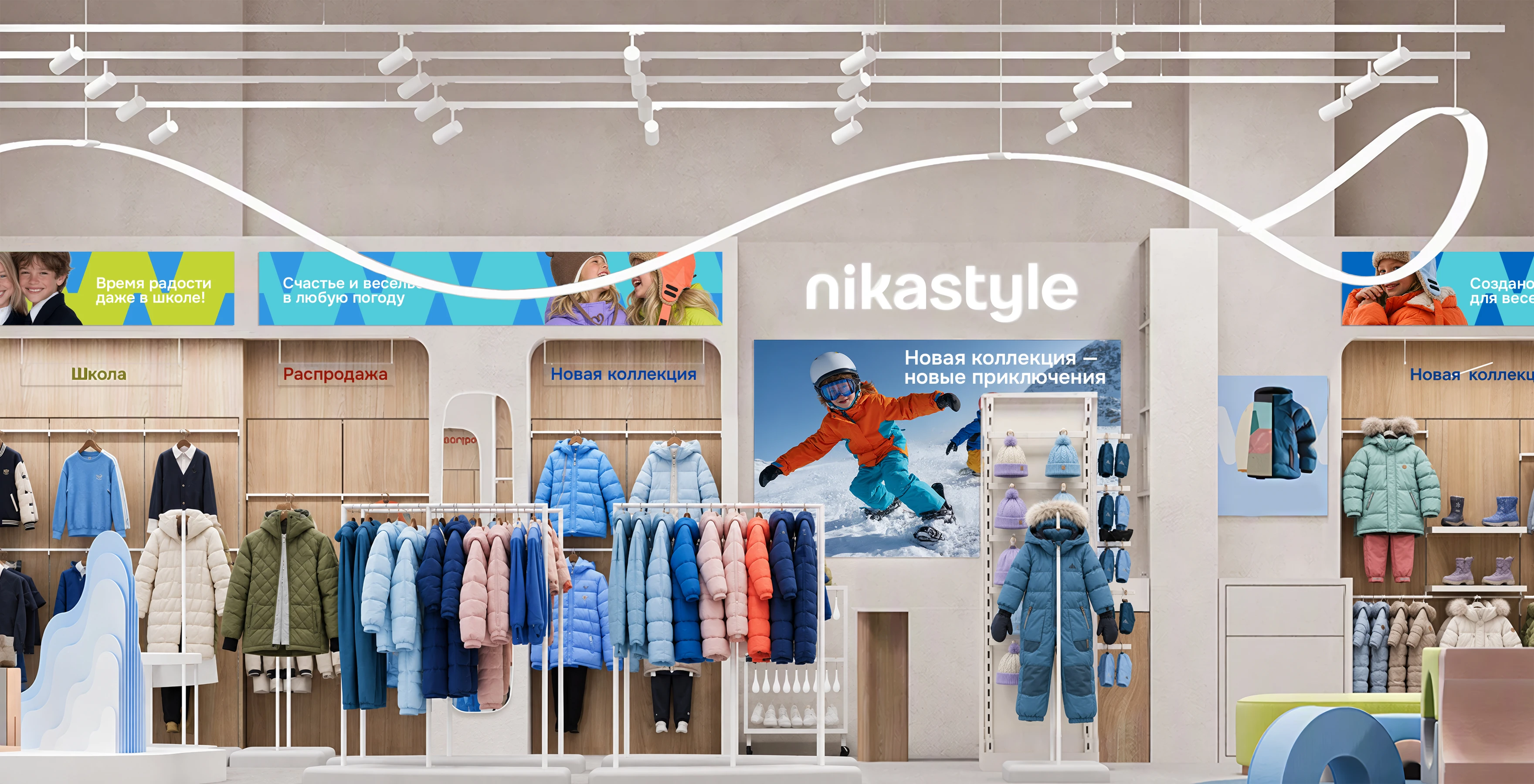
The store interior design pairs a light base palette with wood textures, curved fixtures and colorful accents. This backdrop lets the collection's colors and details stand out. Curved lighting elements reinforce a sense of movement, while the rounded display platforms and furniture echo the brand symbol's soft contours.
Wall-mounted units and freestanding racks organize the display of clothing, footwear and accessories. Signage highlights new collections and product categories. Children's poufs, fitting areas and mirrors allow parents to take a closer look at garments while children join in the selection. The thoughtfully designed space makes care for the whole family's comfort a tangible part of the brand.
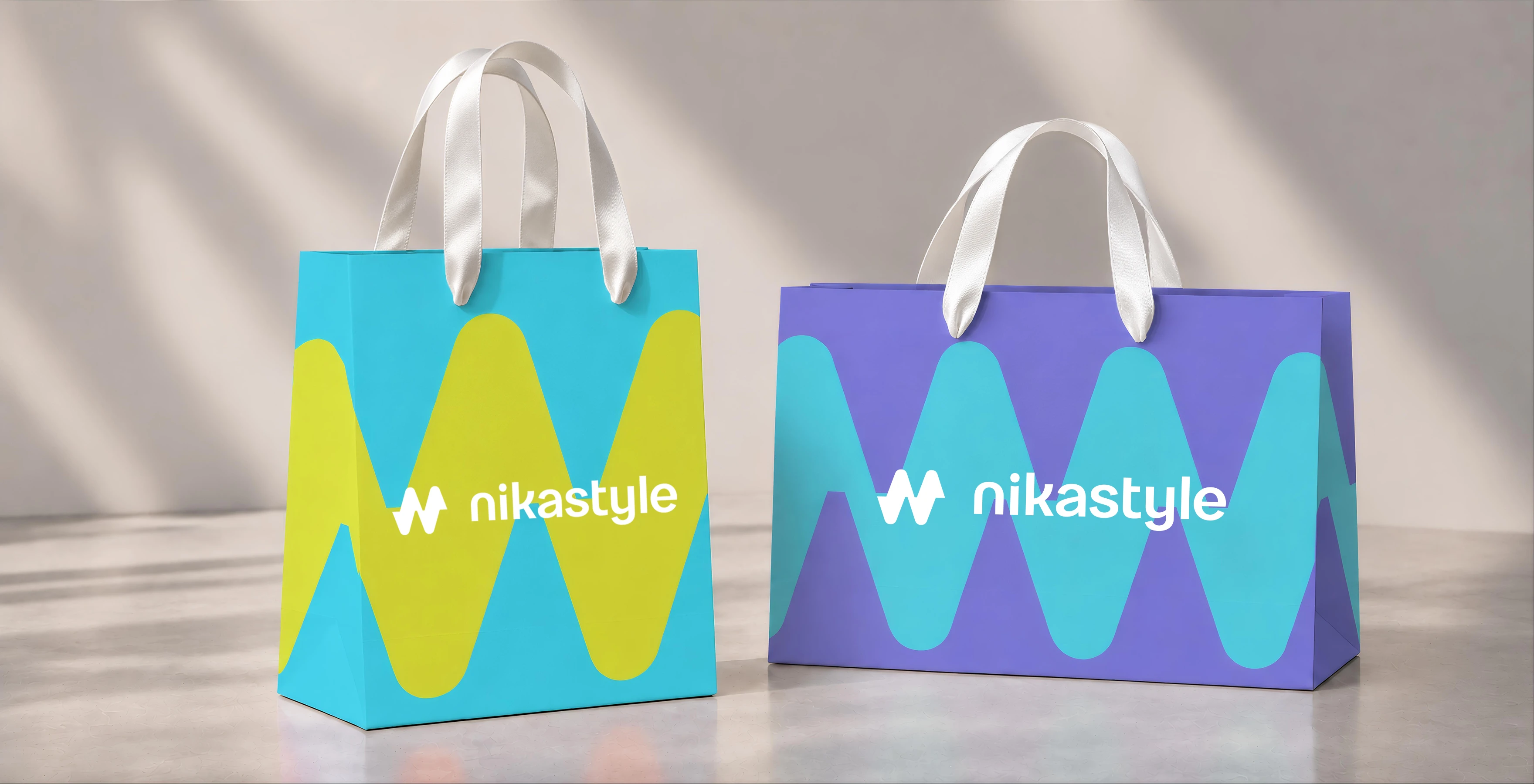
Packaging design brings the new identity to NIKASTYLE's branded shopping bags. A bold graphic motif, contrasting combinations of turquoise, lime green and lilac, and a clearly positioned logo make the packaging a distinctive expression of the brand. The design retains its visual impact across different proportions and formats.
The shopping bag completes the in-store experience and accompanies the customer beyond the store. Shared colors and graphics connect it with the hang tags, advertising and interior, reinforcing the impression made in store. Through these everyday details, the brand identity becomes part of each family's personal experience.
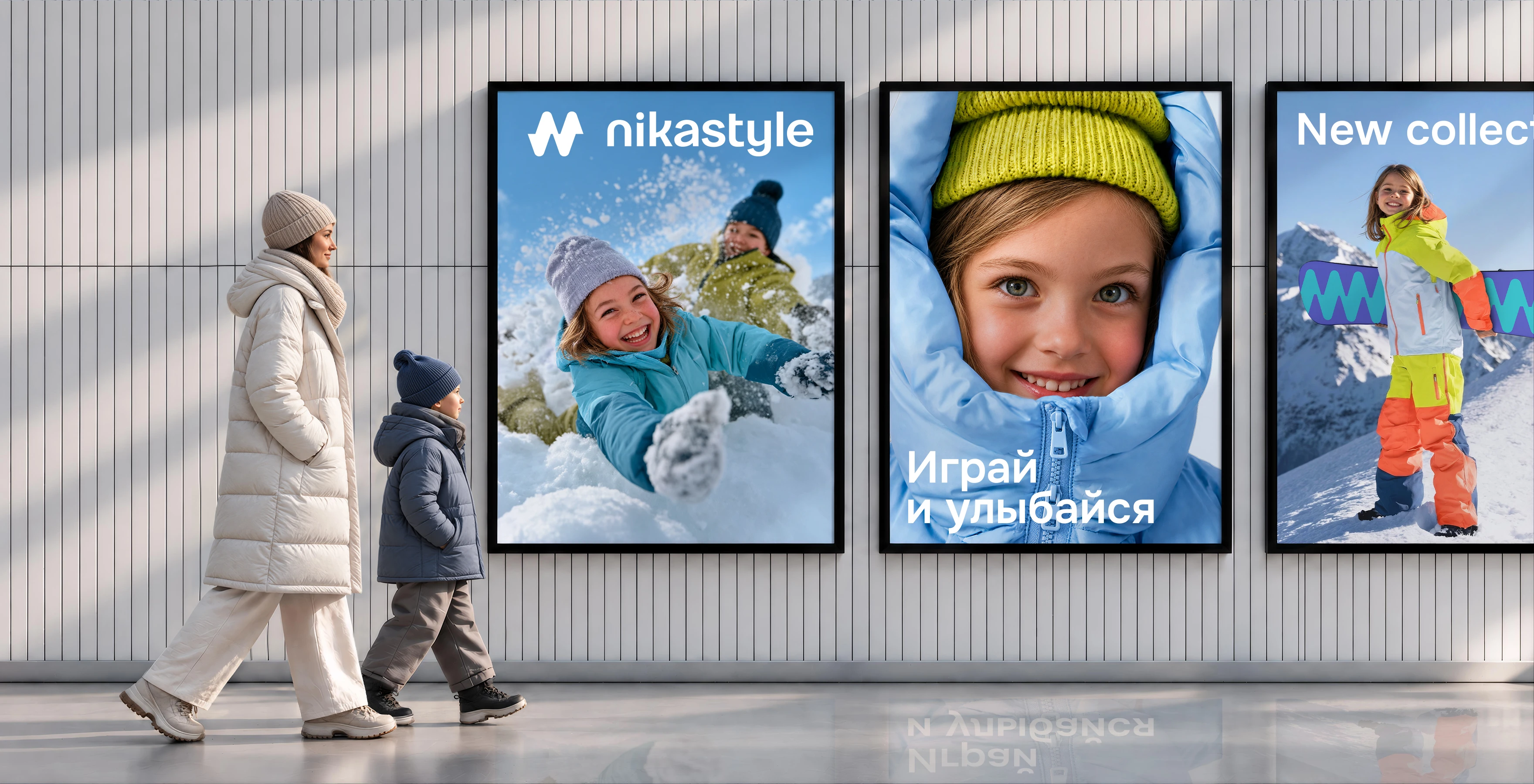
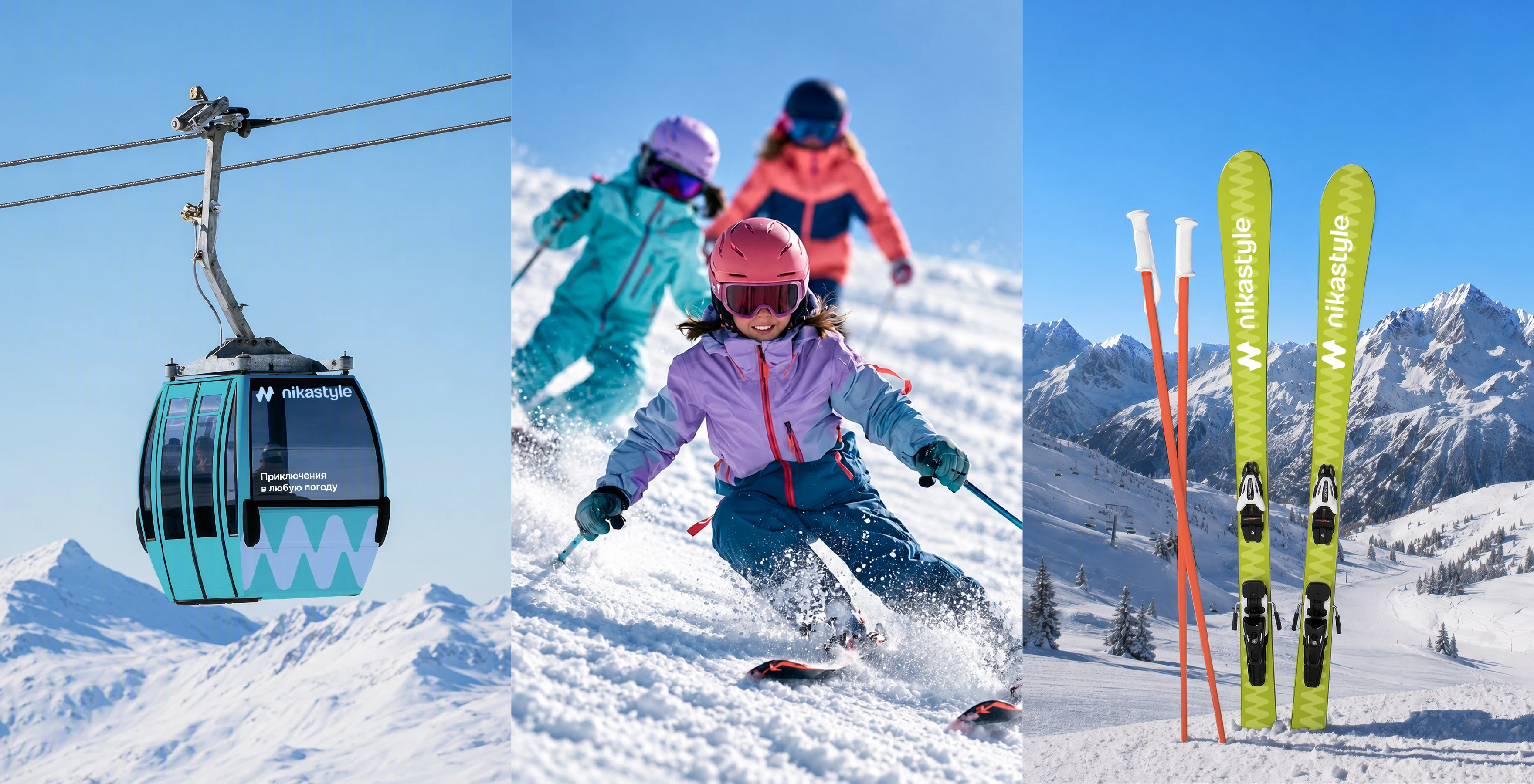
Advertising design centers on children's genuine emotions and the joy of movement. Winter games, walks and skiing show NIKASTYLE clothing in relatable settings. Close-up imagery and concise messages convey the brand's mood at a glance, while branded graphics bring the scenes together into a coherent series.
The communications speak to children and parents alike. Children respond to play, independence and discovery. For parents, their children's comfort and safety come first. Images of outdoor activities bring these expectations together. Branding concepts for ski resorts demonstrate how the NIKASTYLE identity can extend into settings that reflect the product's character and purpose.
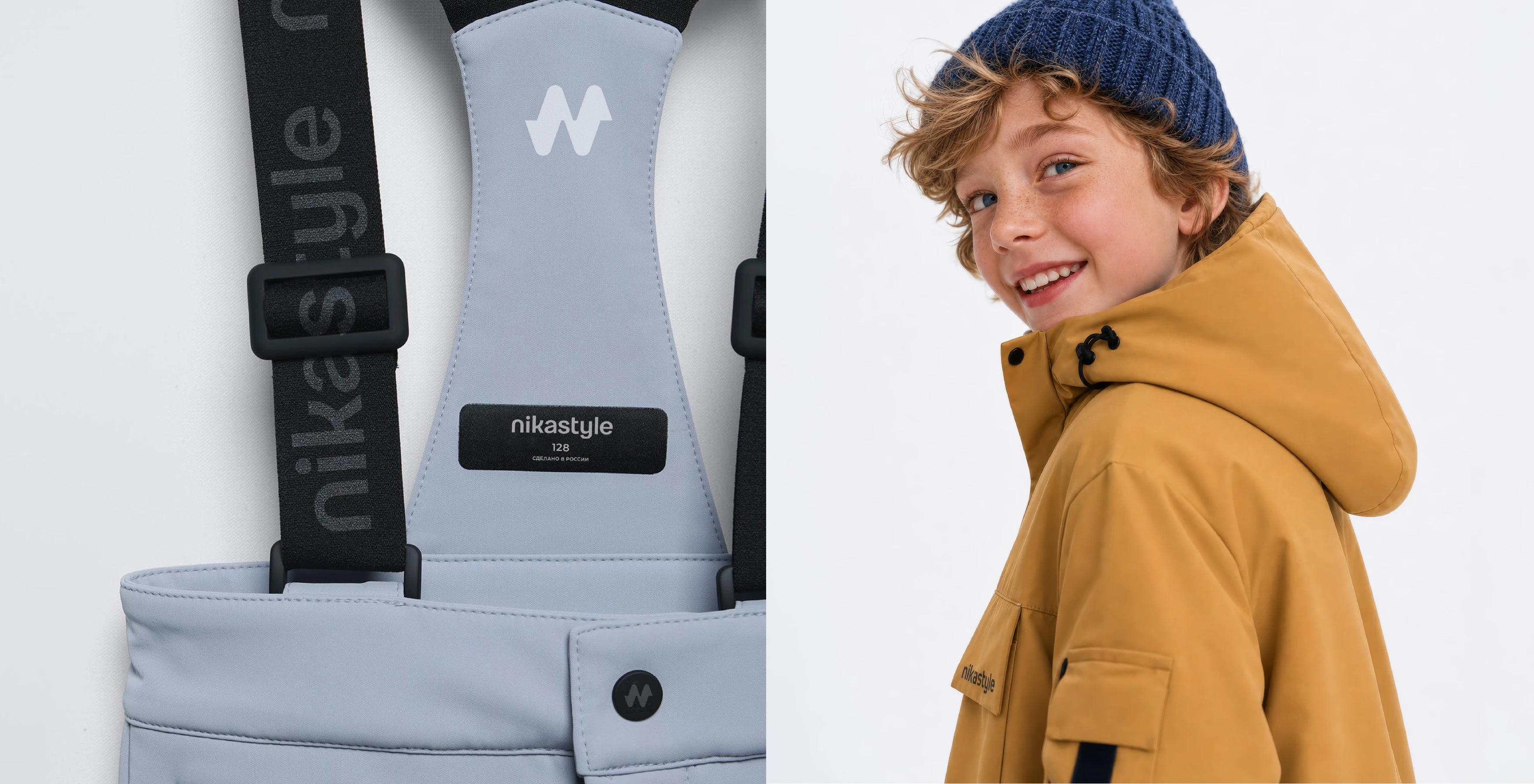
Clothing label design and a coordinated system of hang tags formed an important part of the project. Colorful hang tags draw attention to the brand, while compact labels and patches maintain its presence on the garments themselves. The balance between the logo, brand name and product information is tailored to each format, keeping the identity clear in both large graphics and small labels.
The brand symbol unites elements with different materials and functions, from patches on knitted hats to branded straps and hardware. These details connect each garment with the identity the family has already seen in advertising and in store. The visual strategy creates continuity throughout the customer's experience of the product.
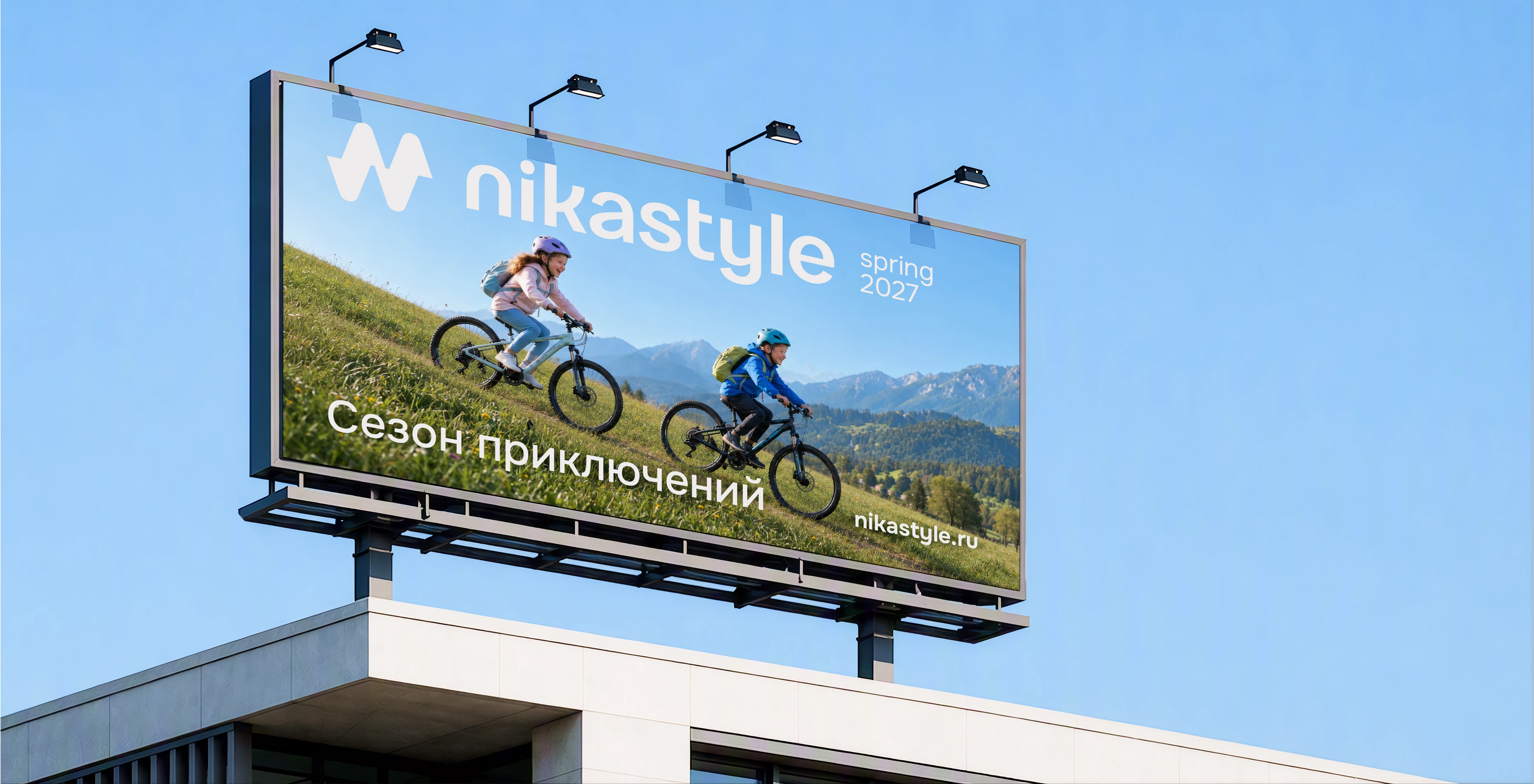
The advertising system spans digital and outdoor formats. Vertical social media layouts focus on the children, clothing details and short, emotive messages. On a large billboard, the same idea is conveyed through a large-scale image and a clearly legible logo. Brand colors and the symbol's distinctive contours maintain consistency across formats.
Changing seasons expand the brand's story, with cycling routes and woodland walks following snowy slopes. The visual strategy allows the scenes, characters and collection highlights to change while preserving a consistent mood. NIKASTYLE stays with children throughout the year as they move, play and discover the vast and wonderful world around them.
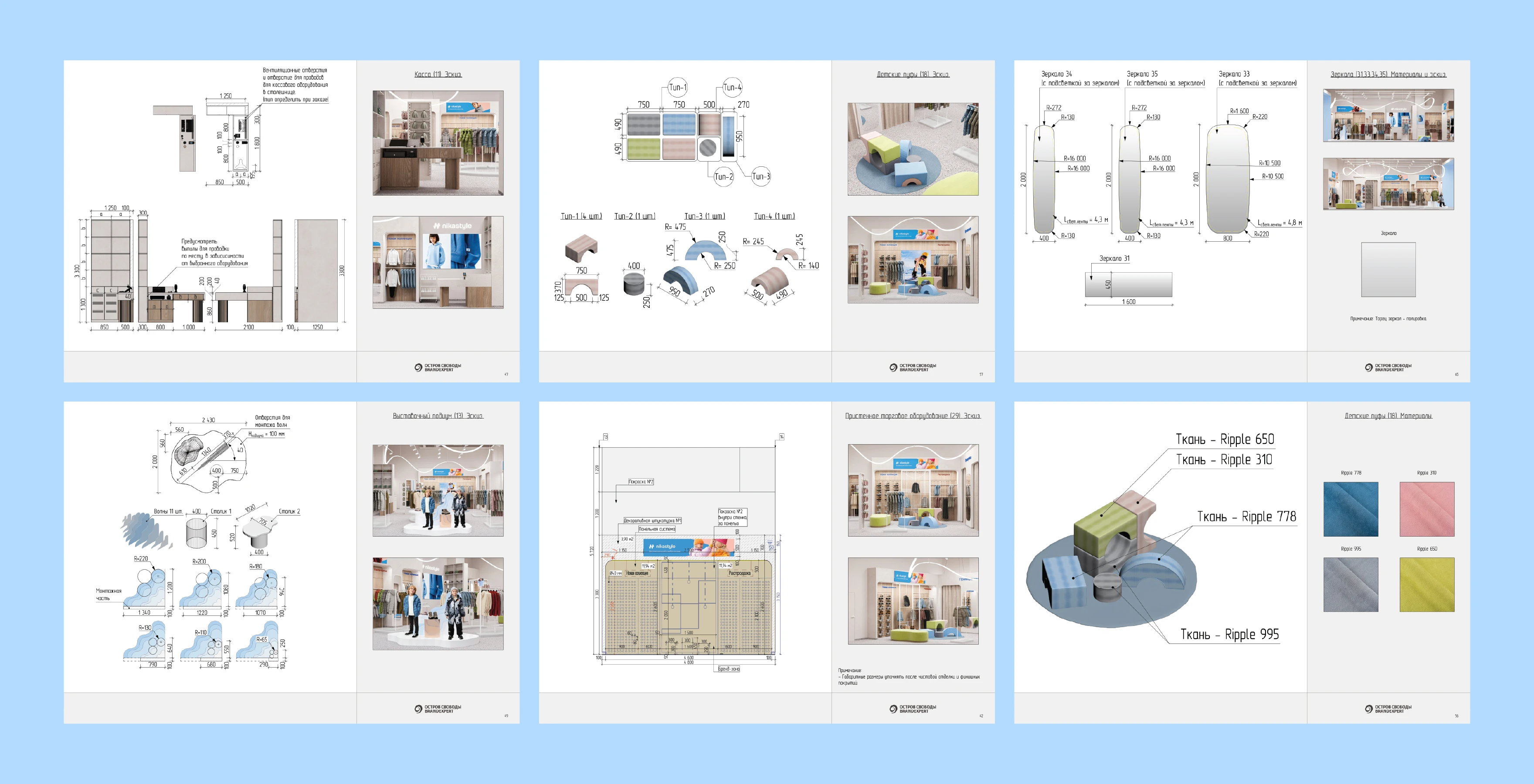
The project resulted in a cohesive visual system unifying the brand, its products, advertising and its own retail stores. The BRANDEXPERT Freedom Island team united the clothing's technical performance with NIKASTYLE's emotional appeal, establishing a consistent approach to future brand communications.
The brand's retail chain continues to grow. Each store gives families a more personal experience of NIKASTYLE: they can explore the collection, try on a favorite item and make sure their child feels comfortable in it. The refreshed identity strengthens that trust and invites families to set out on new adventures.
Provided services:
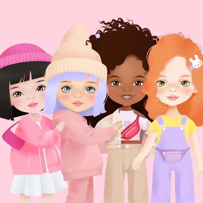 SWEET SISTERS. BRANDEXPERT agency has developed a new unique doll brand SWEET SISTERS for the largest Russian manufacturer of children's goods ORANGE TOYS.
 Сonstellation of dreams. The "Constellation of Dreams" is a new brand of children's clothes for sleep and rest
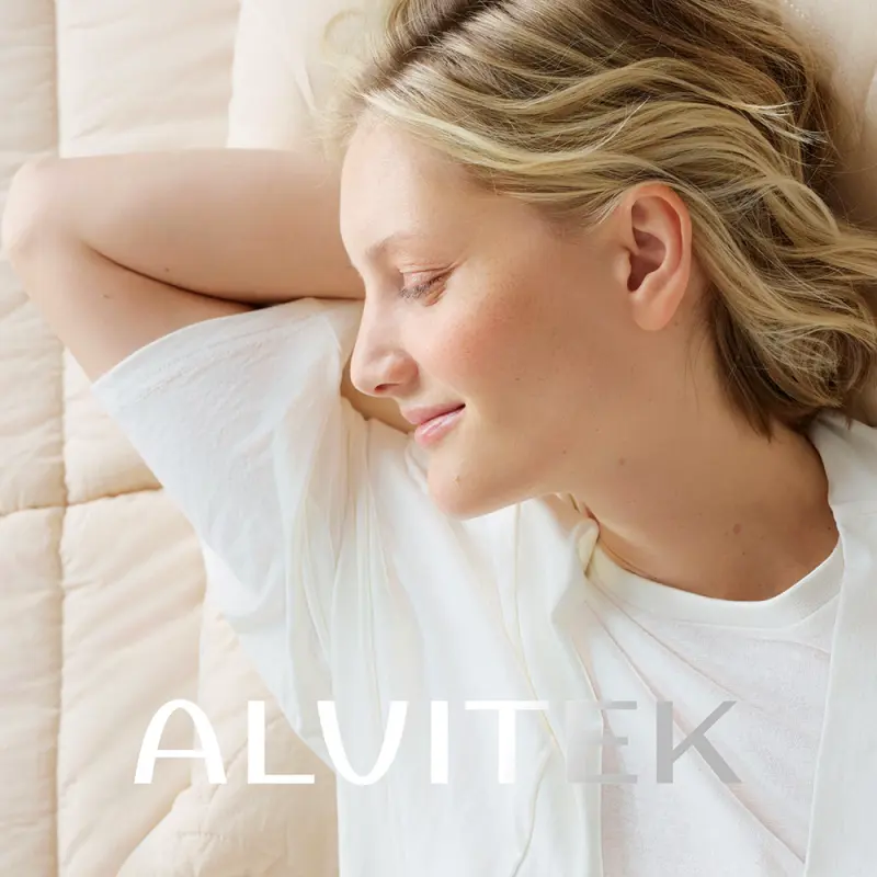 ALVITEK Rebranding: Logo Design, Packaging and Label Design, Photo and Video Production, Advertising, Marketplace Content and Website Development. BRANDEXPERT rebranded ALVITEK with a new visual strategy and logo, packaging and label design, professional photo and video production, advertising, marketplace product cards and a brand website.
 HILBERD Rebranding and Packaging Design. HILBERD logo and brand identity design, packaging and label design, and professional product photography for the international brand’s limited-edition collection for the Russian market.
Other projects in the similar business segment
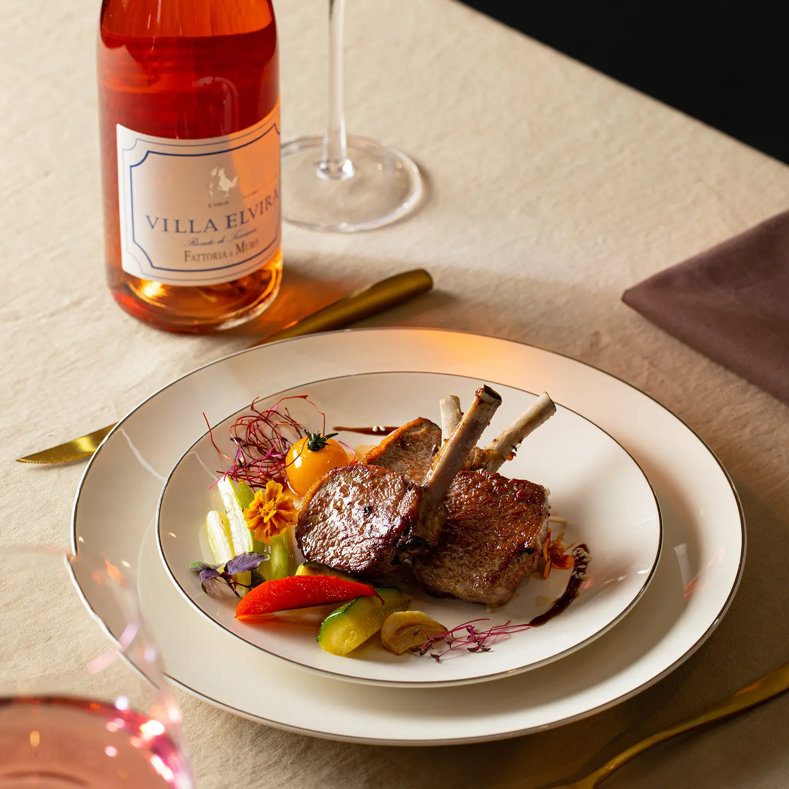

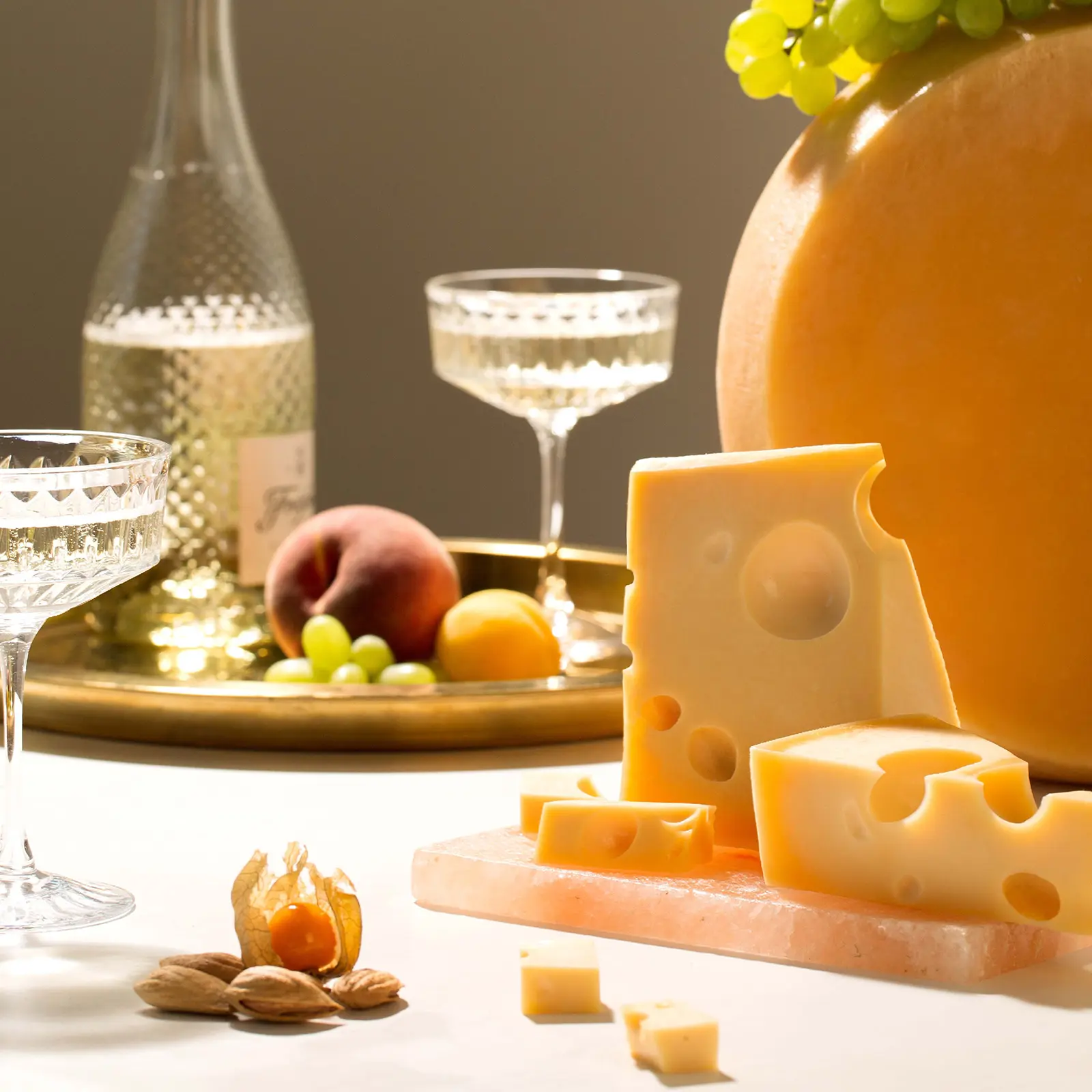

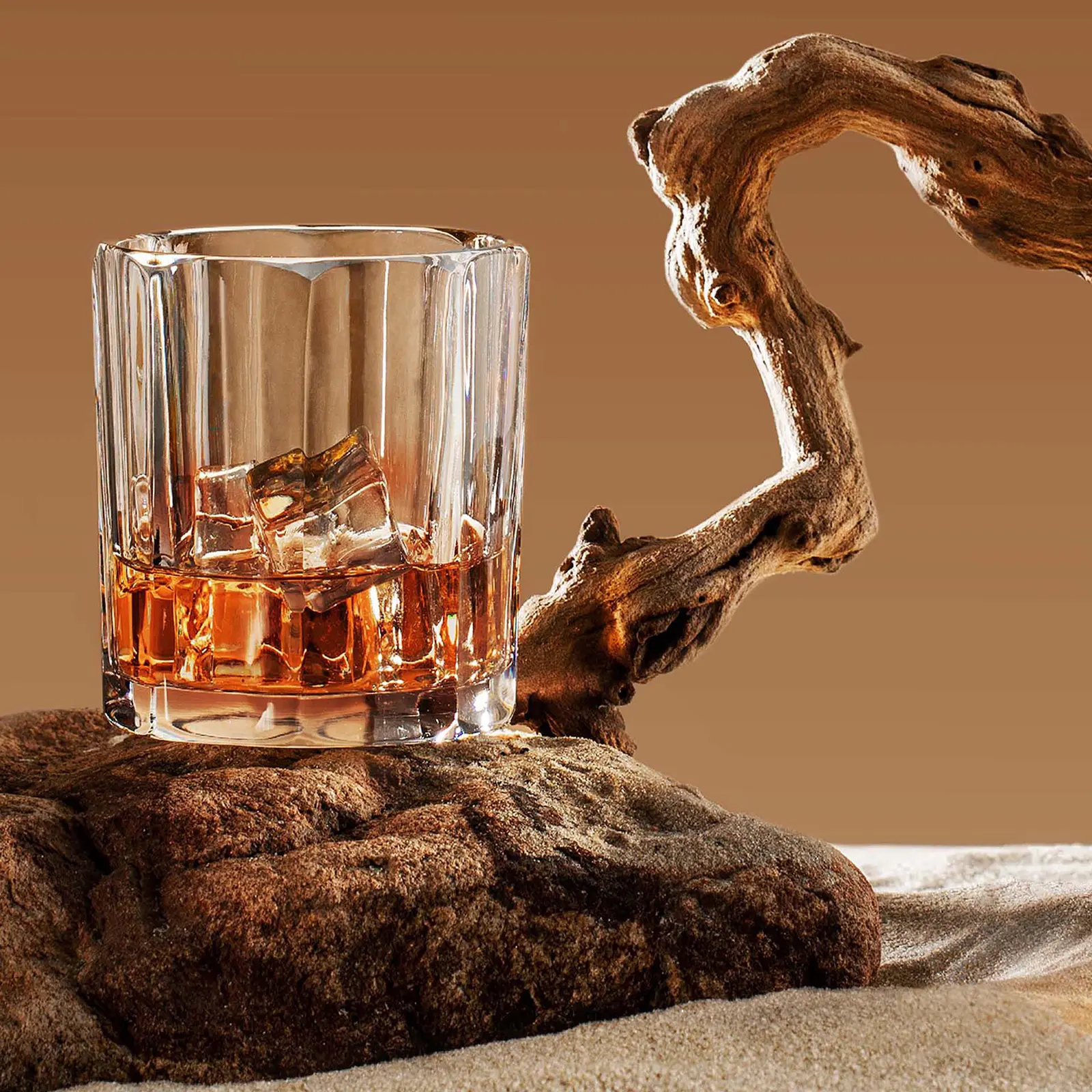




We’re Here to Advise You on Any Branding Challenge
Dear partners, your project is unique and deserves a tailored approach. To prepare a relevant proposal, we need to understand your goals and the services most needed to deliver the best results. We’re ready to provide 360° support and handle all strategic tasks in marketing, design, digital, and brand communications. Our mission is to deliver outstanding solutions that drive financial growth and increase brand value. Get in touch — we’ll be happy to share our expertise and insights with you.
The BRANDEXPERT Team.
The BRANDEXPERT Team.