Zhivopisny Sad — Brand Development, Naming, Logo Design, Advertising Communications, and Print Design
BRANDEXPERT Freedom Island created the brand for Zhivopisny Sad (“Picturesque Garden”), a residential development by DARS. The project included brand naming, logo design, and brand identity design. DARS operates across Russia and has delivered major projects in construction, engineering, and real estate development since 2001. Its new project in Khabarovsk is a modern residential community comprising 25 apartment buildings in an area with strong development potential. Plans for the district include a new school and three preschools, two of which will be located within the residential community, as well as gated parking areas. Particular attention is being given to outdoor spaces, with an emphasis on landscape design.
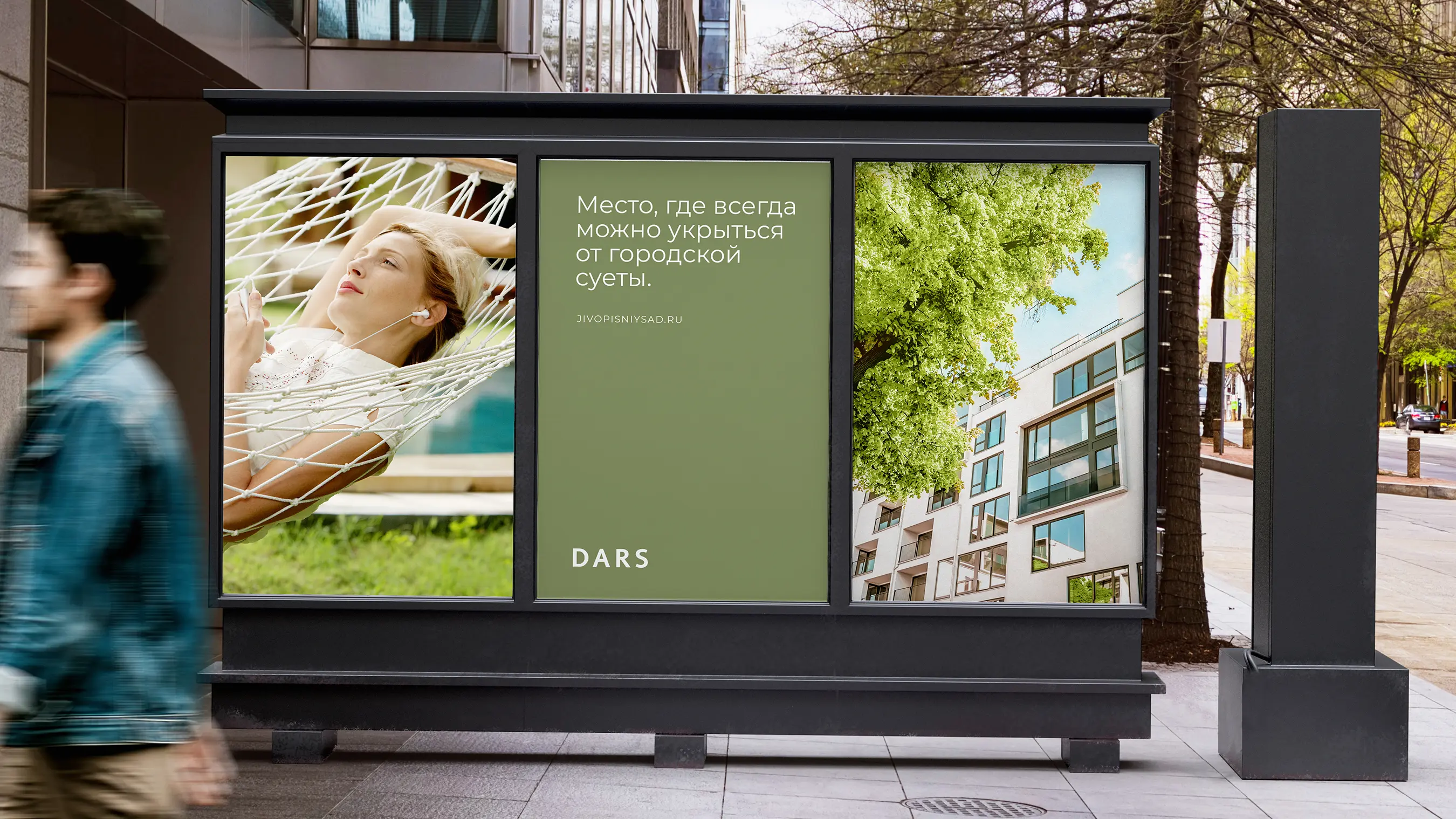
To establish the strategic positioning of DARS’s new residential development in Khabarovsk, BRANDEXPERT “Ostrov Svobody” delivered comprehensive real estate branding that expressed the project’s concept and communicated it effectively to the target audience. The name Zhivopisny Sad evokes a beautiful, comfortable, and welcoming place to live, bringing together aesthetic appeal and environmental values. The name suggests that residents will enjoy beautiful views and walks through green spaces, as well as comfortable, cozy apartments.
Zhivopisny Sad reflects the idea of preserving nature and green spaces within the development to create an attractive, comfortable living environment. The concept emphasizes environmental awareness and care for nature. The name also evokes a quiet, cozy place to live, where residents can enjoy a peaceful atmosphere away from the bustle of city life.
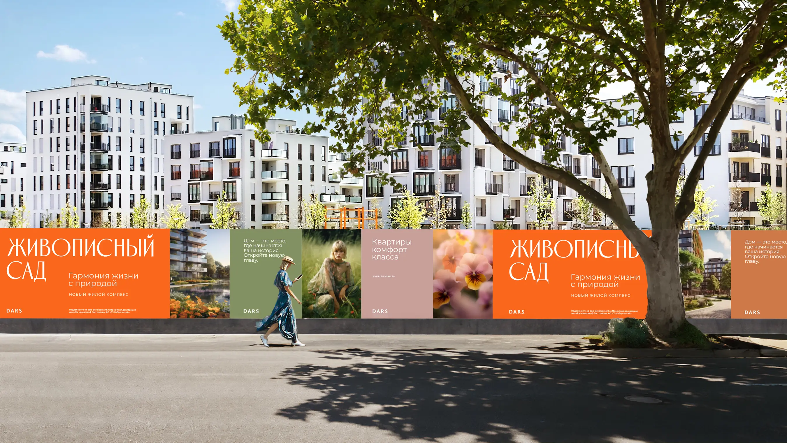
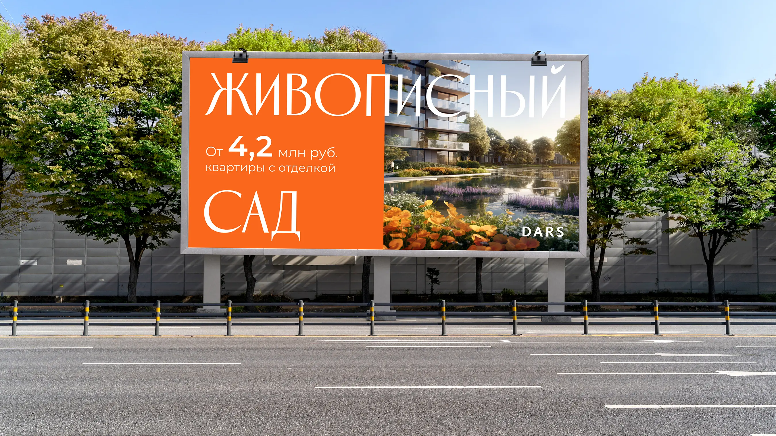
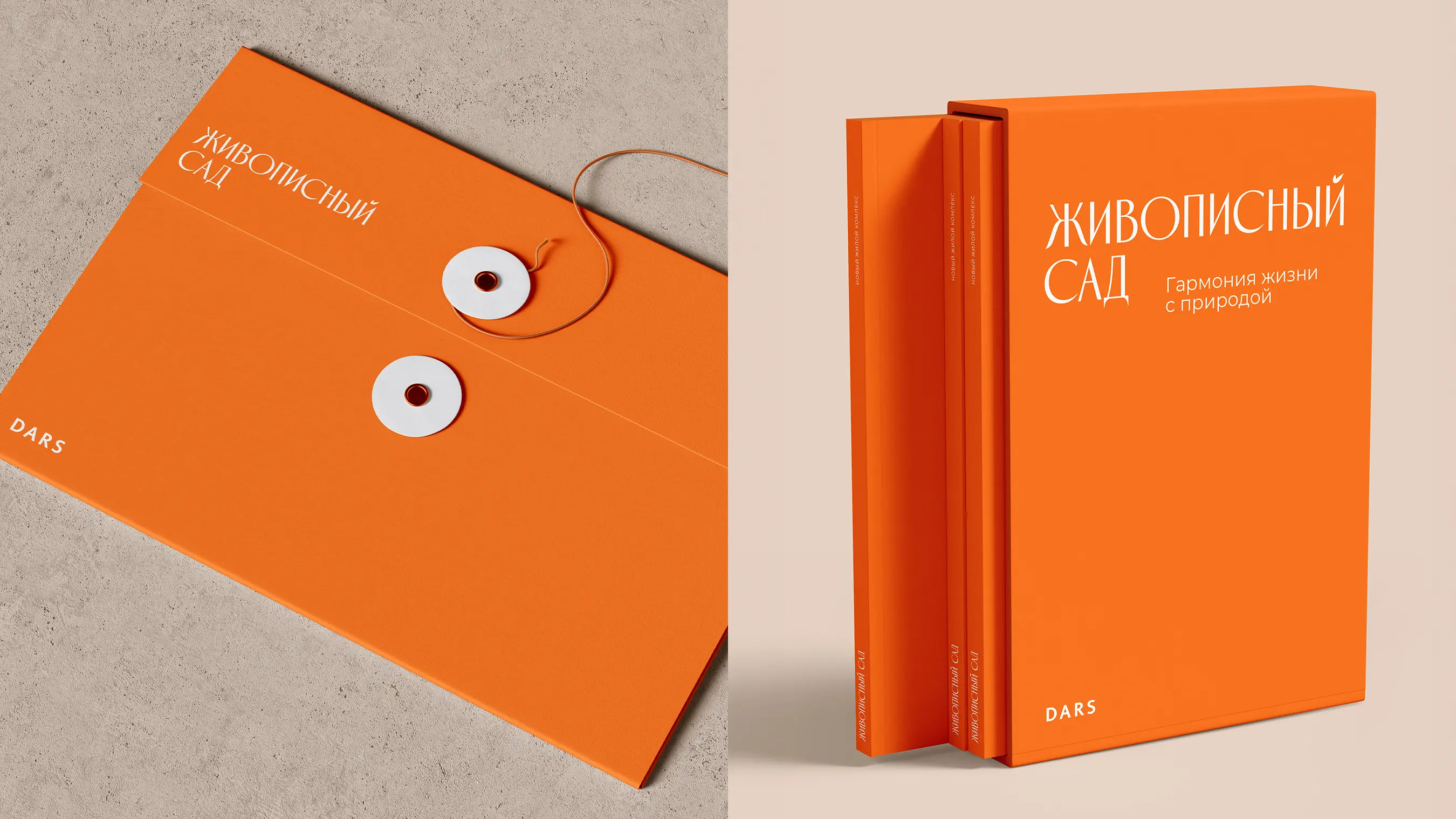
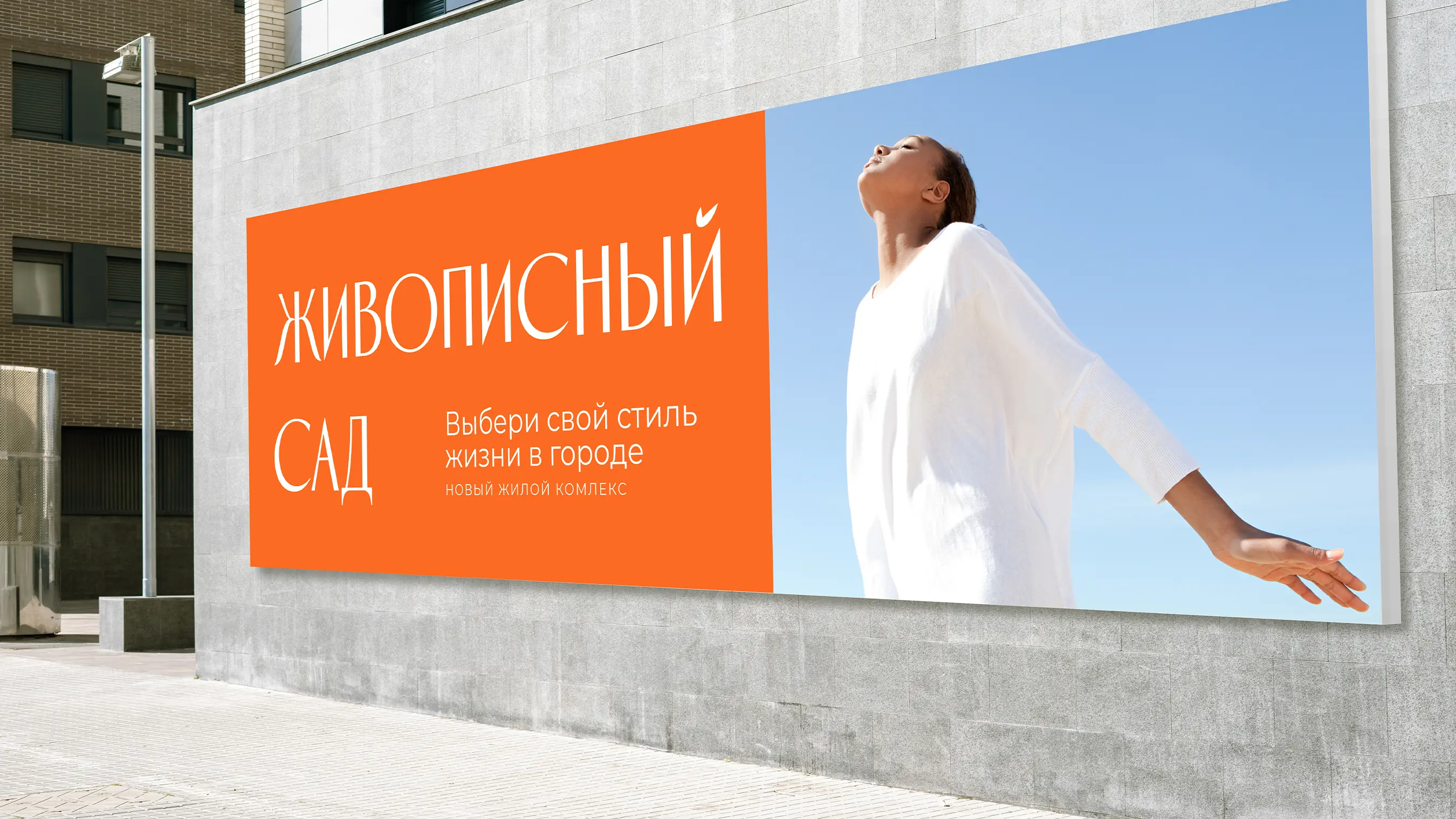
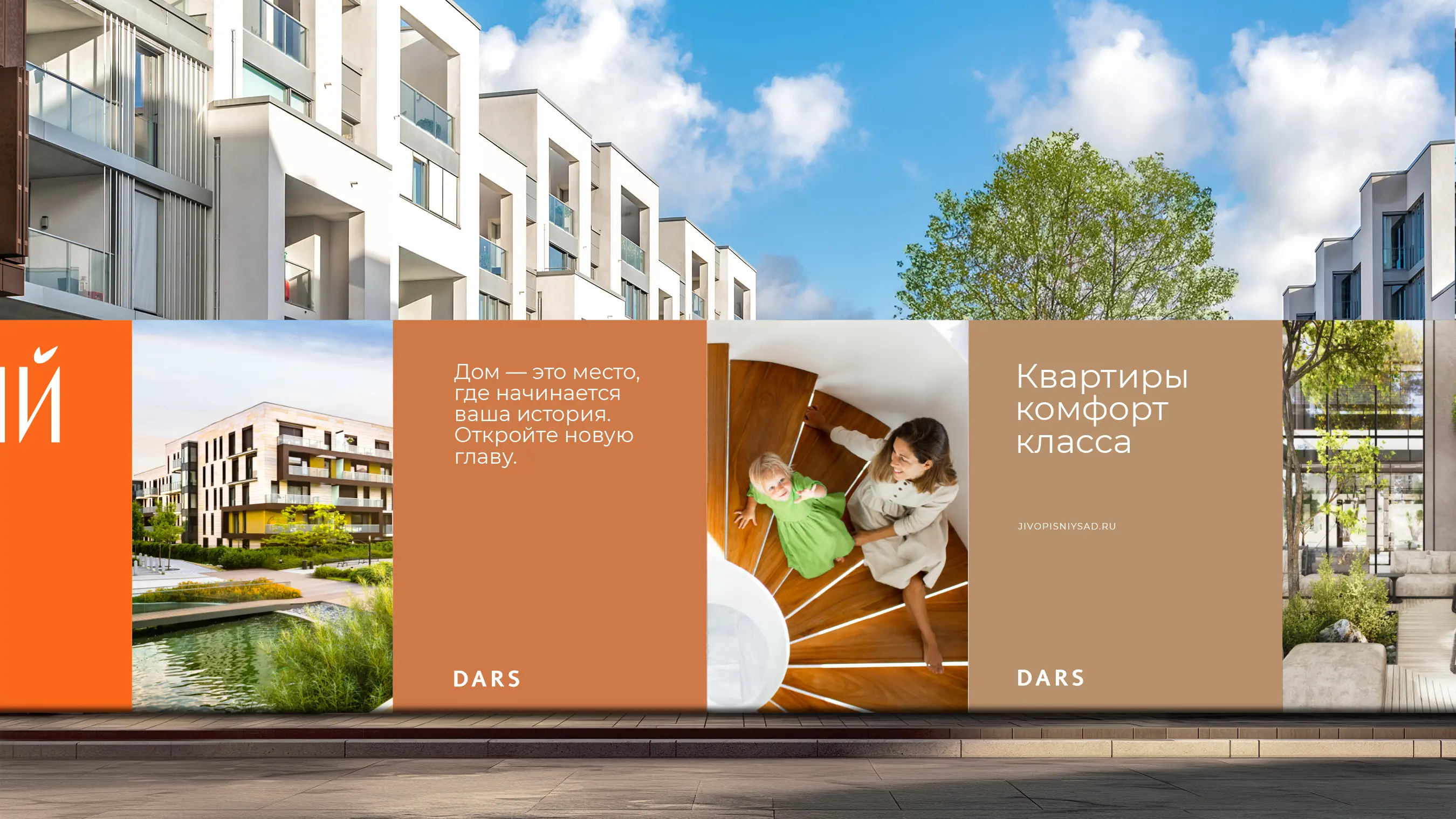
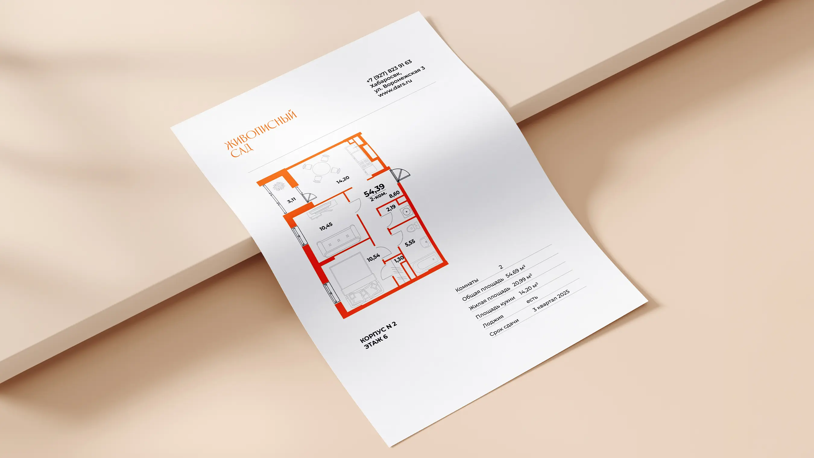
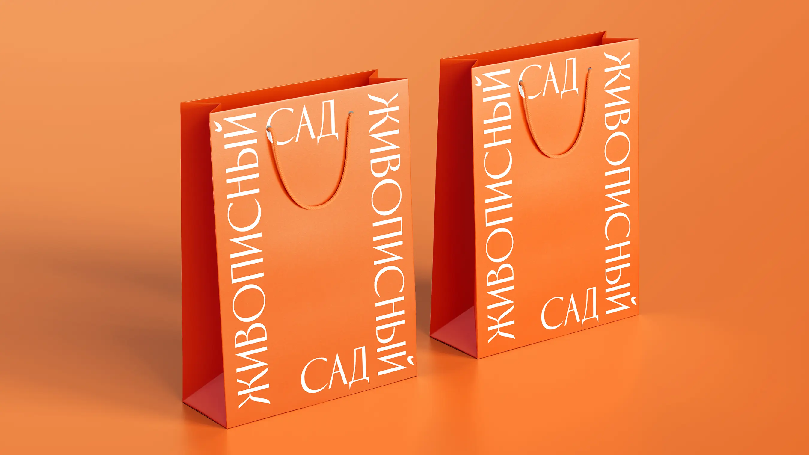
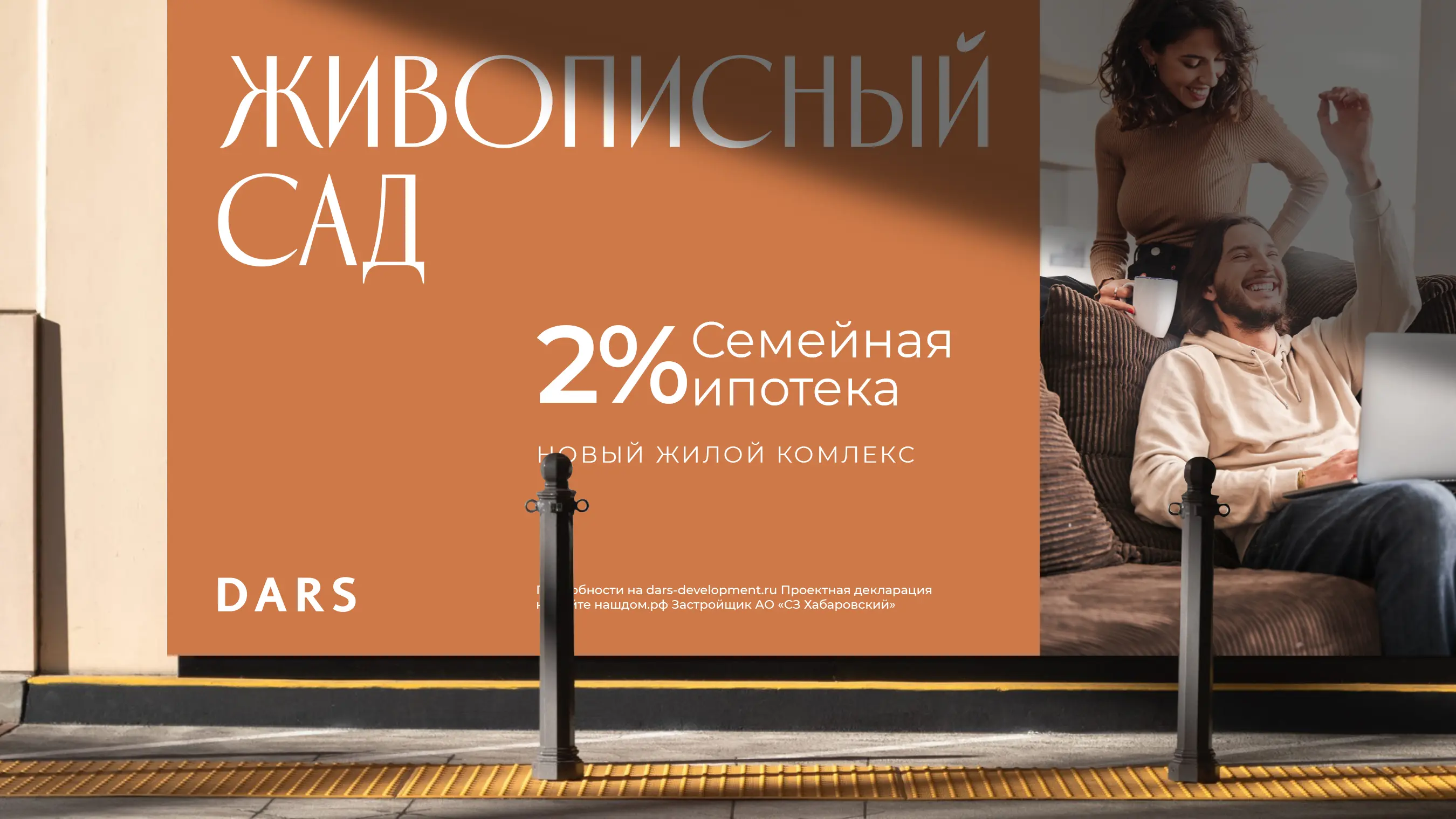
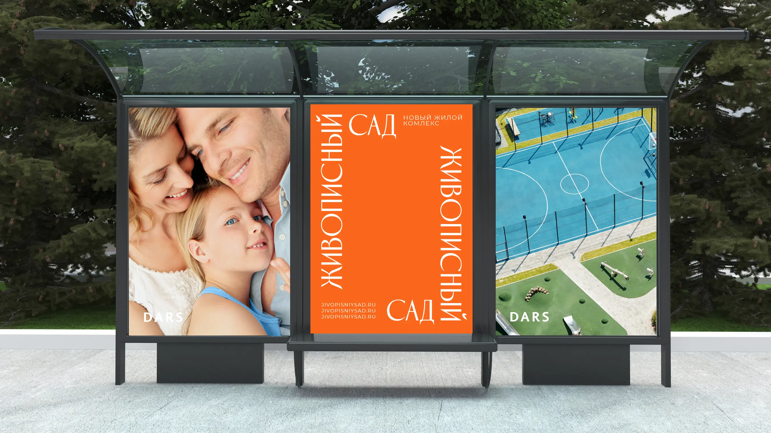
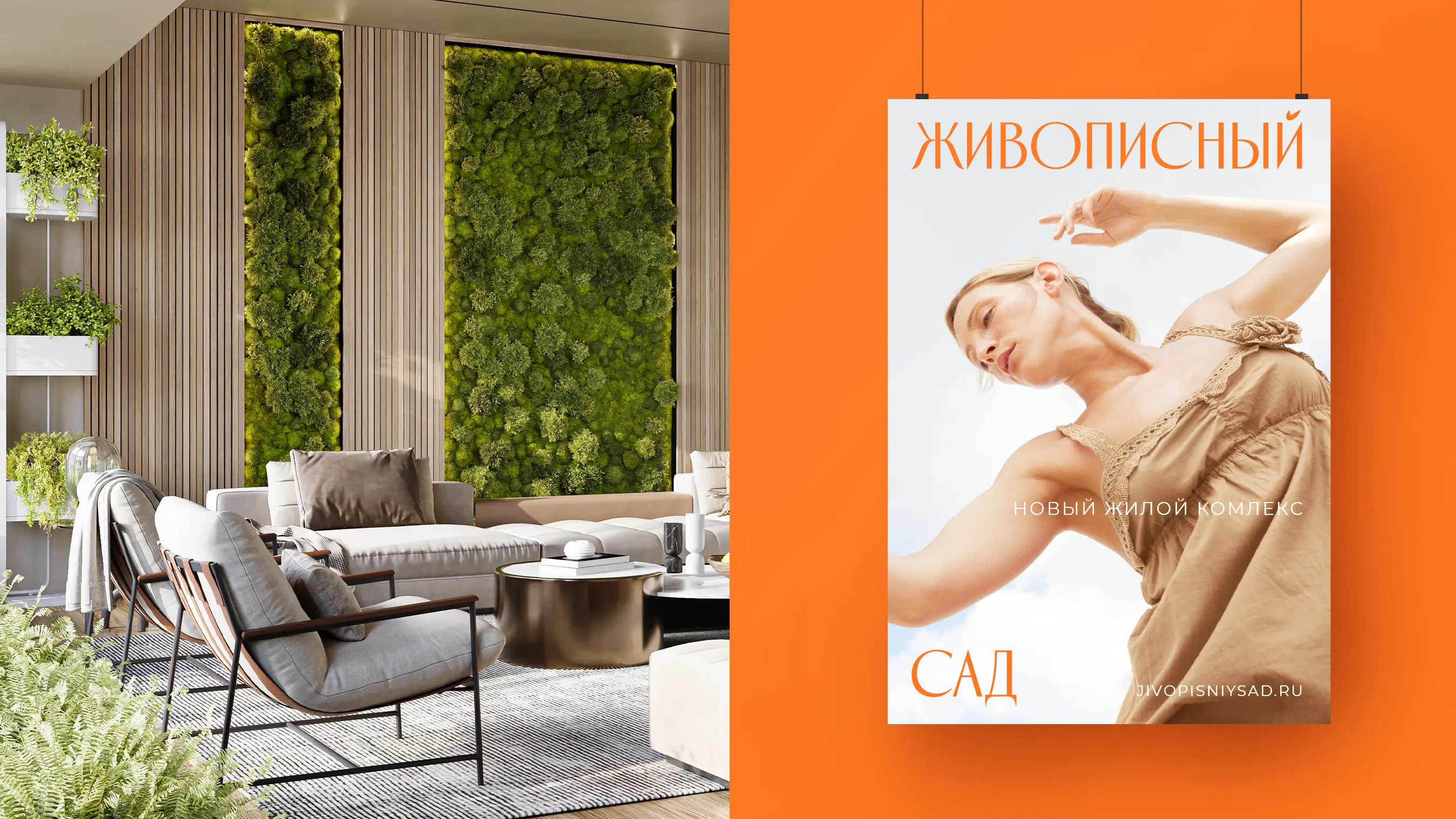
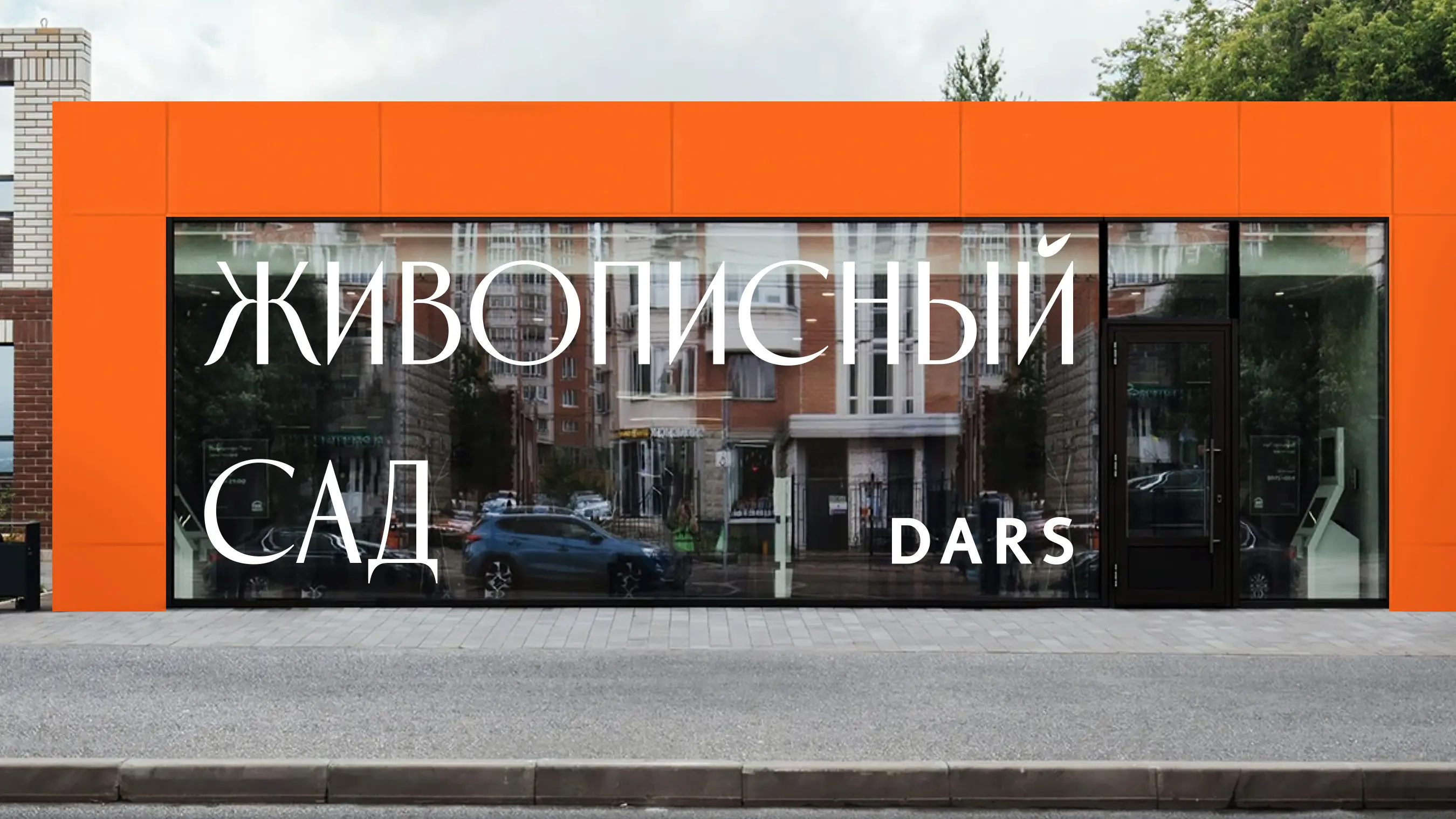
The logo and brand identity design for Zhivopisny Sad create a consistent brand image, reinforce the development’s concept, and support effective visual communication with its target audience. Orange brings energy and vibrancy to the brand, preserving its connection with nature and giving it a distinctive, dynamic character. The typography of the Zhivopisny Sad logo conveys professionalism and style and aligns with the brand’s overall image as a place of beauty, comfort, and harmony with nature.