BAUSTERN — Elevator Manufacturer Branding: Naming, Brand Positioning, Logo Design, Visual Identity and Website Design
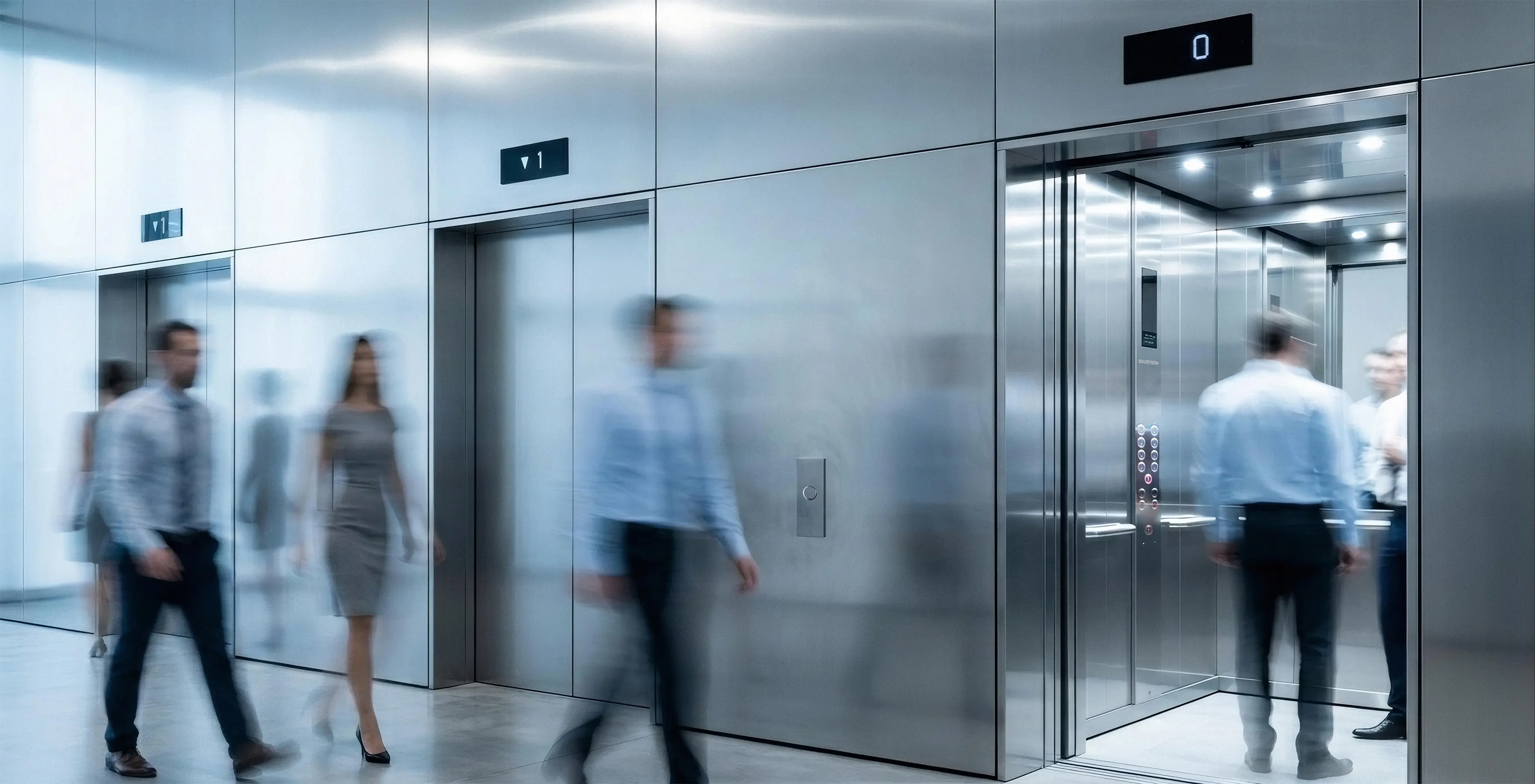
BAUSTERN is the passenger and freight elevator brand of TverLiftMash Production Association, a Russian elevator manufacturer. The company designs, manufactures and installs elevator systems for residential buildings, office buildings, industrial and logistics facilities, shopping centers, healthcare facilities and other building types. Its in-house engineering and production capabilities allow the company to tailor each solution to the project and support clients from structural design coordination through installation and commissioning.
BRANDEXPERT Freedom Island was commissioned to create a modern, independent elevator brand that would express the company’s accumulated engineering expertise and speak clearly to both professional audiences and end users. The new identity had to work equally well in communications with property developers, architects, design engineers, building owners and passengers, conveying quality, safety, reliability, comfort, project-specific customization and contemporary design.
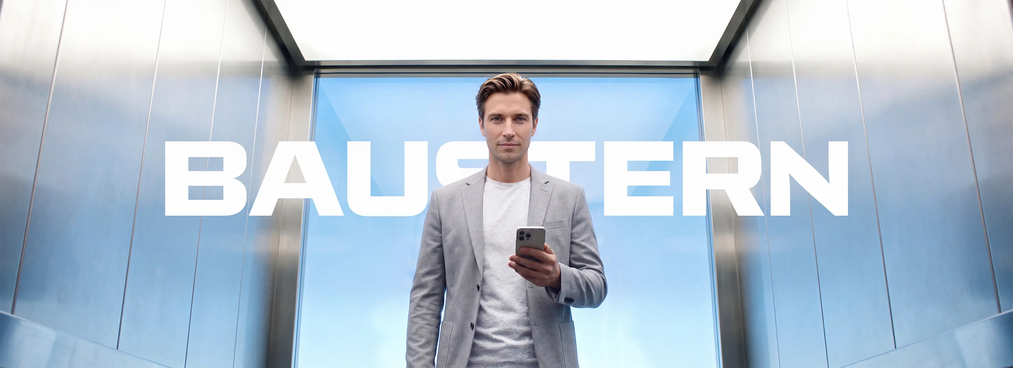
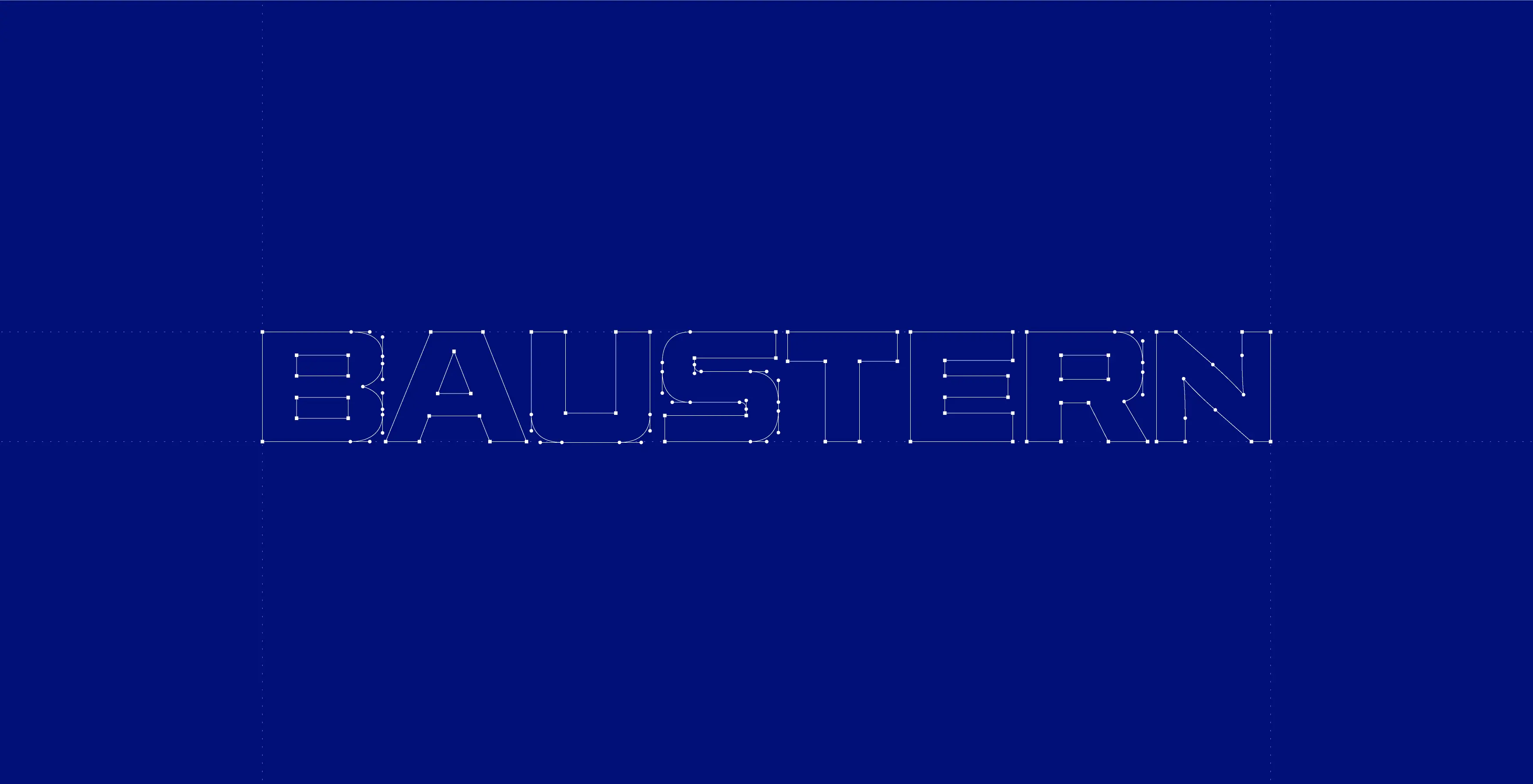
The BAUSTERN logo was designed as a custom wordmark. Wide geometric letterforms, precisely engineered angles and distinctive cuts reference technical drawings, metal structures and the linear geometry of an elevator shaft. Rounded details and open counters make the identity dynamic and contemporary. The wordmark remains highly legible across building facades, equipment, workwear, digital applications and technical documentation.
The name BAUSTERN combines the German words Bau, meaning “construction”, and Stern, meaning “star”. It connects the elevator category with upward movement, high standards and the development of the urban environment. Its concise, international sound gives the brand a technological character while maintaining a direct link to architecture and vertical mobility. This idea evolved into the communication theme “To the Stars and Beyond”.
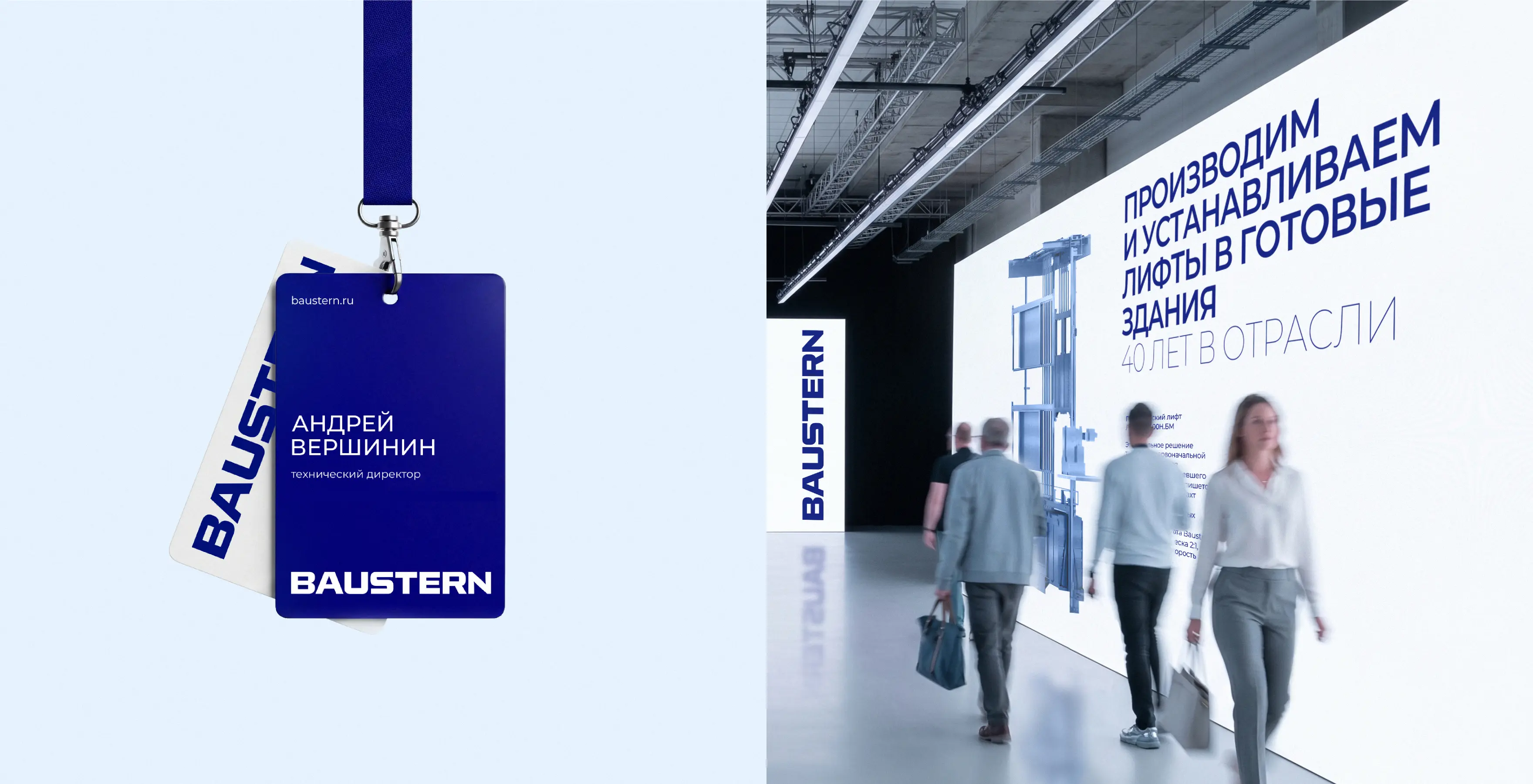
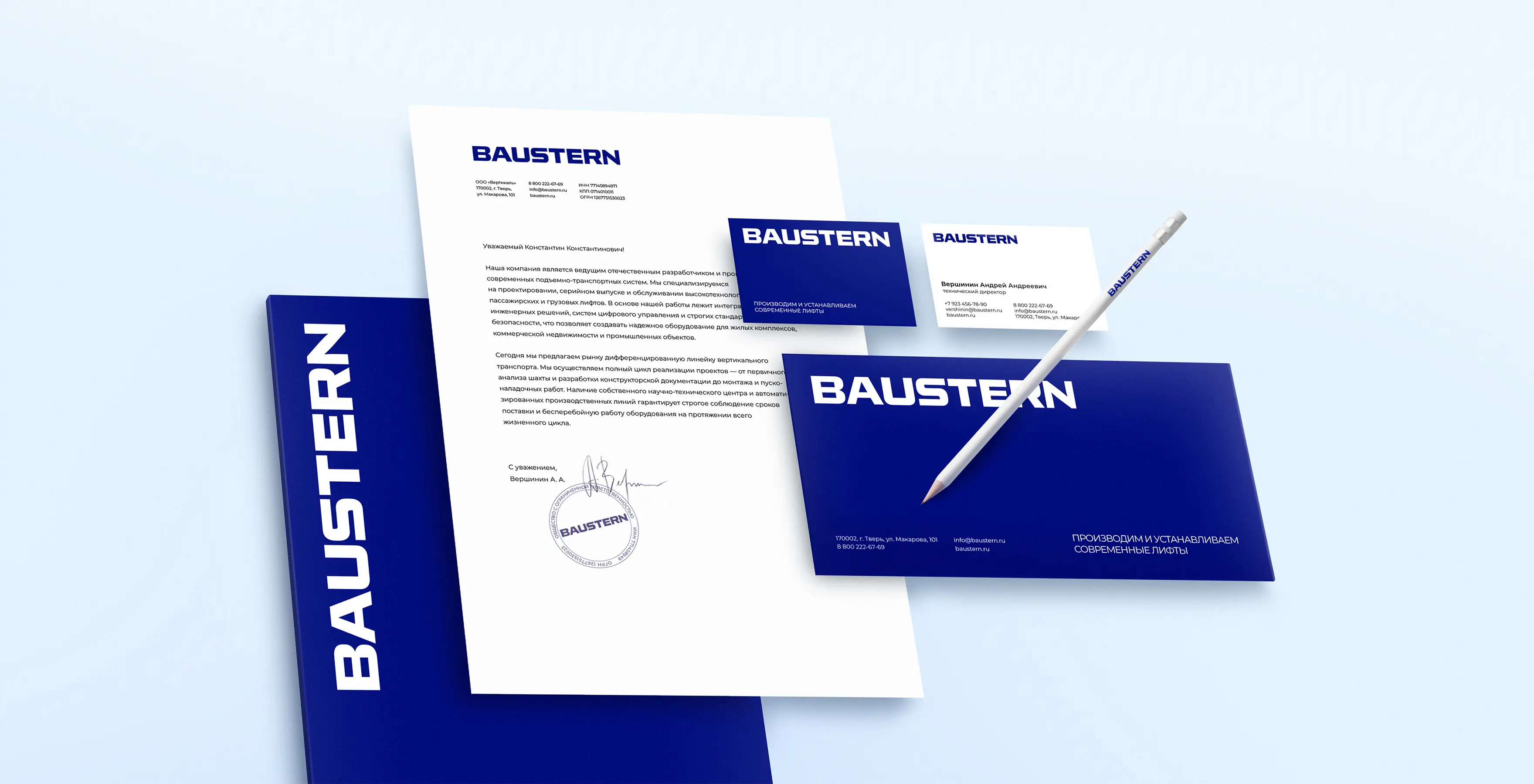
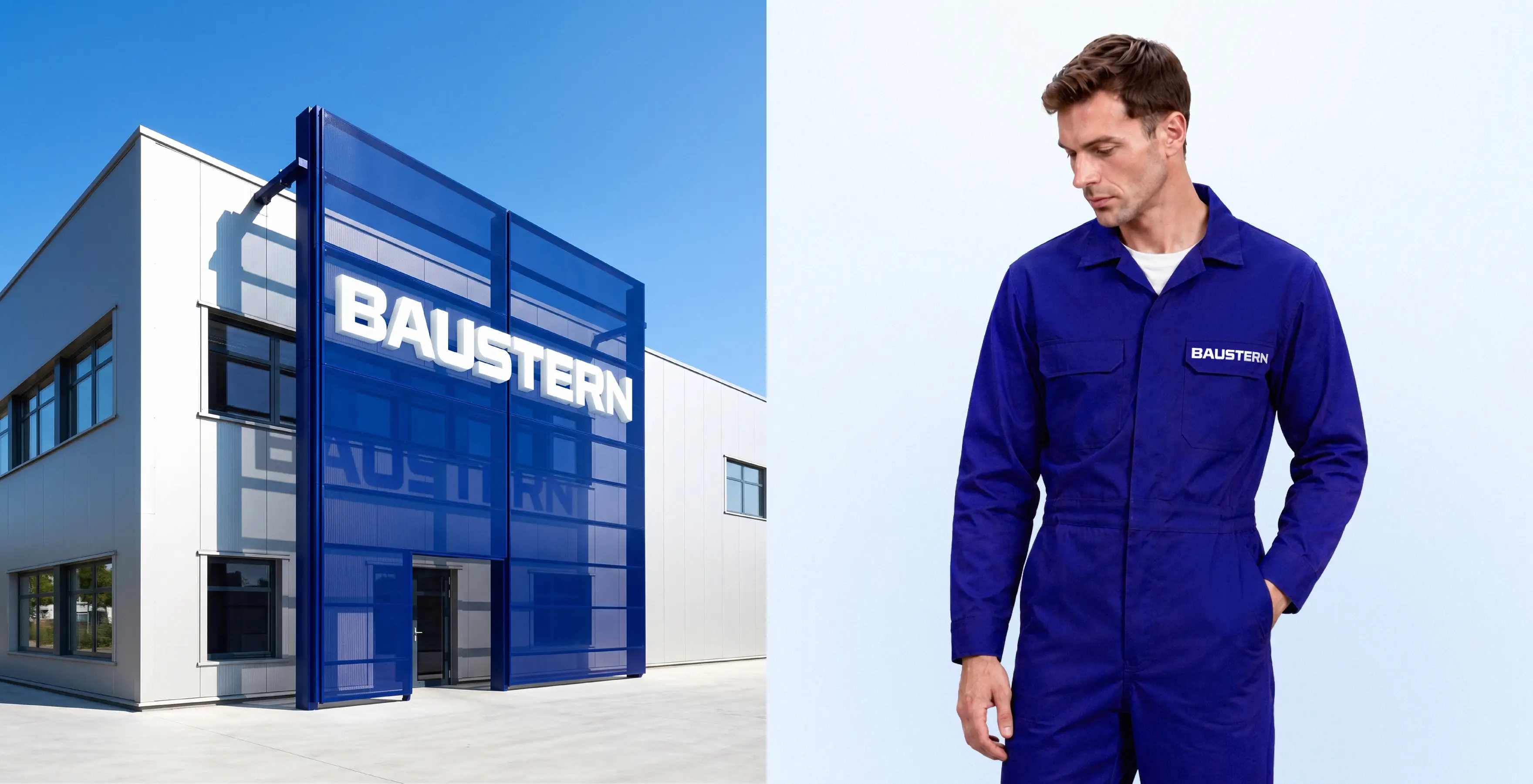
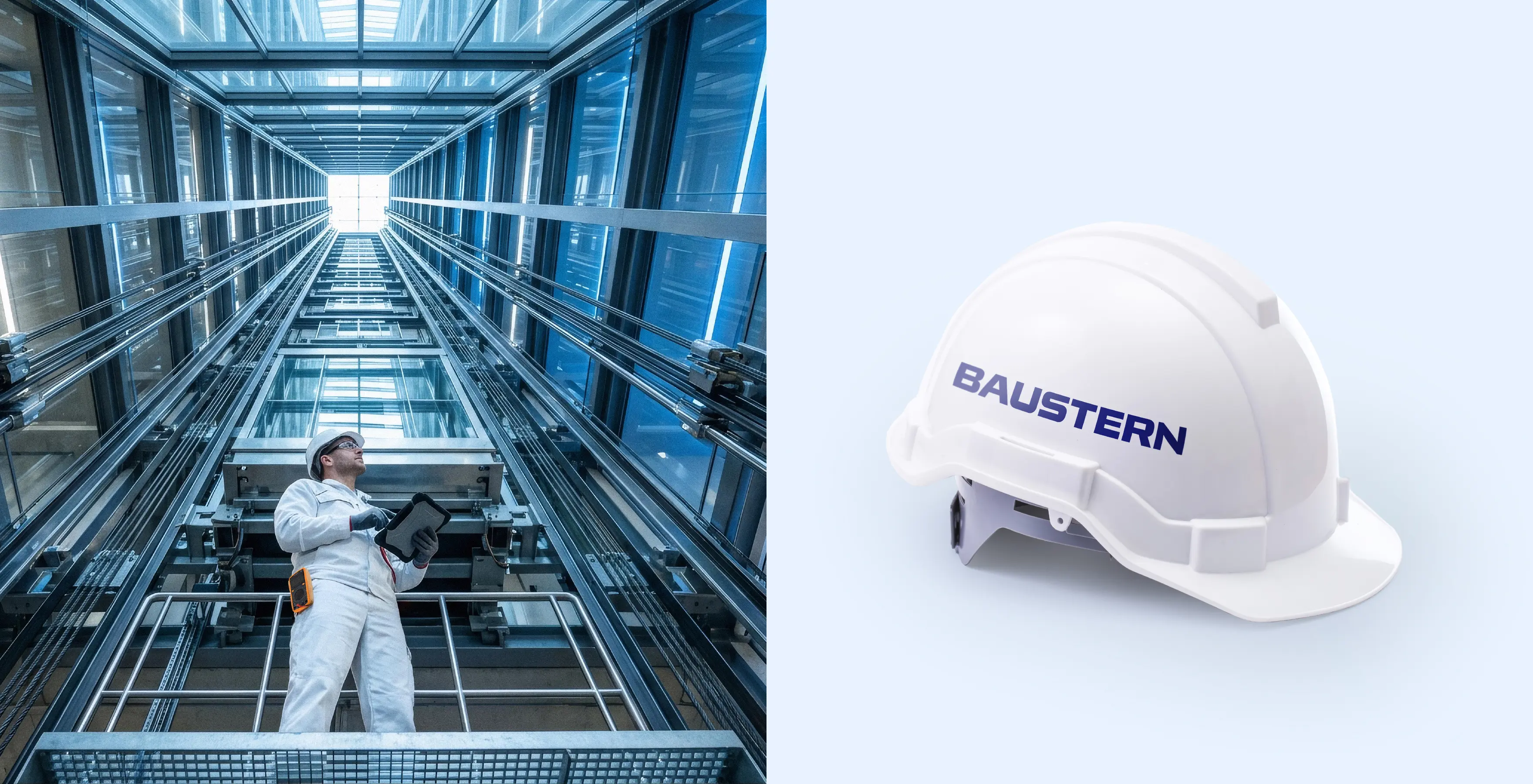
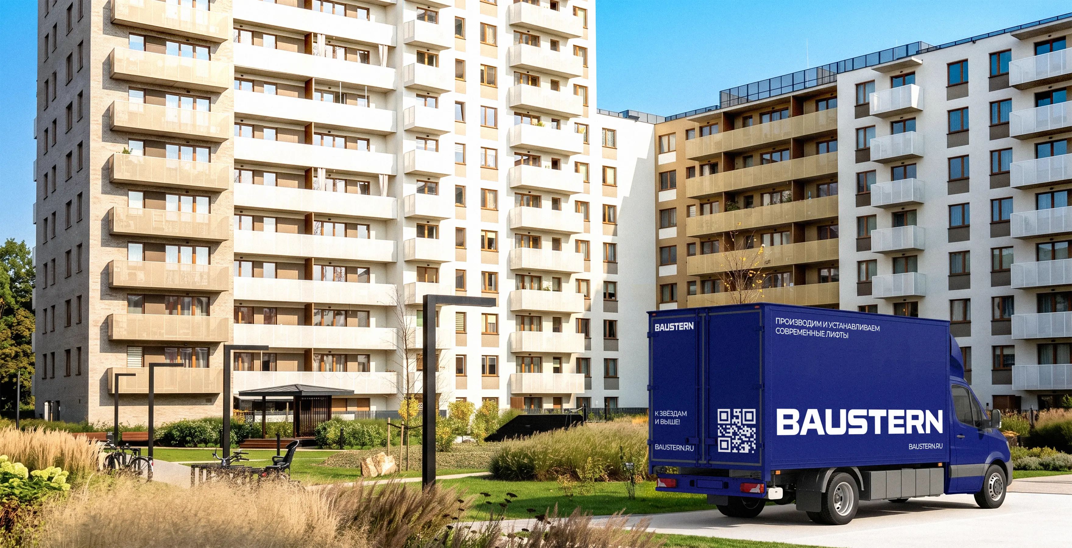
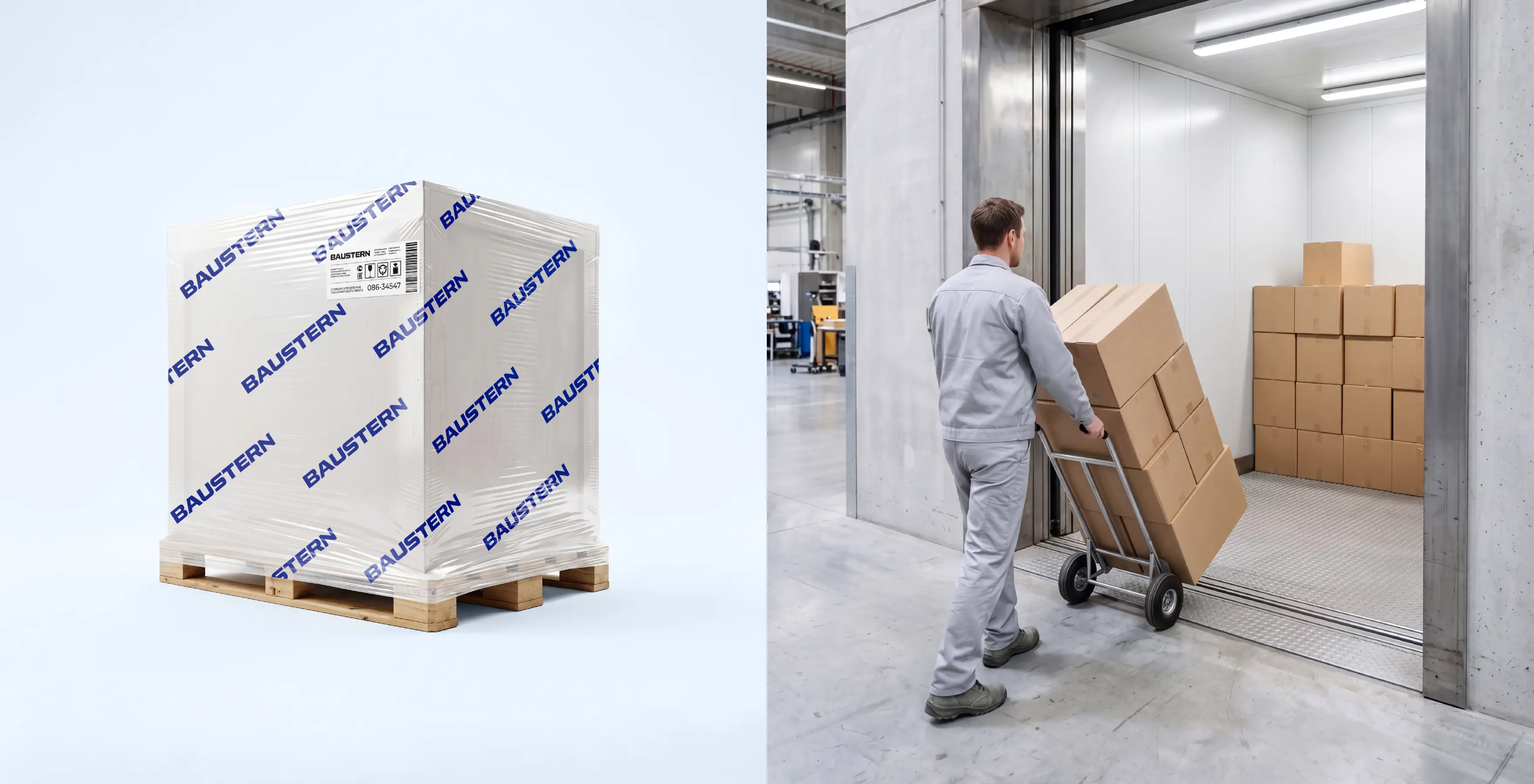
The identity system extends across corporate and technical documents, product catalogs, business cards, the factory facade, employee uniforms and safety equipment, vehicles, event badges and exhibition spaces. A consistent visual and compositional language makes BAUSTERN recognizable across B2B communications, project sites and the urban environment.
BRANDEXPERT also developed the information architecture and website design for BAUSTERN, combining brand presentation with practical product-selection tools. The website was structured to showcase the elevator range and configuration options, present solutions for different building types, explain equipment benefits, provide access to technical documentation and simplify inquiries to the engineering team. Complex information was organized into clear user journeys for property developers, design engineers, building owners and end users.
BAUSTERN’s visual identity is built around deep blue, white and cool silver tones. The palette combines associations with the sky and upward movement with the materials and visual language of the category: steel, glass and light. A large-scale logo, open compositions, a modular grid and a clear typographic hierarchy organize complex technical information and give the brand a confident, contemporary character.
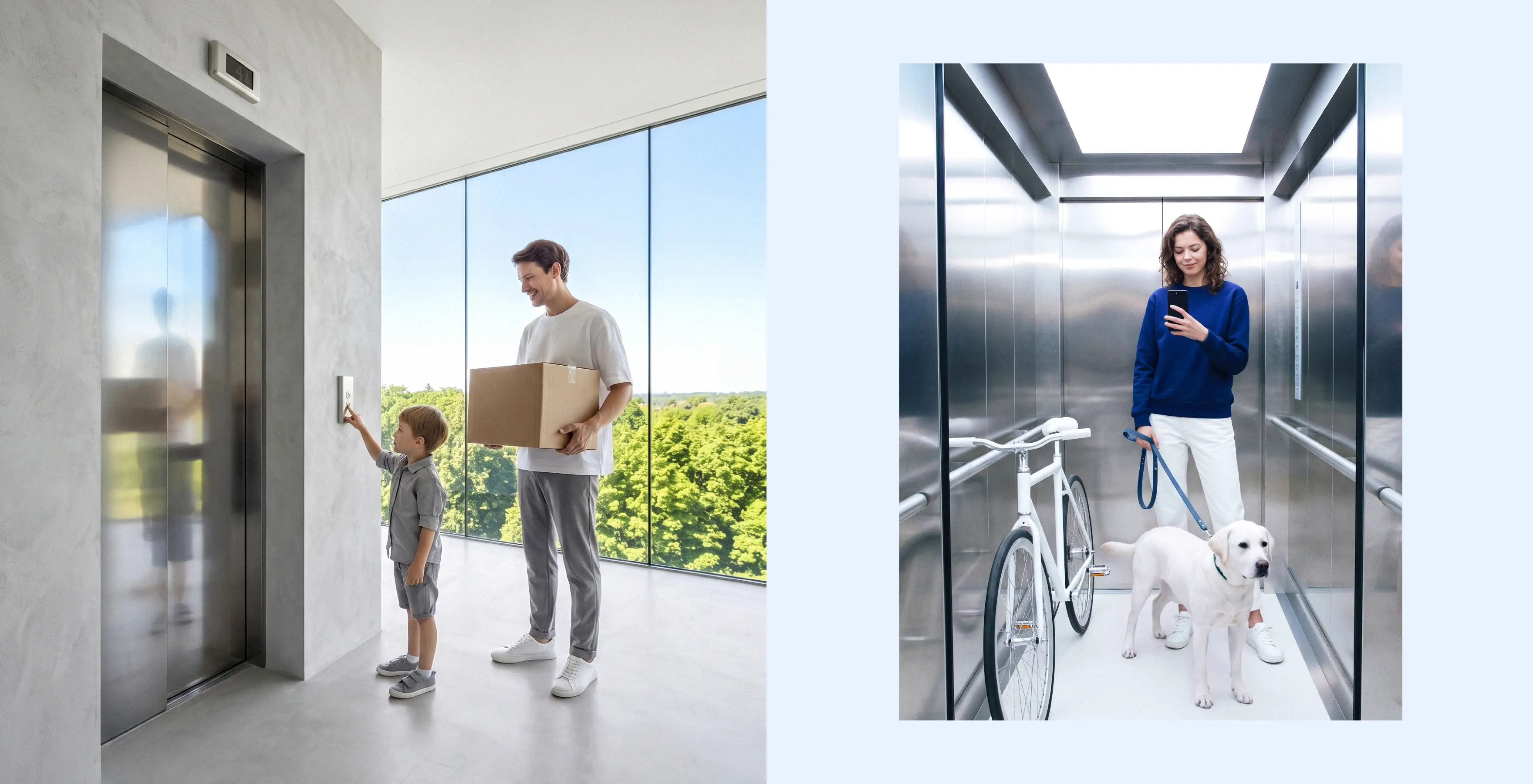
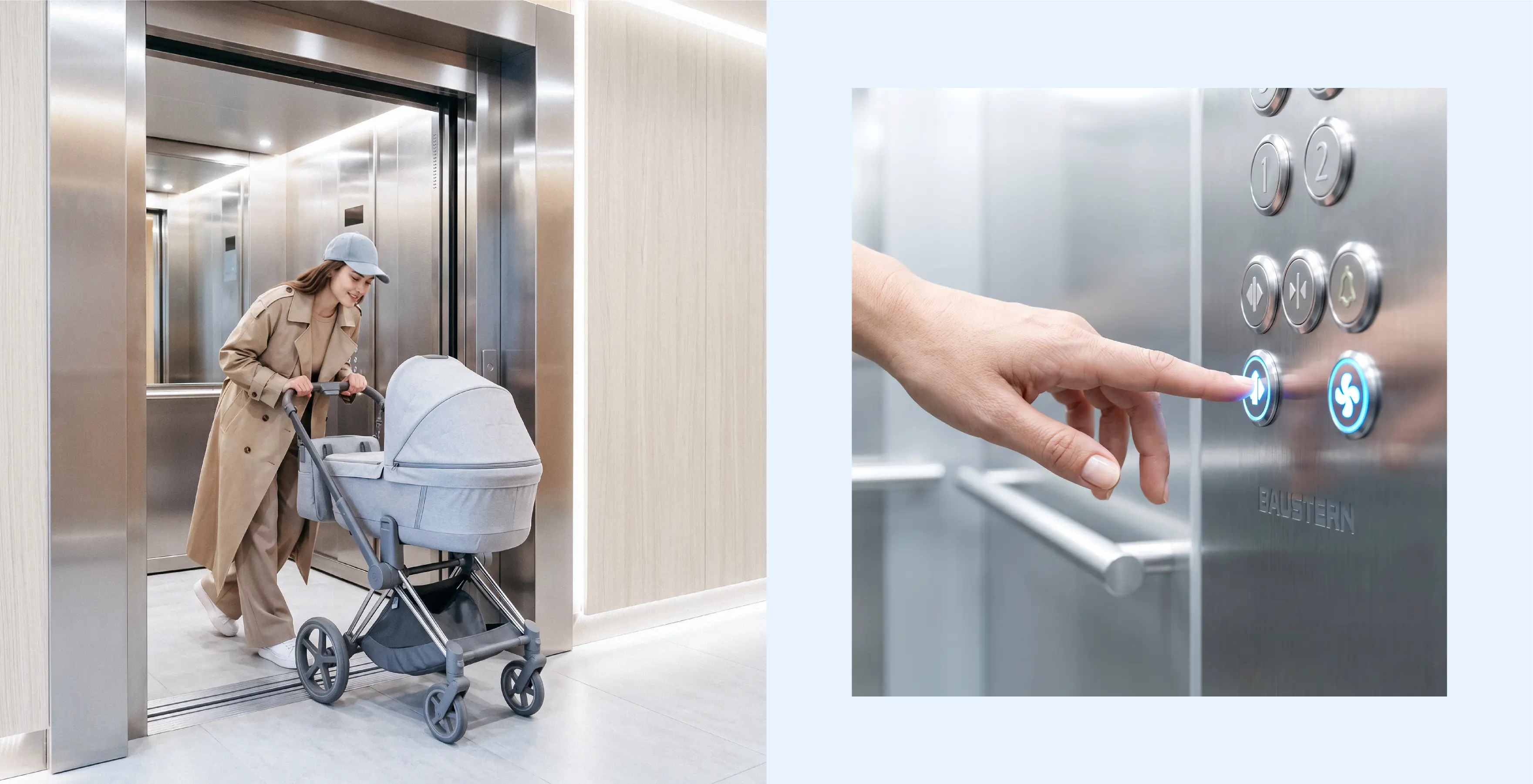
BAUSTERN’s brand positioning combines engineering expertise with a human-centered approach. The elevator is presented as part of the architecture, the daily journey and the overall building experience. For professionals, it is a precise technical solution integrated into the project; for passengers, it means safe, smooth, quiet and comfortable travel.