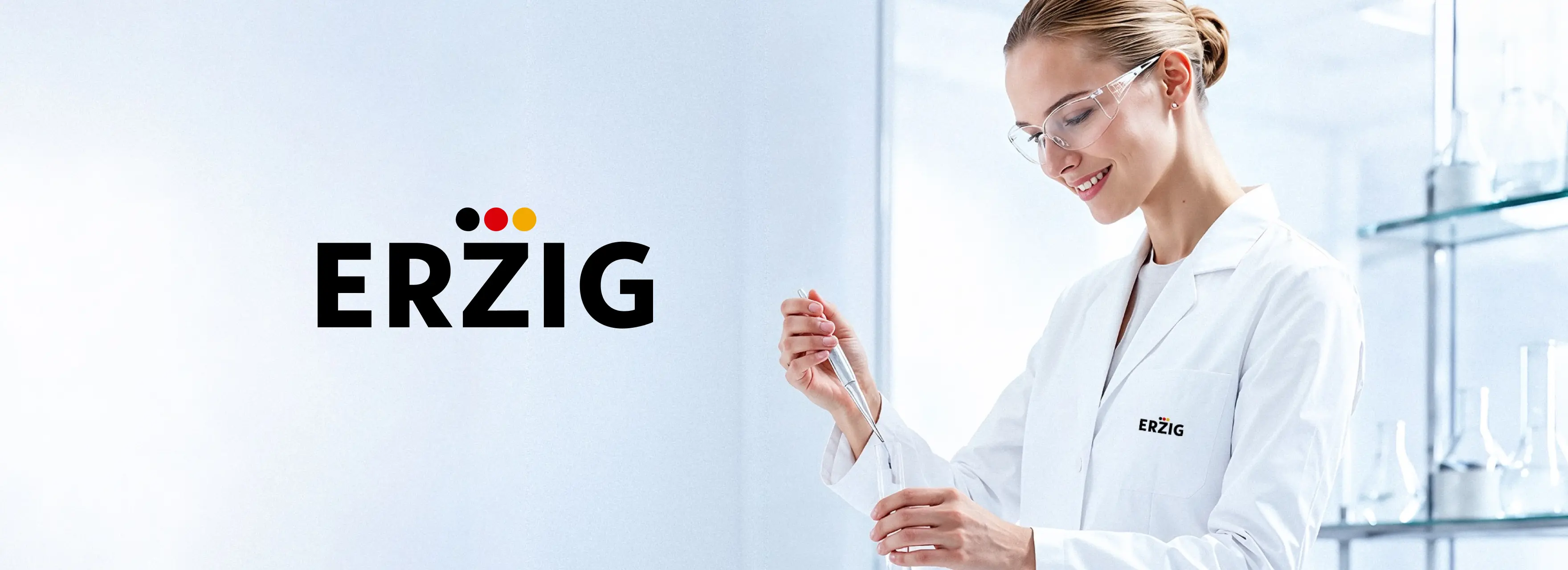
Rebranding of the ERZIG pharmaceutical brand: logo and corporate identity development, packaging and label design
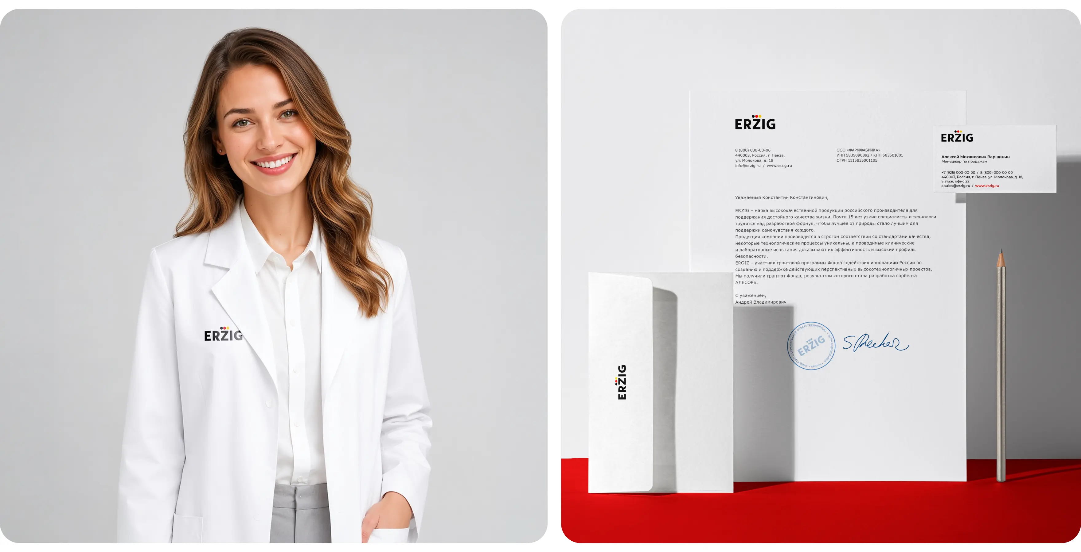
ERZIG is a modern pharmaceutical company developing a broad product portfolio for supporting quality of life: vitamin and mineral complexes, herbal products, sorbents, gastrointestinal products, sports nutrition, and products for women’s and men’s health. The brand is built on international quality standards, innovative development and production technologies, and strict control of raw materials and finished products. For 15 years, this approach has shaped trust in every solution within the portfolio.
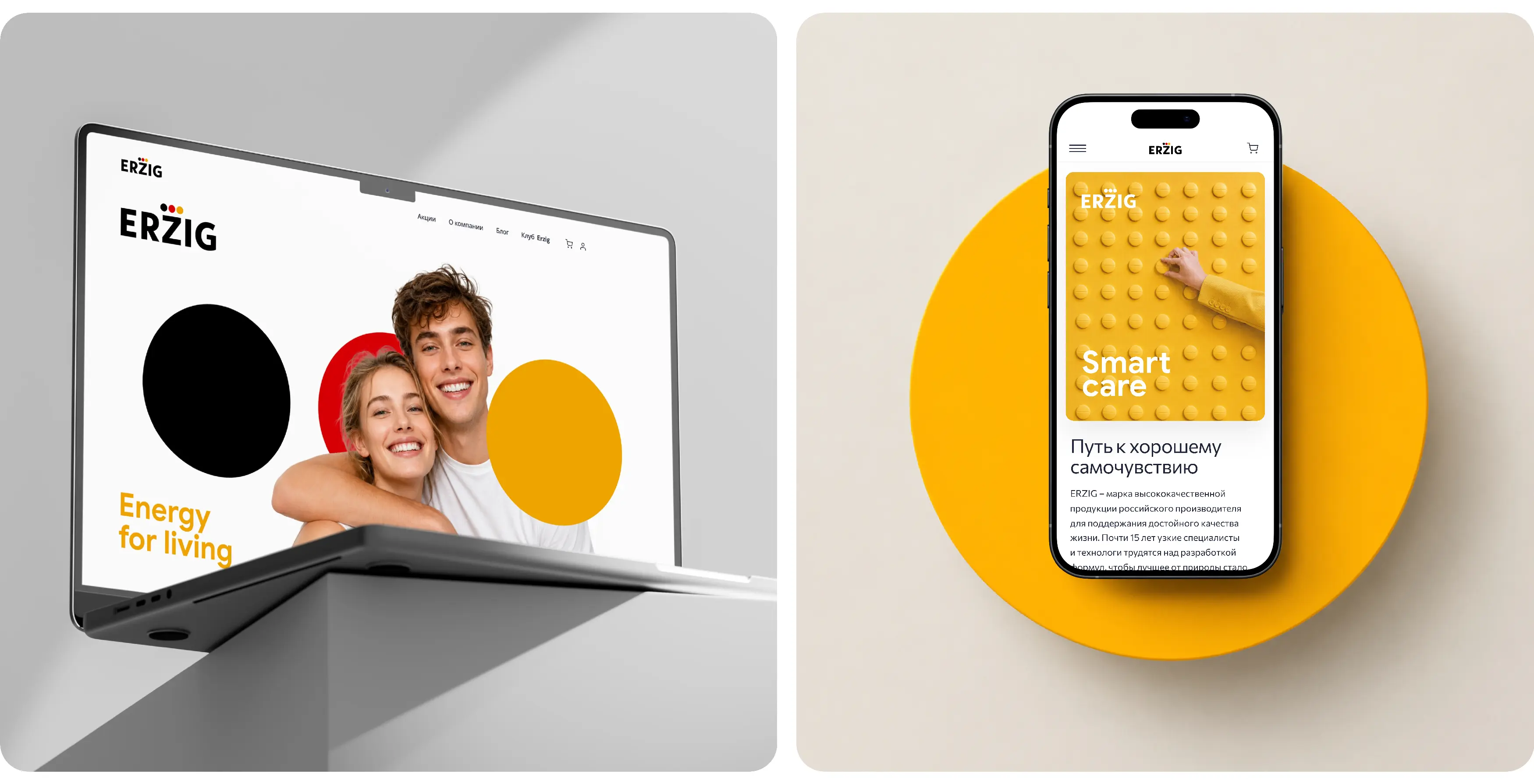
BRANDEXPERT “Ostrov Svobody” carried out a comprehensive rebranding of ERZIG: updating the logo and corporate identity, developing the brand’s visual strategy, packaging and label design, as well as advertising materials for promoting the product lines.
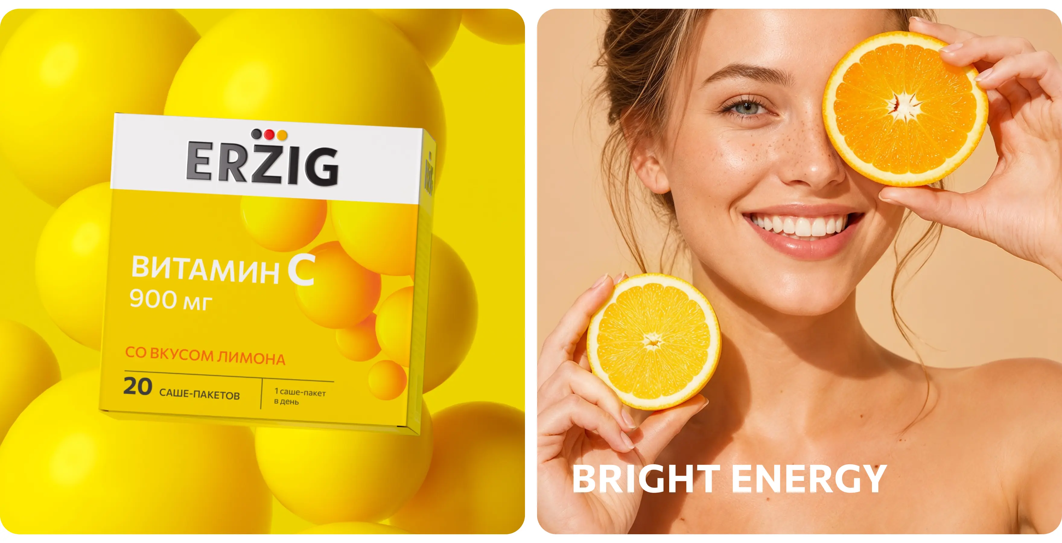
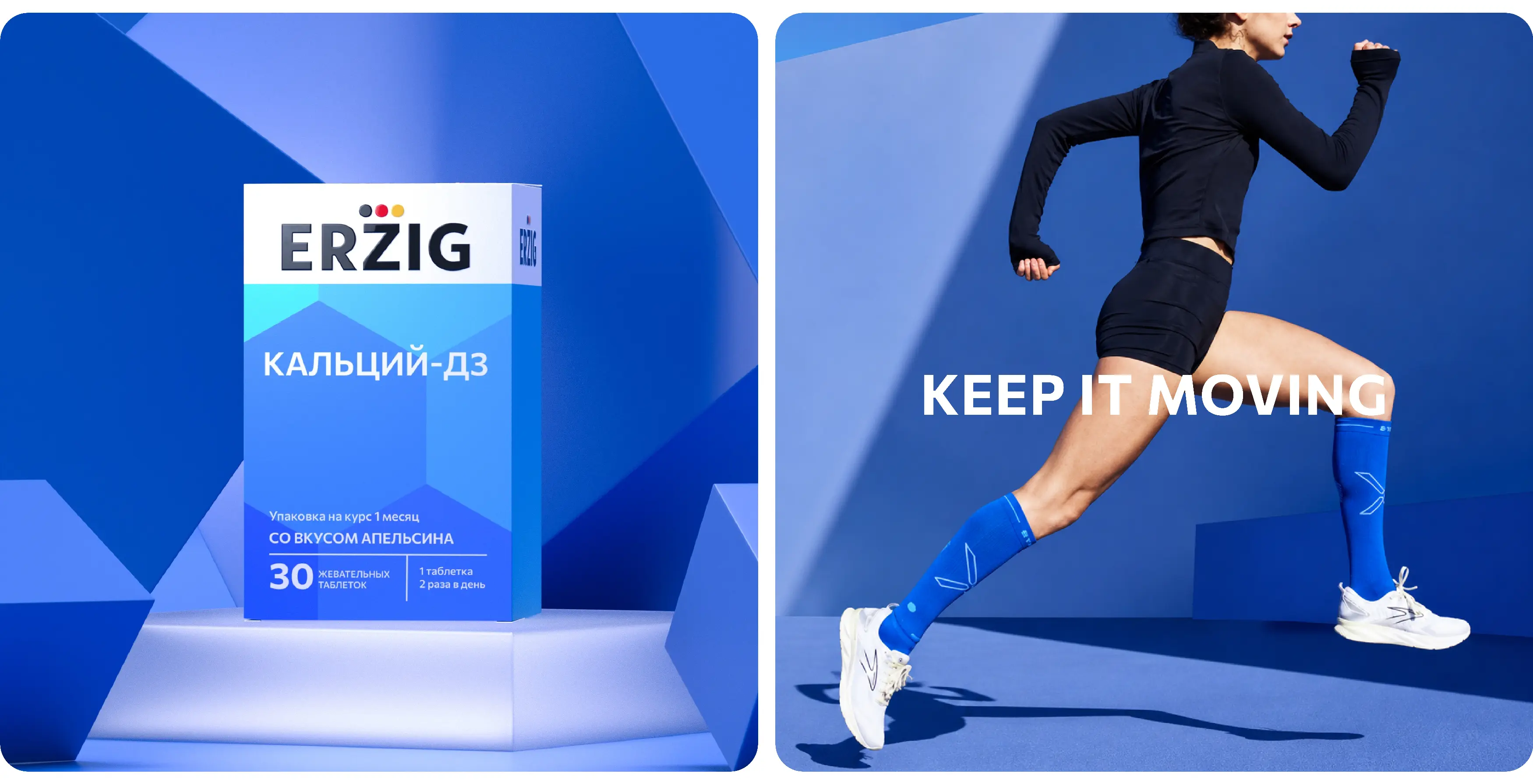
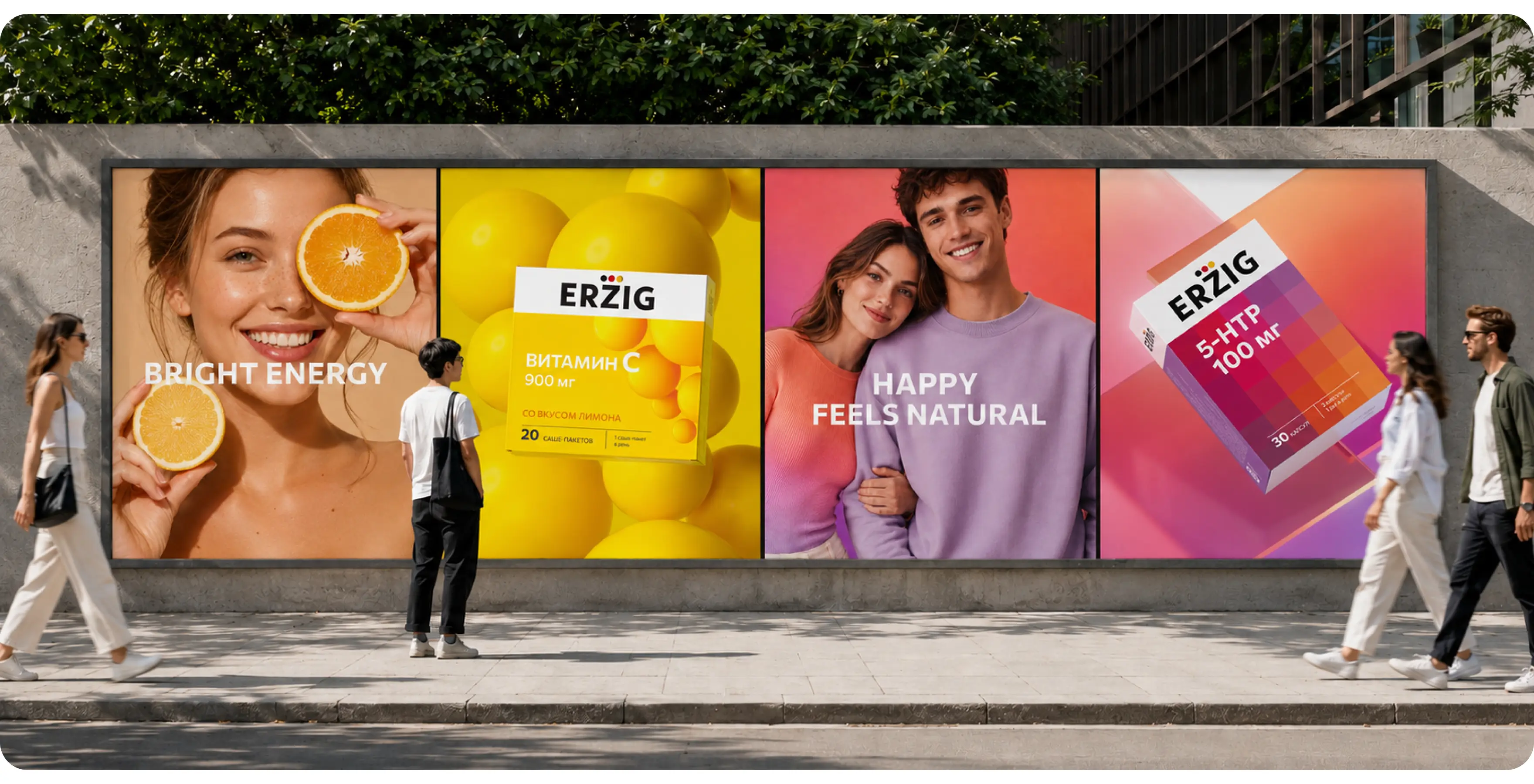
The key task was to create a unified design system for a large pharmaceutical portfolio. We built a visual architecture in which the ERZIG brand takes the leading role, while each category receives its own color, graphic and emotional code. This approach increases brand recognition, simplifies navigation across the assortment and helps transfer trust from one product to another.
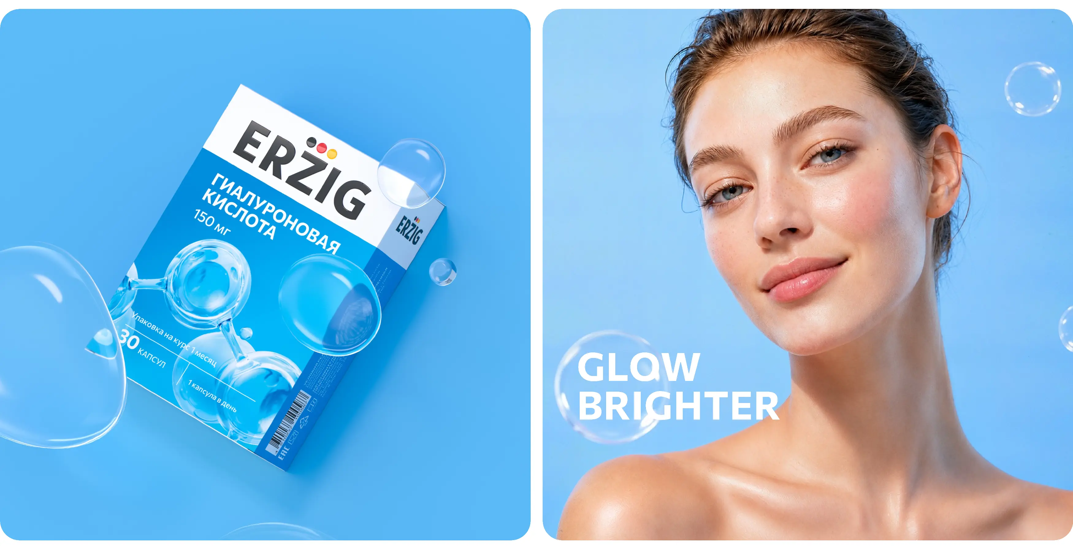
The updated ERZIG identity combines pharmaceutical clarity, European restraint and the living energy of everyday self-care. The white master block with the logo creates a sense of order, quality and expertise. Bright color fields make the packaging visible on the shelf and in e-commerce. The herbal line uses soft natural shades and botanical motifs. Vitamin complexes feature rich gradients and energetic graphics. Sorbents are given a more technological visual language with clean blue-and-white color solutions.
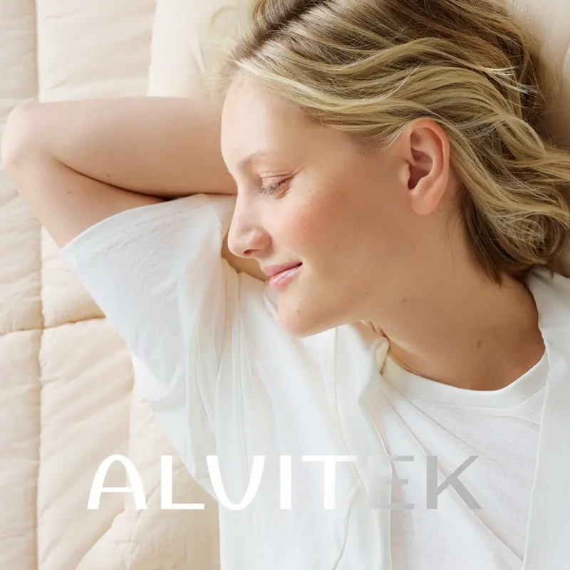
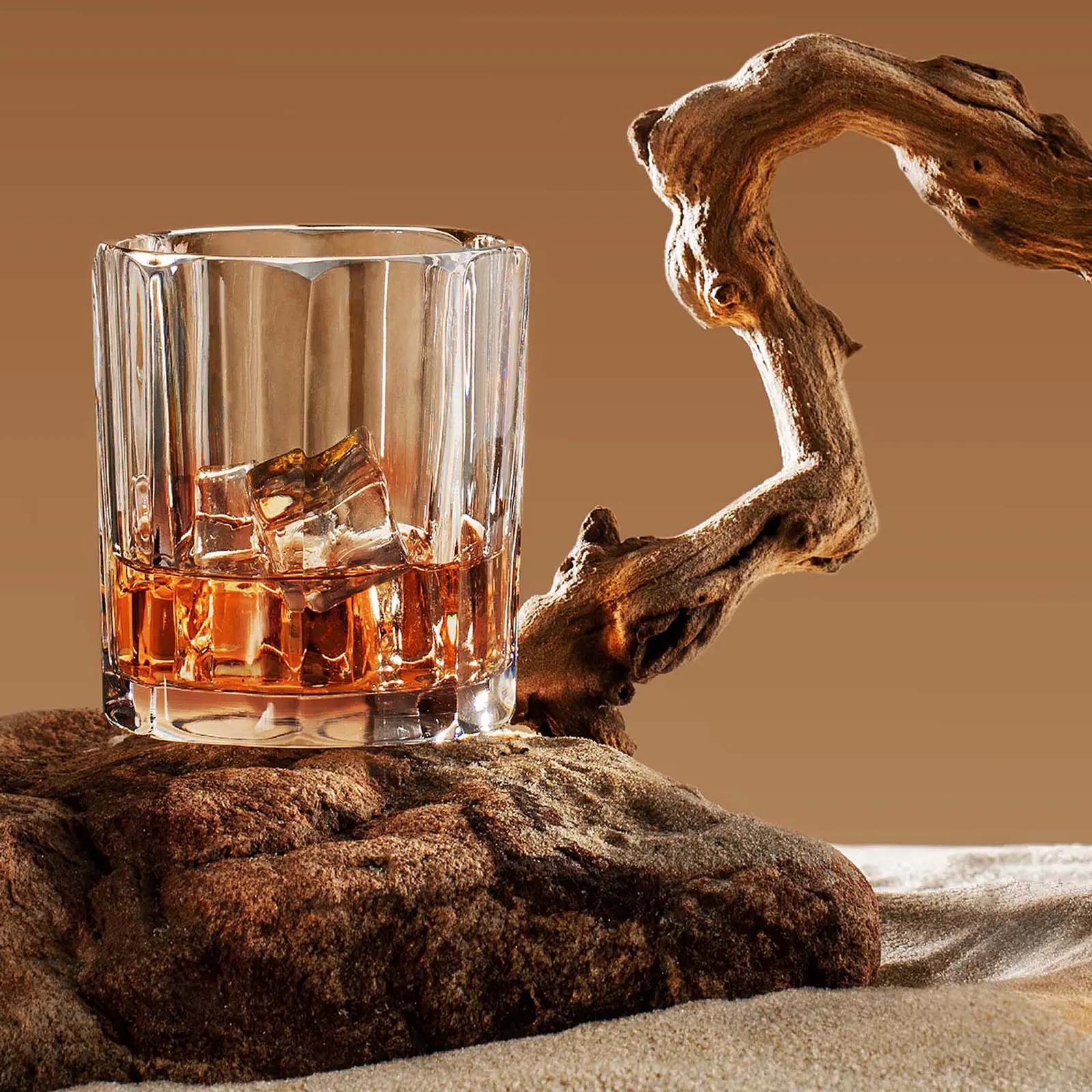
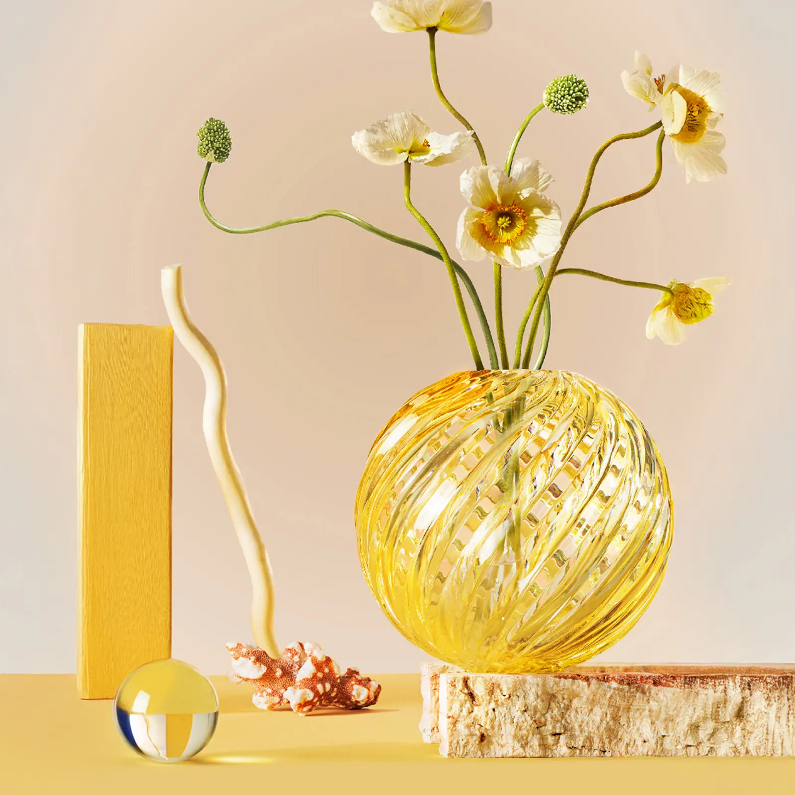
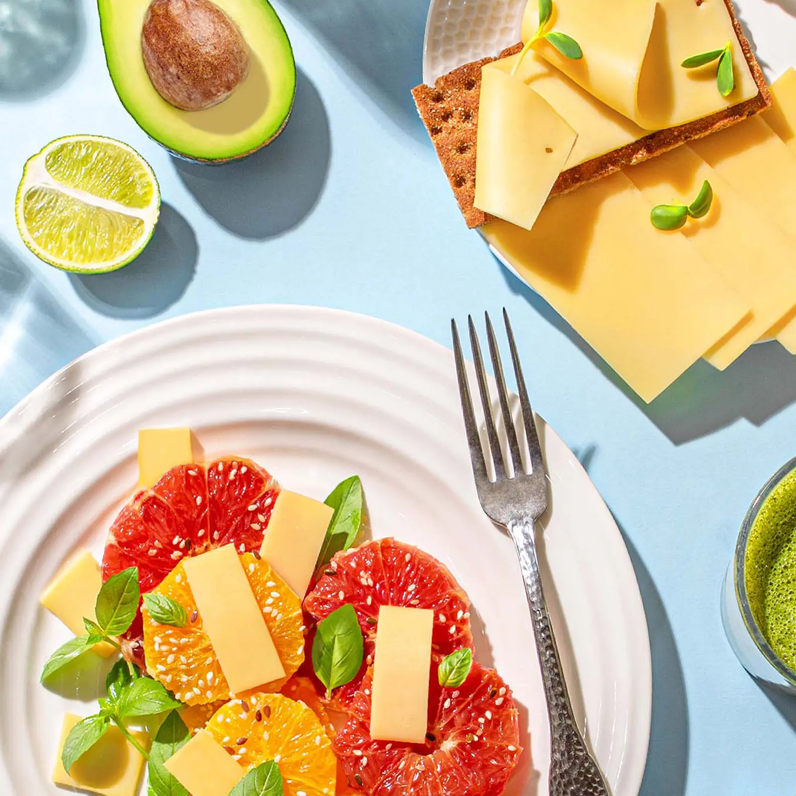
The ERZIG advertising system continues the logic of the packaging and translates the pharmaceutical brand into the language of active modern life. Large color accents, lifestyle photography and concise messages help speak to consumers about what matters most: energy, balance, movement, beauty, care and excellent well-being every day.
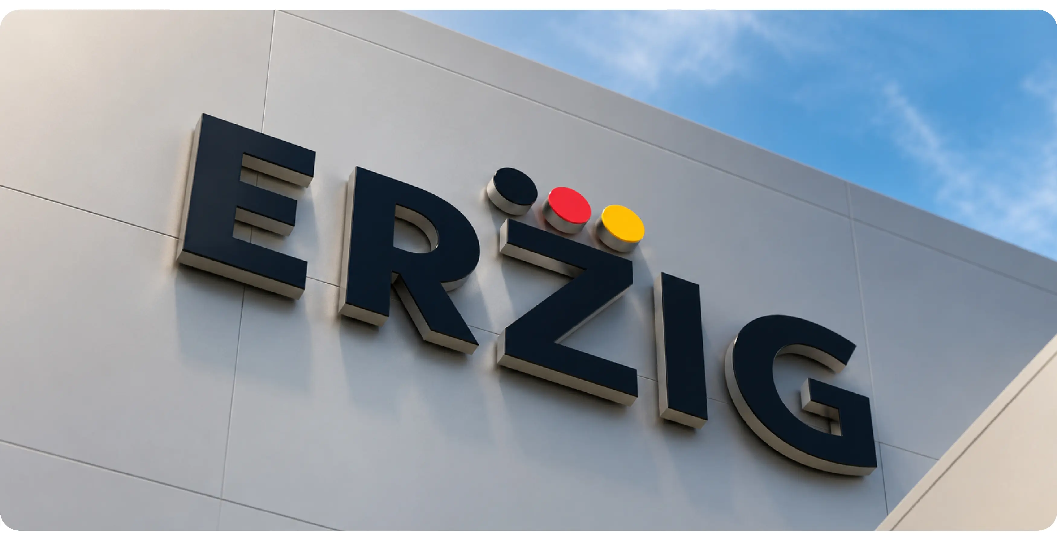
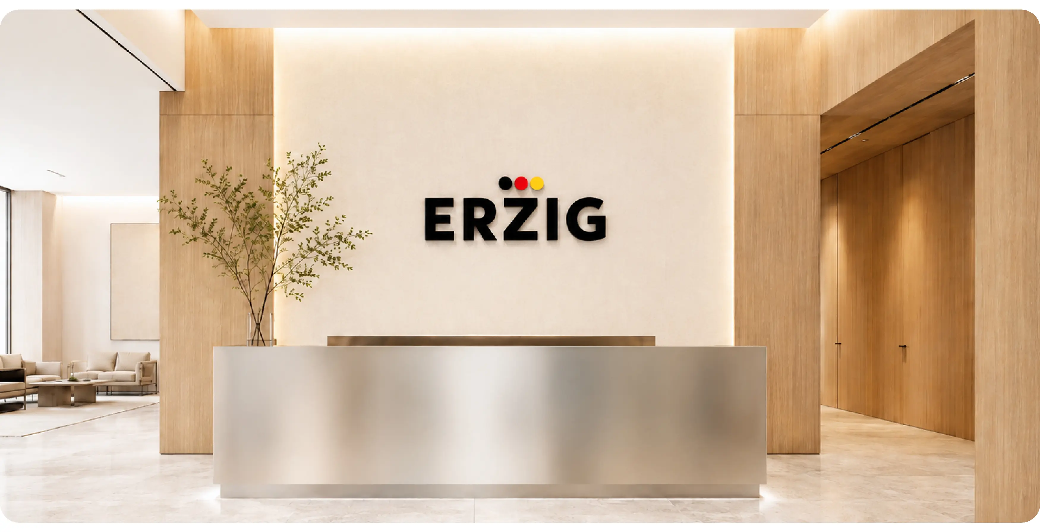
As a result of the rebranding, ERZIG gained a unified visual system that brings together the logo, corporate identity, packaging, label and advertising materials.
The new identity makes the brand more visible, structures the broad assortment and creates a foundation for the further development of product lines. ERZIG now looks like a global pharmaceutical brand with clear architecture, strong packaging and a flexible communication language for offline and digital environments.