
BAUMARS — Heavy Equipment Branding, Brand Naming, Logo and Brand Identity Design, Advertising Design

BRANDEXPERT Freedom Island branding agency was tasked with creating a distinctive heavy equipment brand. It needed to convey the power and reliability of the machinery, reflect the scale of major industrial projects and project confidence in a sector where trust depends on equipment quality and service support.
Brand development brought together brand naming, logo and brand identity design, and advertising design. The unifying idea was exploring new territories. It connects the everyday work of heavy equipment with the ambition to build infrastructure where everything is just beginning.


The brand naming concept for BAUMARS combines the German word Bau (“construction”) with Mars, evoking the scale of space exploration and a distinctly masculine character. Together, they express an ambitious vision of building in any environment, even on another planet — an exceptionally demanding task requiring durable machinery and precise engineering.
The imagery of Mars expresses the brand’s ambition to explore new spaces and expand human capabilities. The energetic sound of BAUMARS reinforces this idea. The name gives the brand a distinctive story that can evolve through its visual identity and advertising communications.

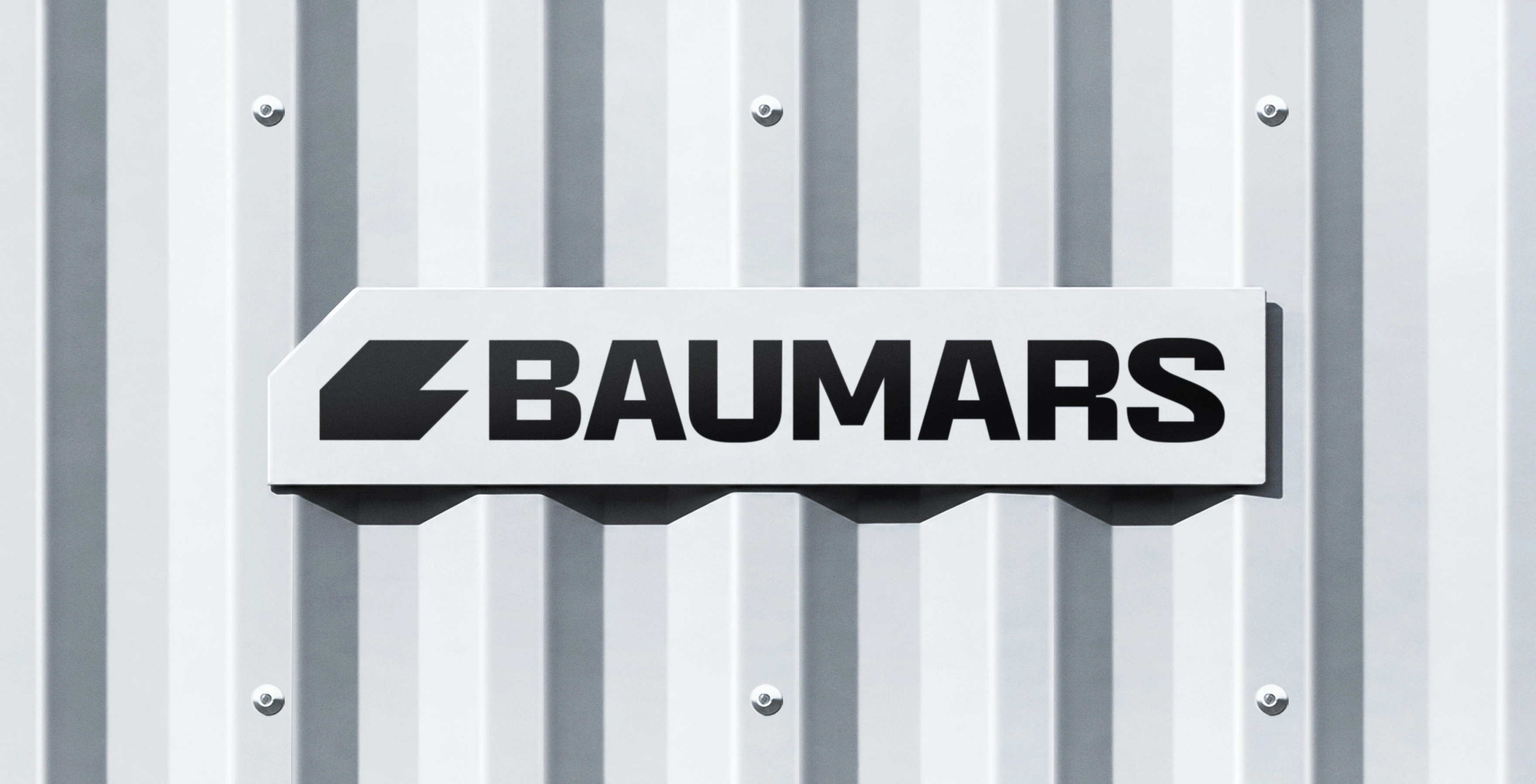
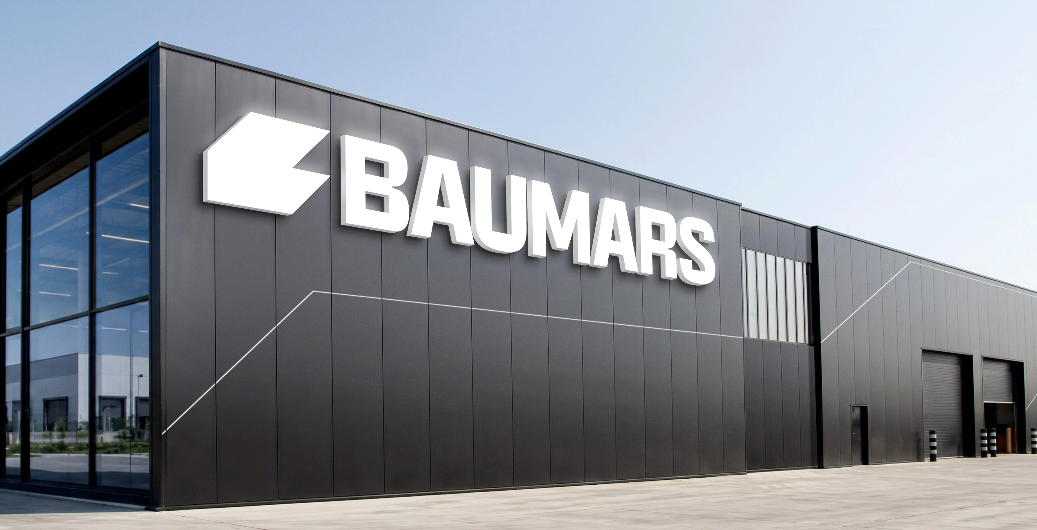
In the logo design, we translated the idea of power into simple geometry. The brand mark combines a stylized “B” with the shape of an earthmoving bucket. Angled edges and a silhouette pointing to the right create a sense of movement, connecting the symbol with the work of heavy equipment and the exploration of new territories.
The wordmark uses bold, uppercase sans-serif lettering. The heavy letterforms give the name visual weight, while the simple construction keeps it legible. Together, the mark and name form a compact logo lockup for machinery, building facades and industrial equipment.

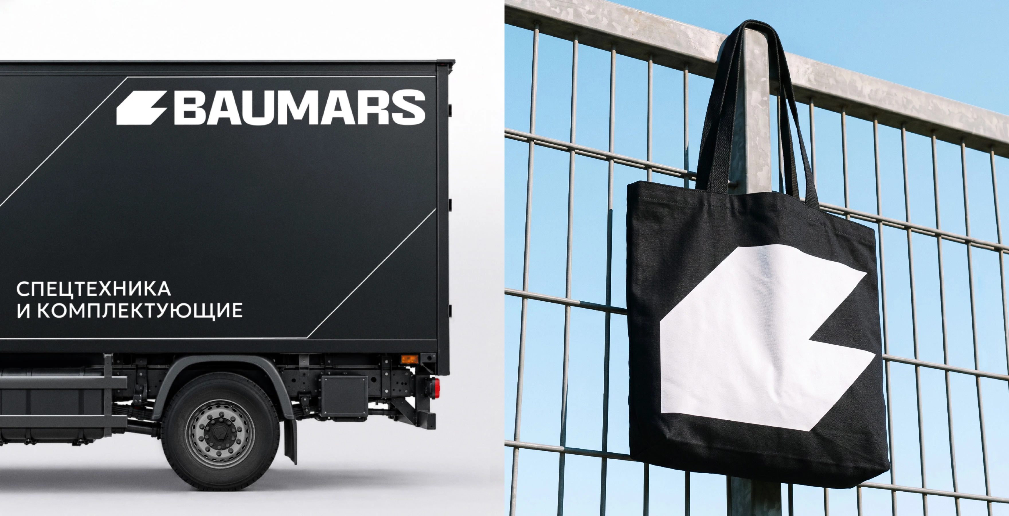
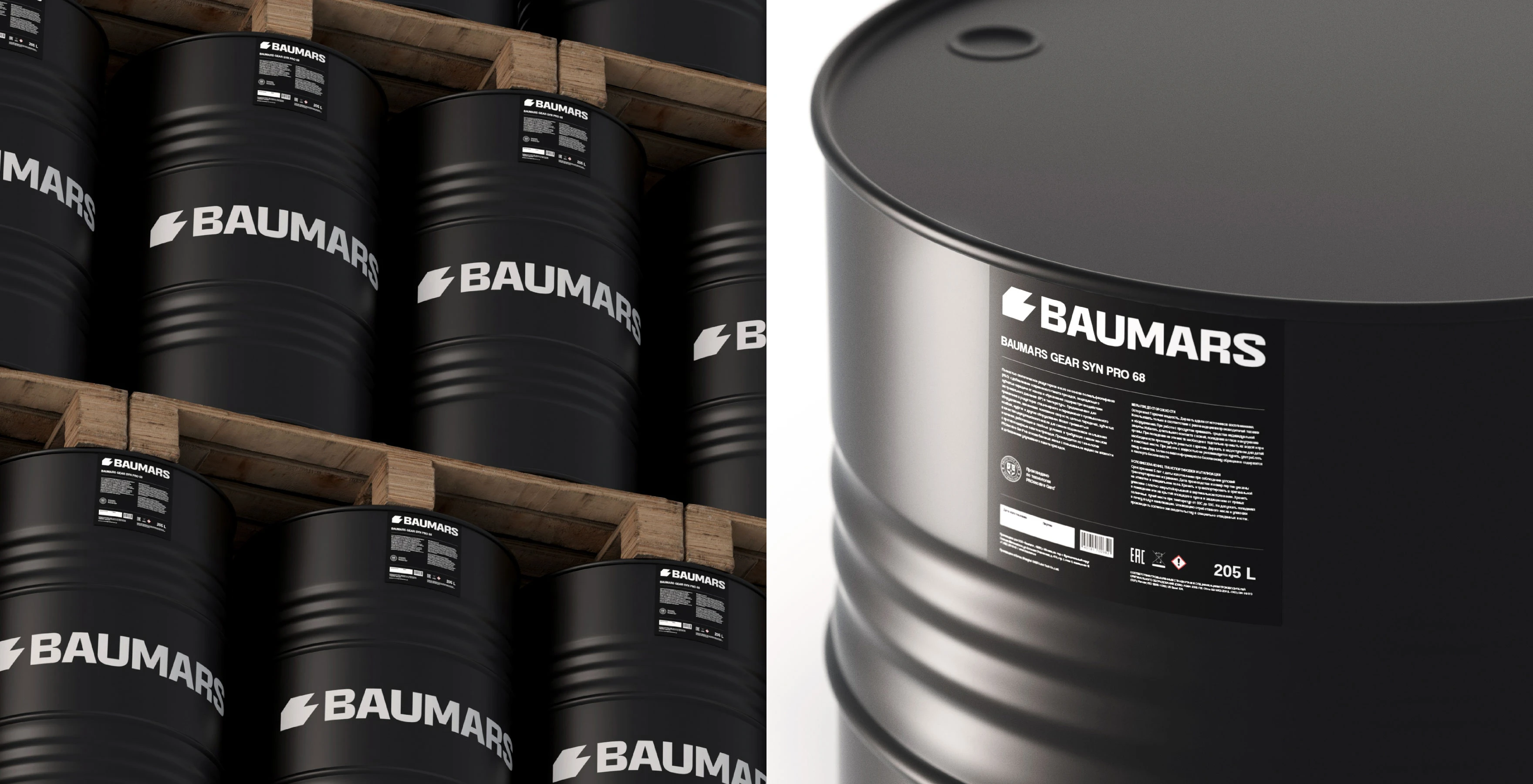
The brand identity design builds on the logo’s geometry. Black and white form the core of the system. This contrast keeps branding clear on light and dark surfaces, works with metal and makes the name the focal point of the composition.
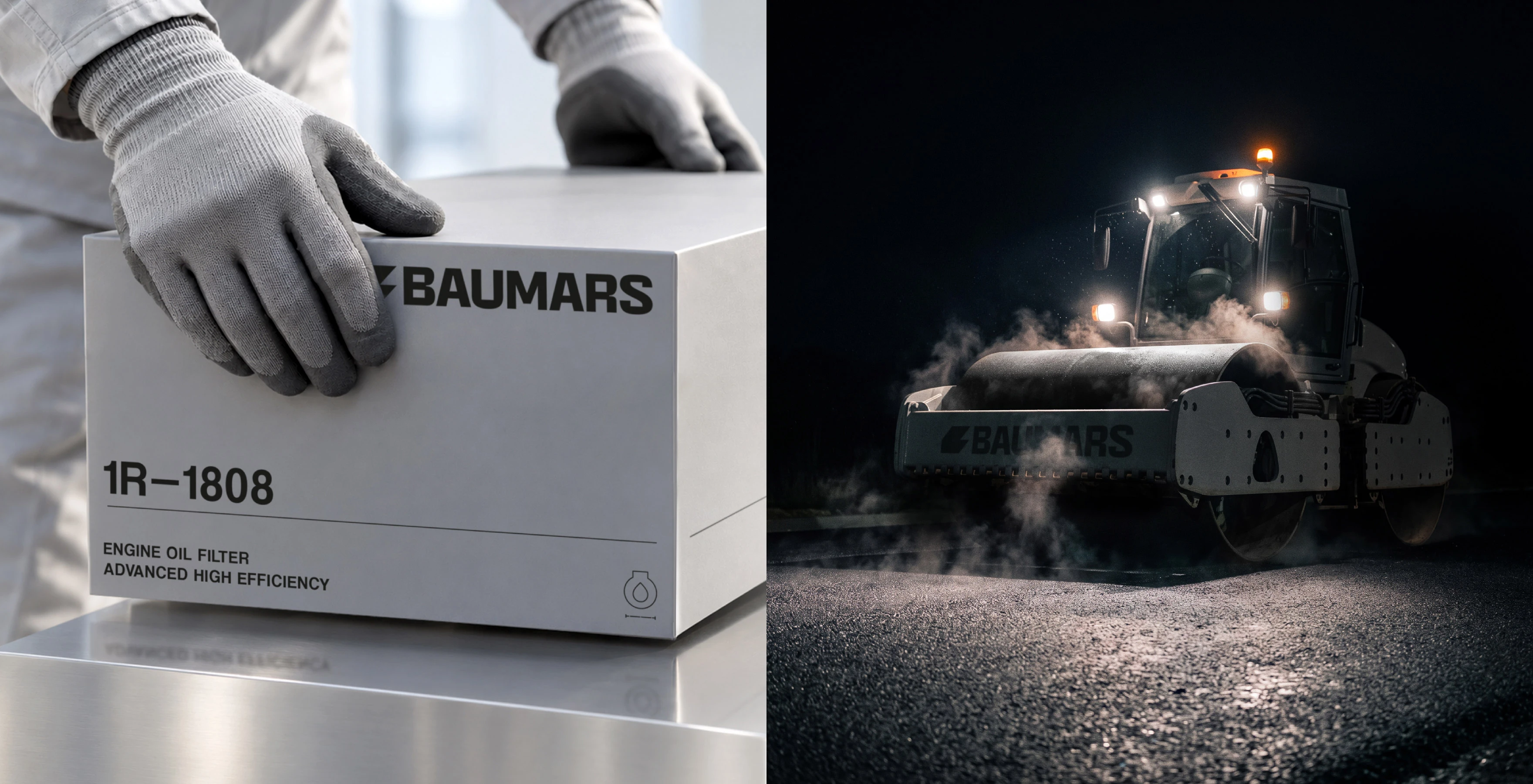
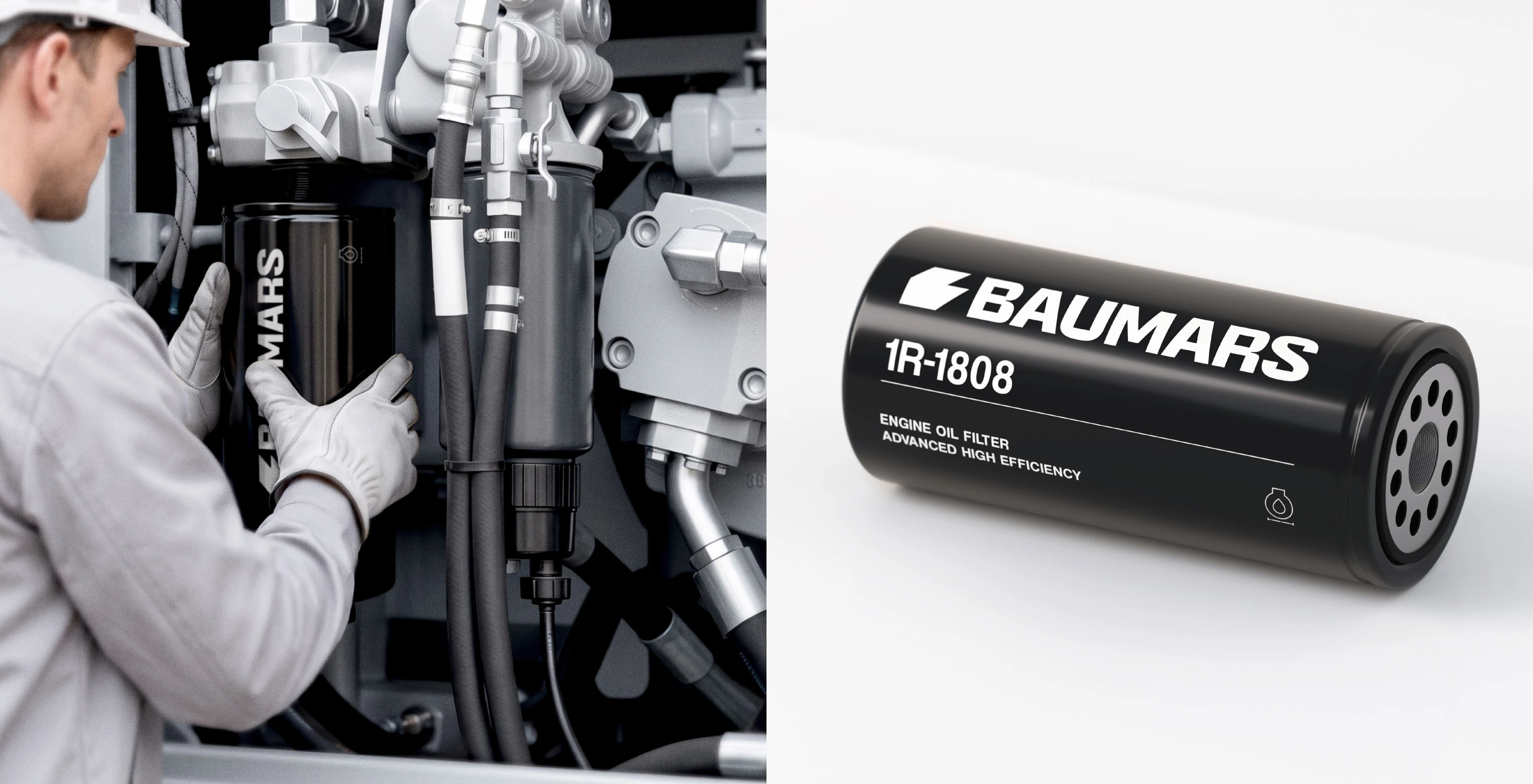
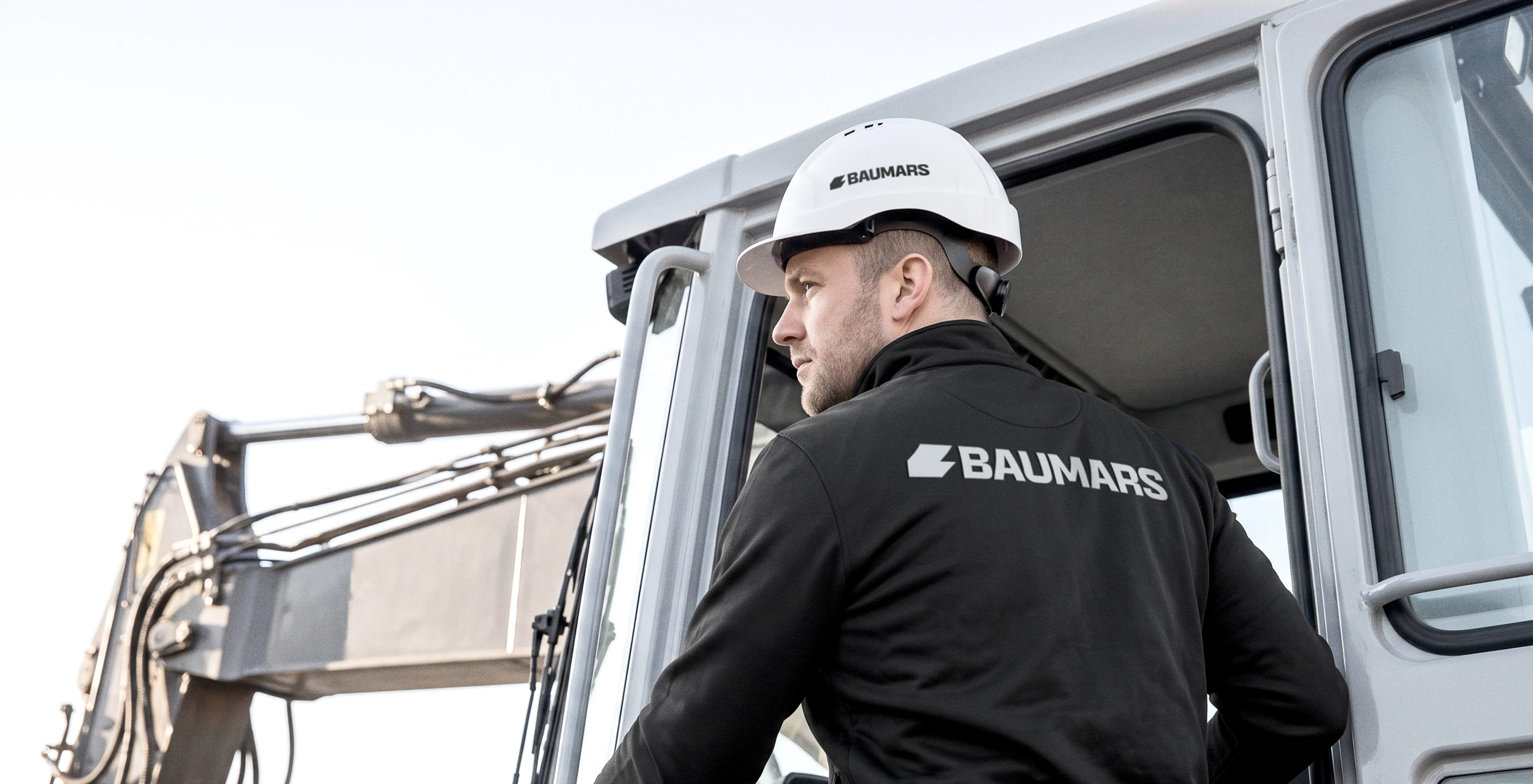
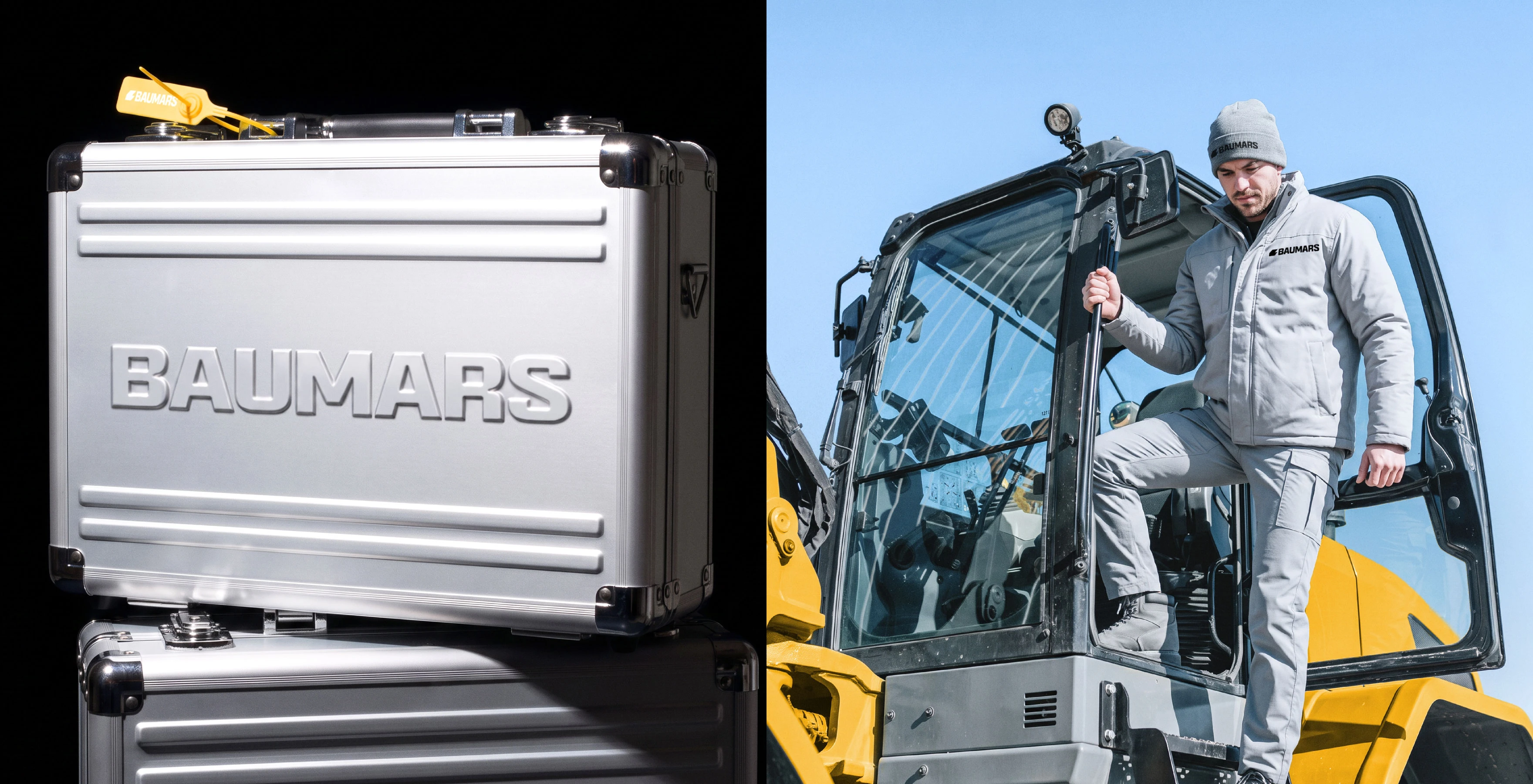
A fine outline of the brand mark became an additional graphic element. It can be enlarged, cropped and incorporated into images of machinery. Diagonal lines connect the designs used across vehicles, products and advertising materials. A compact logo appears on workwear and hard hats, while the bag features the mark as a standalone graphic. This keeps the identity consistent across different scales and application methods.


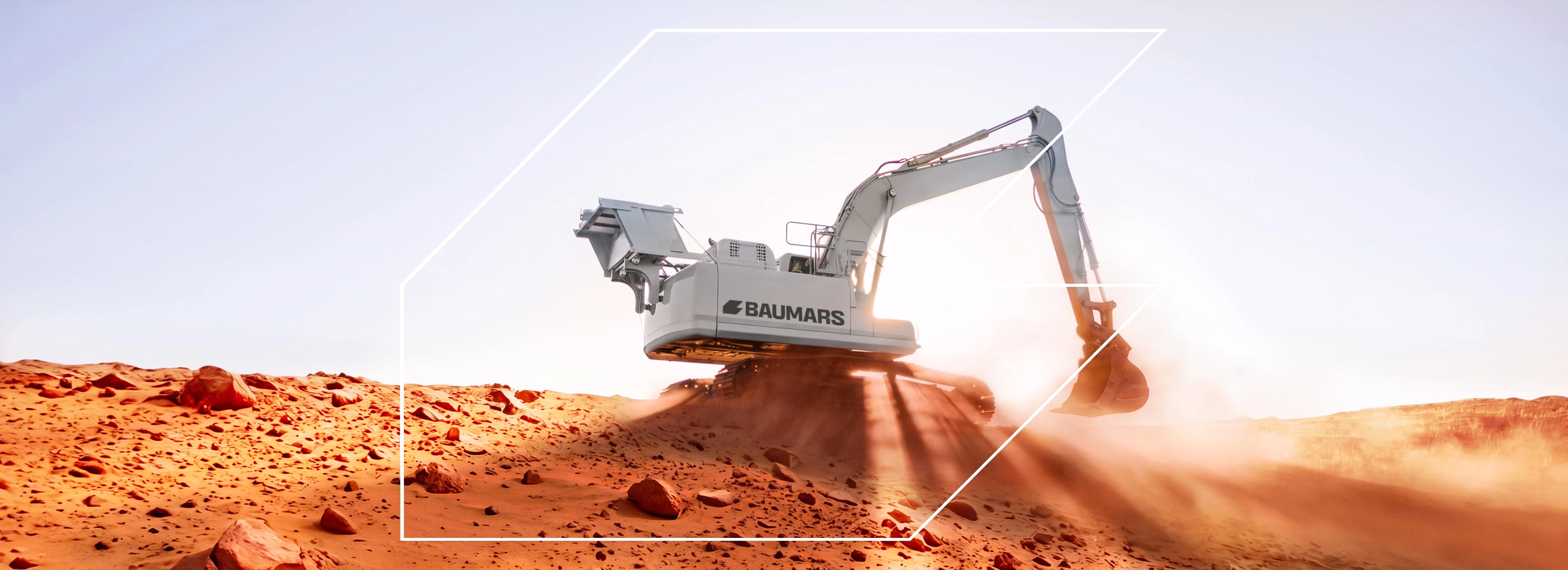
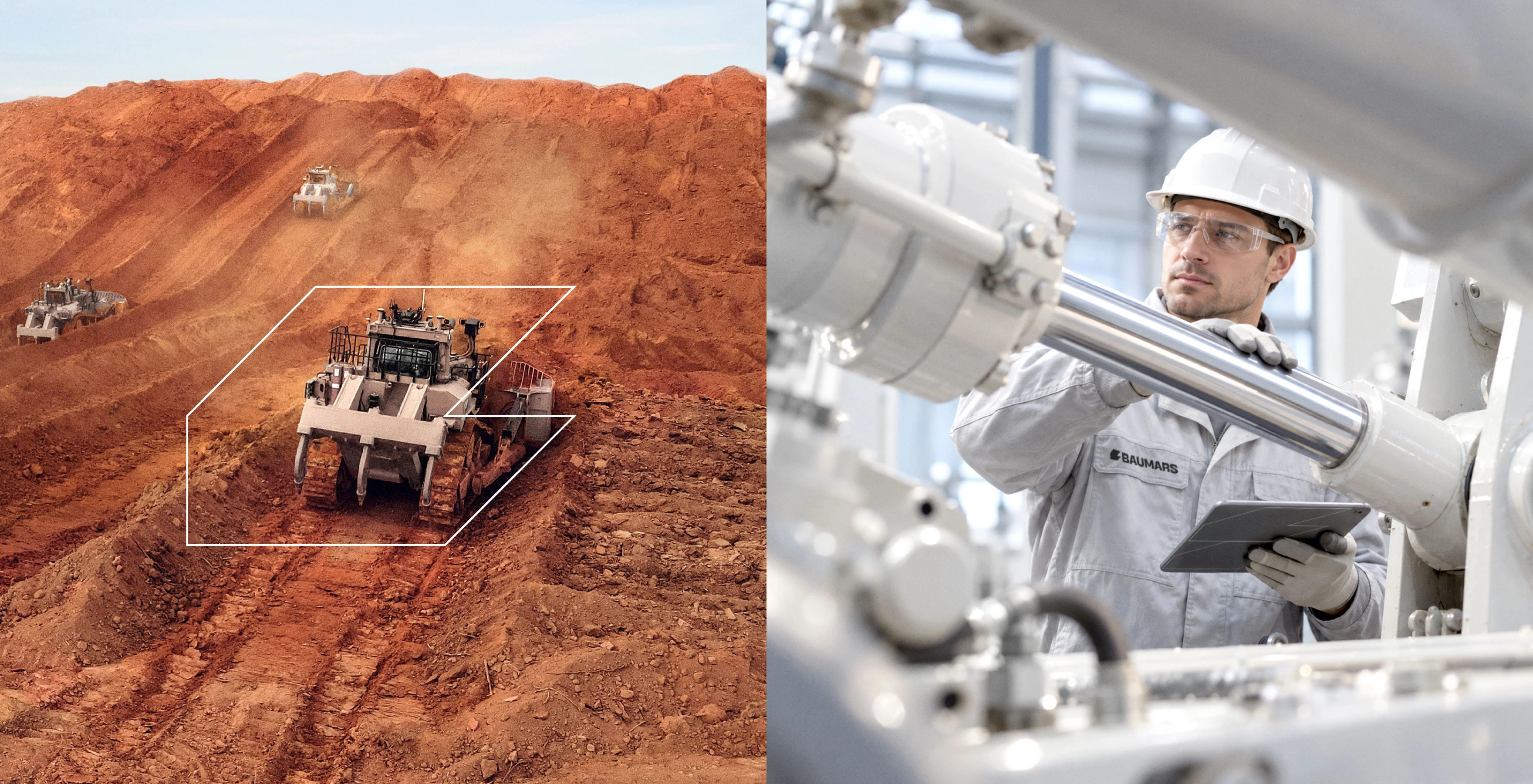
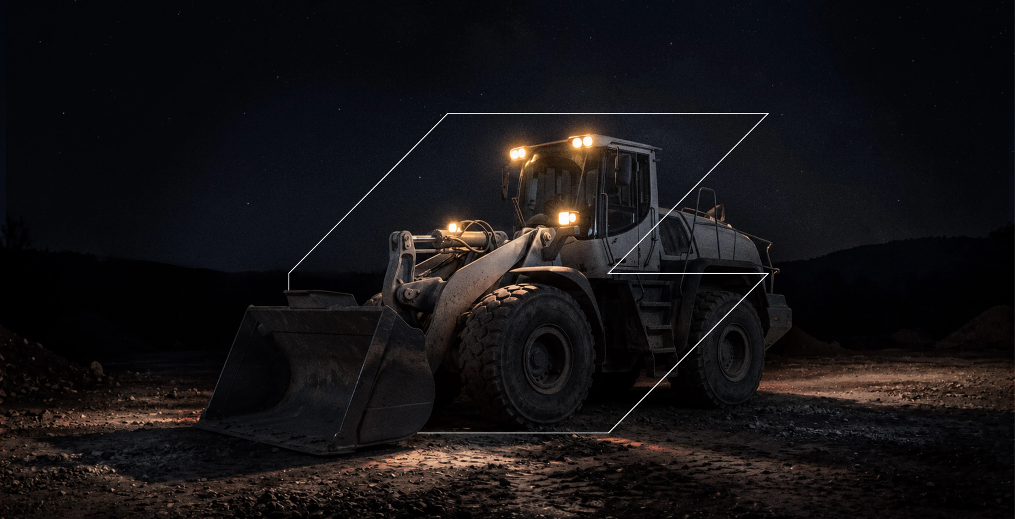
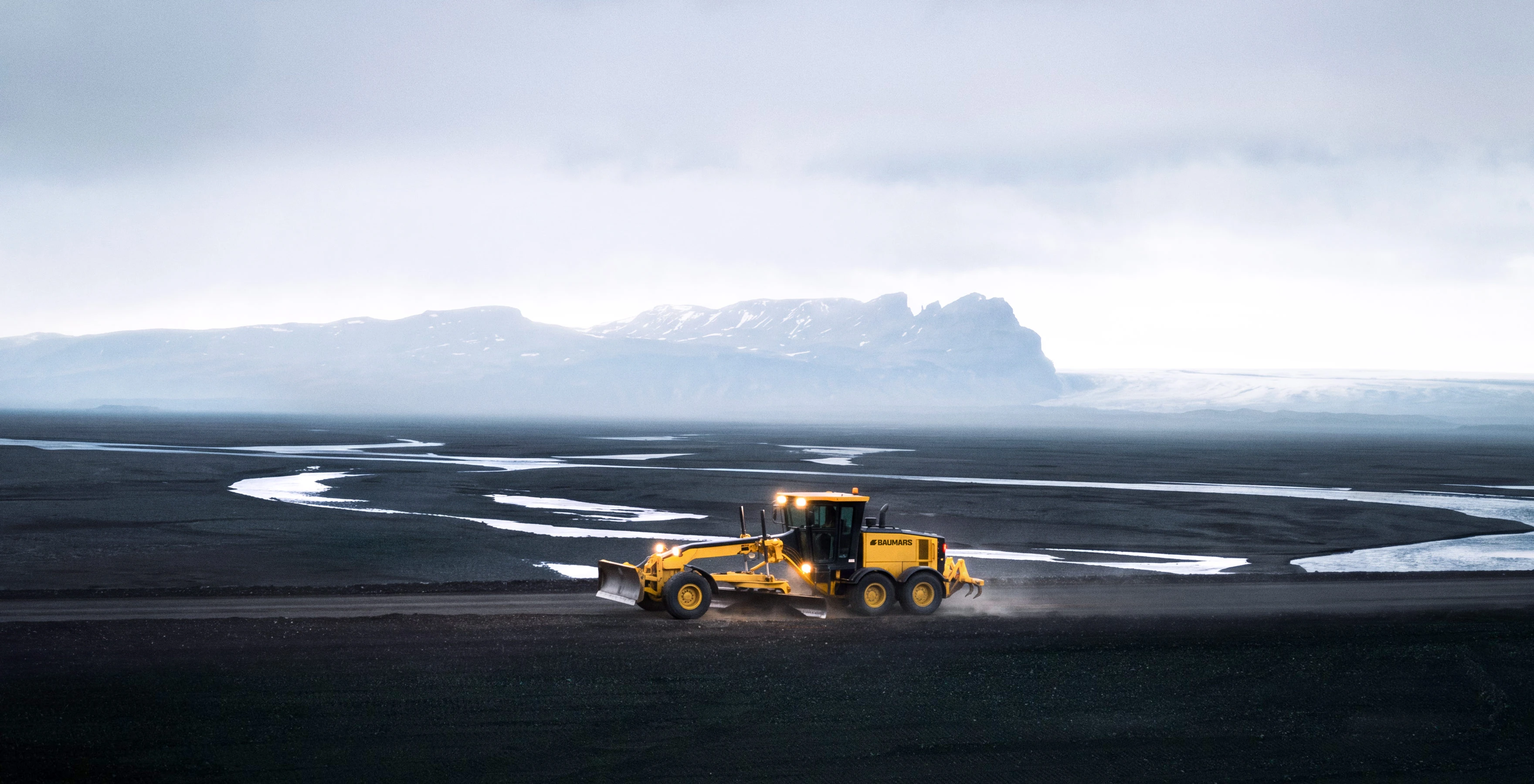
Advertising design for BAUMARS centers on equipment in action. Quarry landscapes, night work and vast open spaces convey the scale of the challenges the brand addresses. Images of engineers and operators add a human dimension, highlighting the people whose expertise determines the outcome.
The outline of the mark draws attention to the machine and connects different scenes. The visual metaphor of exploring another planet develops the meaning of the name, reinforcing the image of equipment built for demanding missions. Close-ups of components and working parts make the communications more tangible and keep them connected to customers’ everyday tasks.


BAUMARS now has a distinctive name and a cohesive visual identity for effective positioning in the global market. The brand conveys confidence in tackling large-scale challenges. Its recognizable industrial character comes through consistently at every touchpoint, from branded components to heavy machinery opening up new territory.

Other projects in the similar business segment
The BRANDEXPERT Team.